Rana Fresh Pasta Pouch
Topics
Details
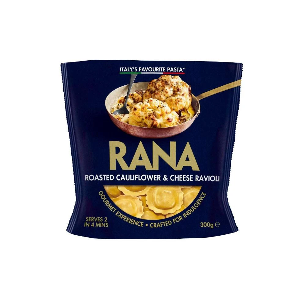
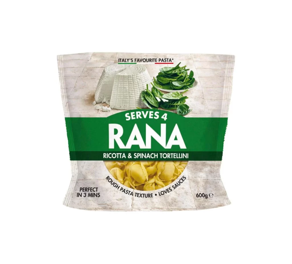
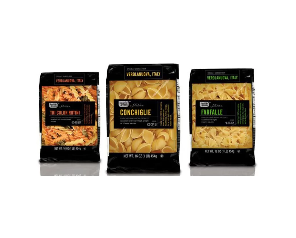
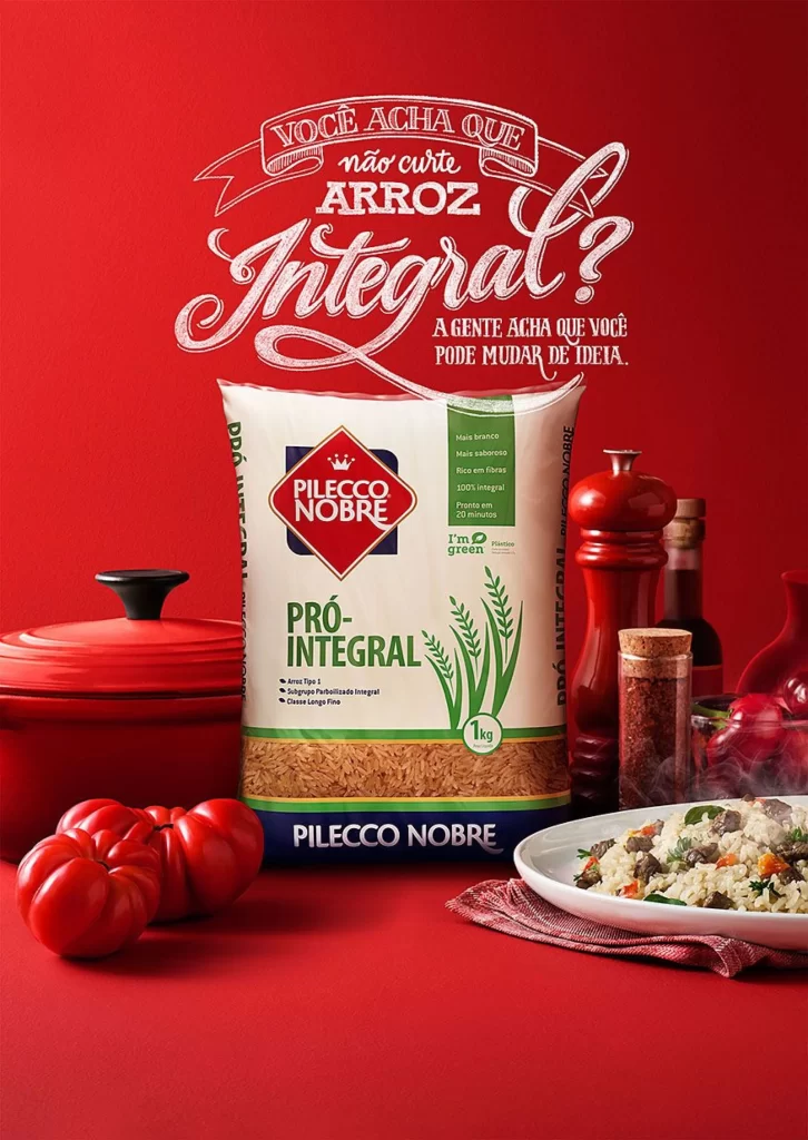
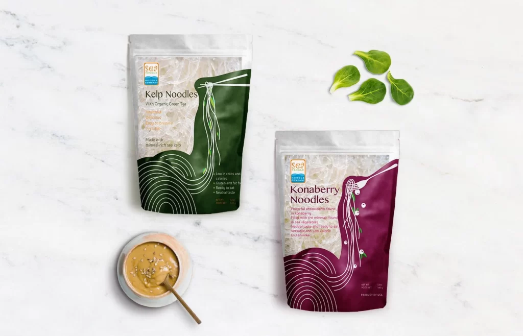
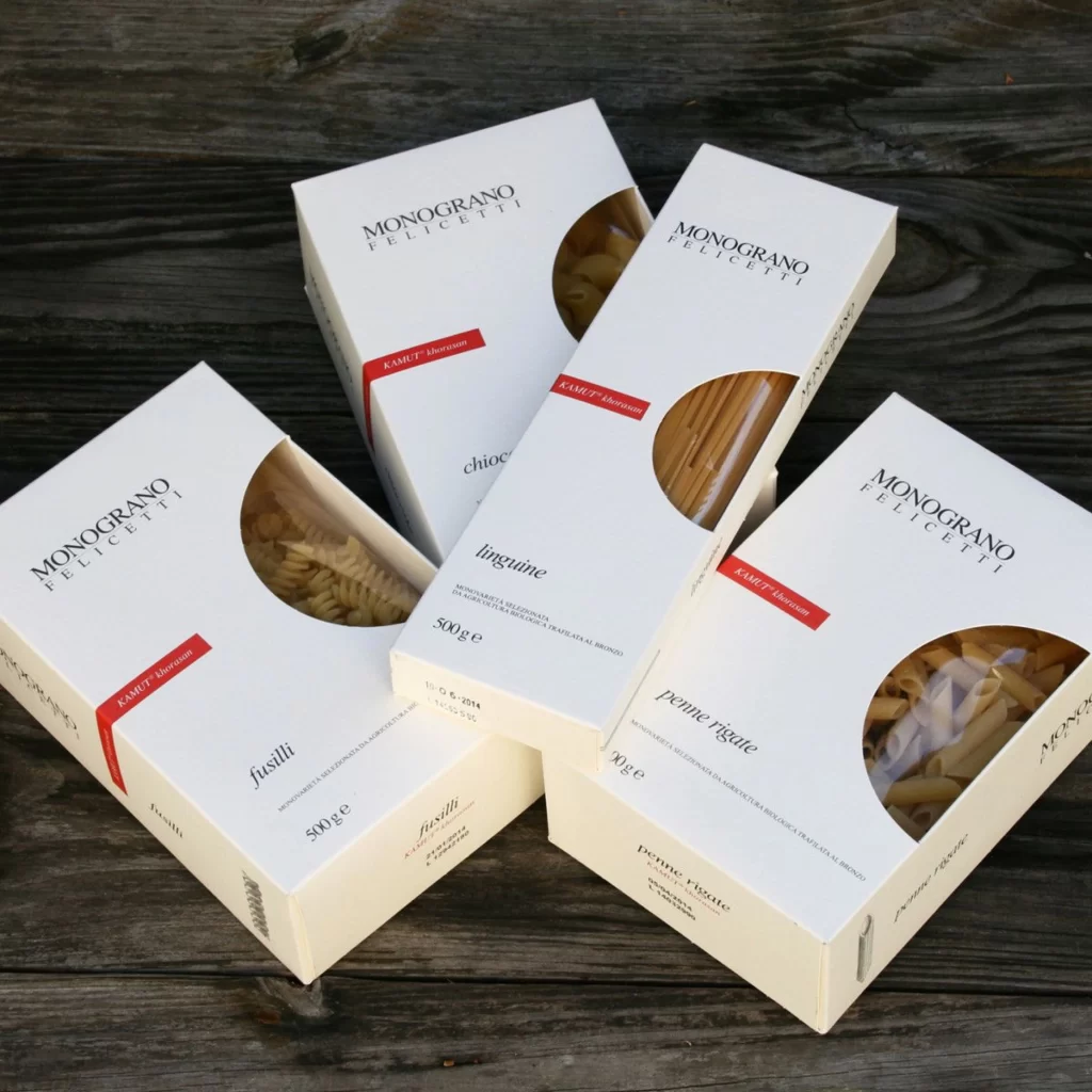
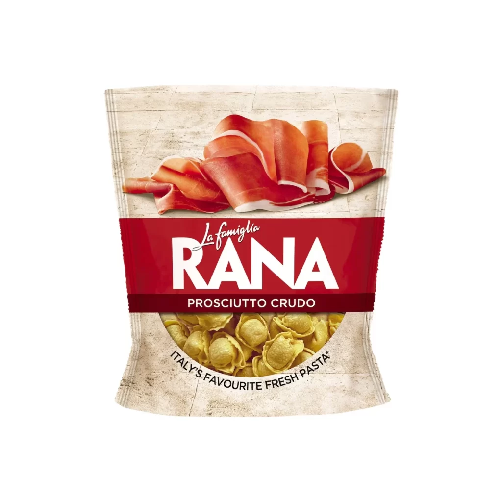
Centered within the frame, a sealed pouch of Rana fresh pasta displays a sophisticated color palette of deep crimson and pale parchment. The upper half features a photographic rendering of thinly sliced prosciutto crudo, its pinkish-red meat and white fat edges curling naturally over a textured stone-tile background. A bold red band bisects the packaging horizontally, bearing the white serif lettering 'La famiglia RANA' above the smaller capitalized text 'PROSCIUTTO CRUDO', while a circular window at the bottom reveals yellow tortellini shapes beneath the curved black slogan 'ITALY'S FAVOURITE FRESH PASTA'.
Visual hierarchy drives the effectiveness of this commercial design through strategic color blocking and typographic contrast. The rich red band creates an immediate focal point that anchors the brand identity, while the realistic food photography establishes appetite appeal and product authenticity. Subtle details like the stone texture background and the transparent product window add tactile depth, distinguishing this package from flat graphic-only designs by incorporating three-dimensional visual elements.
Packaging designers studying Italian food branding would find value in analyzing how traditional culinary imagery integrates with modern typography. Marketing teams developing premium refrigerated goods could reference the balance between transparency and decorative elements when conceptualizing their own retail presentations. Illustrators requiring accurate depictions of cured meats or fresh pasta shapes might utilize the photographic details as anatomical guides for commercial artwork.