Pasta Chickpeas Protein Fiber Red White
DownloadTopics
Details
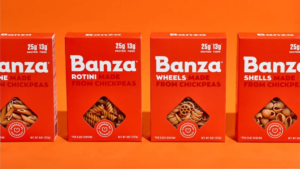
Four red cardboard boxes of Banza chickpea pasta stand in a horizontal row against a solid orange backdrop. Each package features the brand name in bold white sans-serif lettering above a diamond-shaped transparent window revealing the specific pasta shape inside—penne, rotini, wheels, and shells respectively. The composition presents the products at eye level with even, shadowless lighting that emphasizes the vibrant contrast between the crimson packaging and the saturated background.
Visual consistency across the product line creates immediate brand recognition through repeated typographic hierarchy and color blocking. The transparent die-cut windows serve as functional design elements that allow consumers to verify texture and form while maintaining structural integrity of the packaging layout. Nutritional claims appear in white text near the top of each box, establishing a standardized information architecture that balances marketing appeal with health-conscious messaging.
Packaging designers studying food retail aesthetics will find value in analyzing how this brand maintains visual cohesion across multiple SKUs while differentiating individual products through shape variation. Marketing teams developing plant-based protein branding could reference the color psychology employed here to convey energy and appetite stimulation. The full-resolution asset is accessible at no cost for those needing to examine print production details or color calibration specifics.