Oikos Pro Yogurt Protein
DownloadTopics
Details
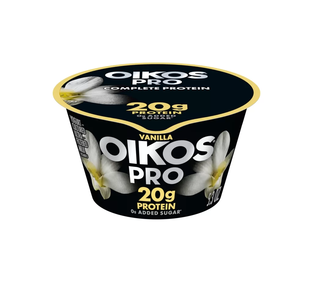
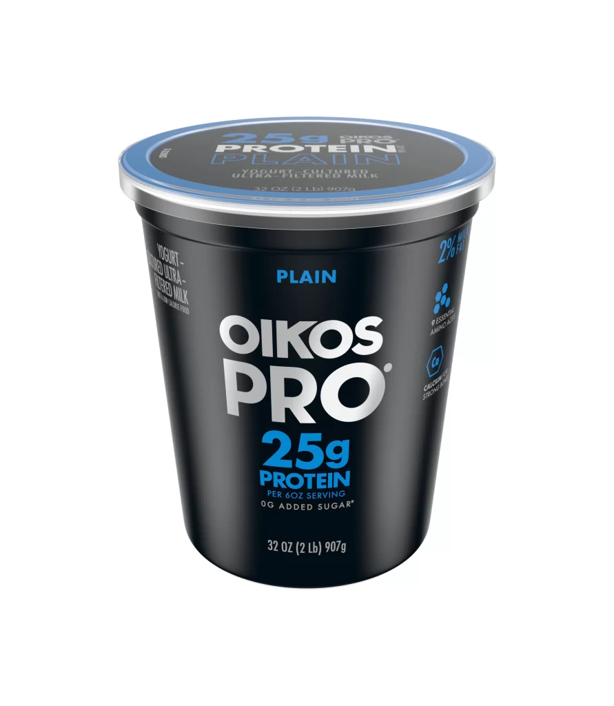
A matte black plastic tub of Oikos Pro Plain yogurt stands upright, topped with a dark blue lid featuring a silver metallic rim. Bold white sans-serif lettering spells out the brand name across the front, while bright cyan accents highlight the 25g protein claim and the word PLAIN positioned above the logo. The container tapers slightly toward the base and displays additional nutritional details in smaller white text along the left and right sides, all set against a clean, light backdrop with even studio lighting that eliminates harsh shadows.
The visual identity relies on a stark contrast between the deep black vessel and the electric blue typography, creating immediate legibility for the high-protein positioning. Hierarchical text sizing draws the eye from the massive brand mark down to specific metrics like the 32-ounce weight and zero added sugar promise. Designers studying this packaging will notice how the color-coded lid coordinates with the accent text to reinforce product line recognition across different flavors.
Food photographers and packaging students can examine how cylindrical forms catch light along their curved surfaces without losing detail in the shadows. Brand analysts might compare this athletic aesthetic against traditional dairy packaging to understand market segmentation strategies. Anyone needing crisp source material for texture studies or label layout experiments can access the full-resolution file at no cost directly from the resource library.