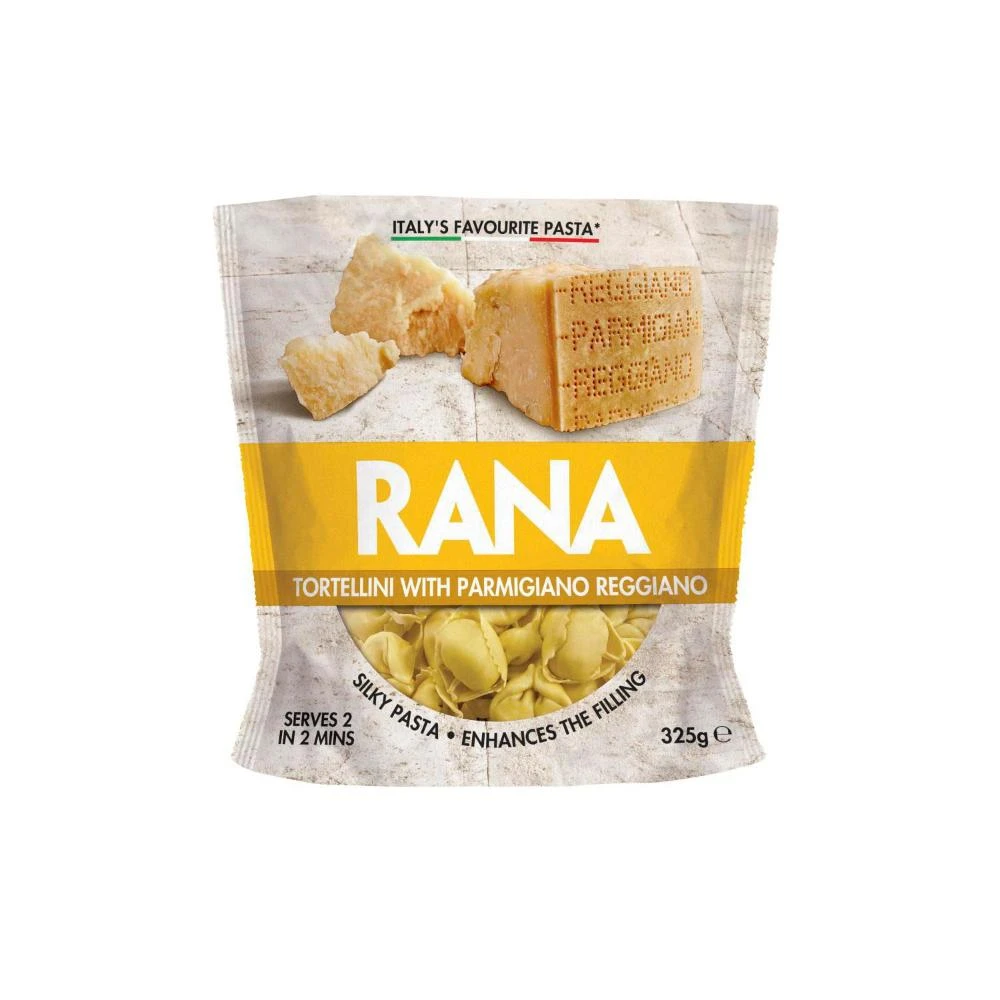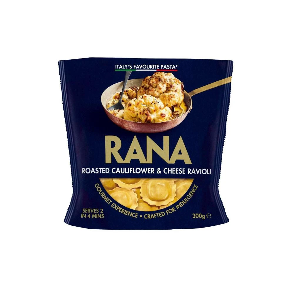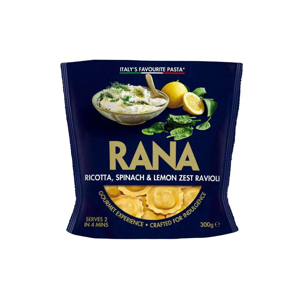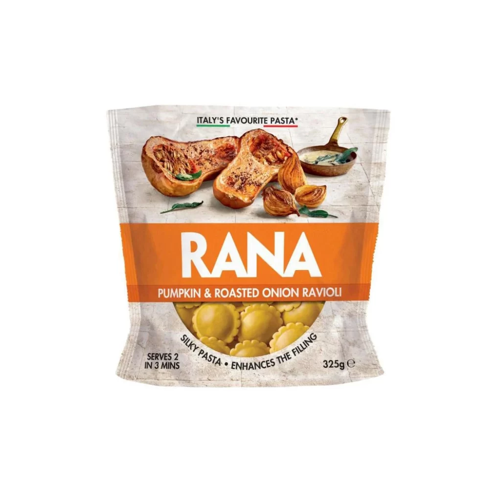
Rana Chicken Mozzarella Tortelloni Pouch
Topics
Details
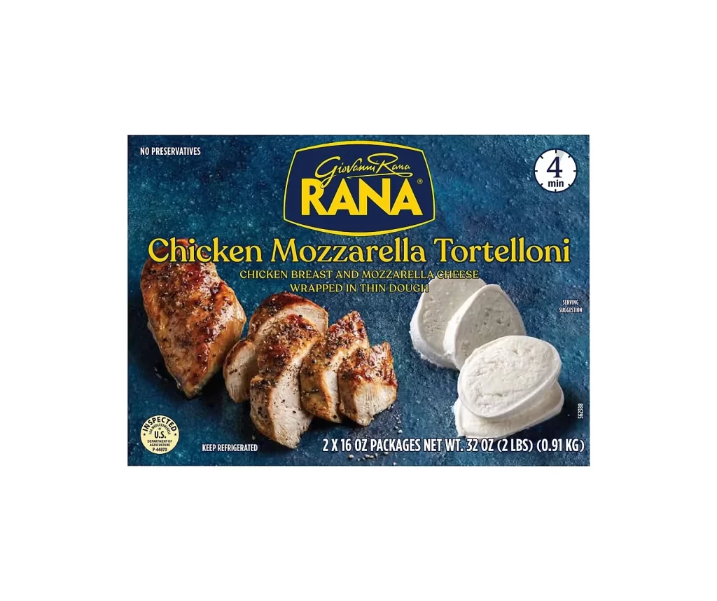
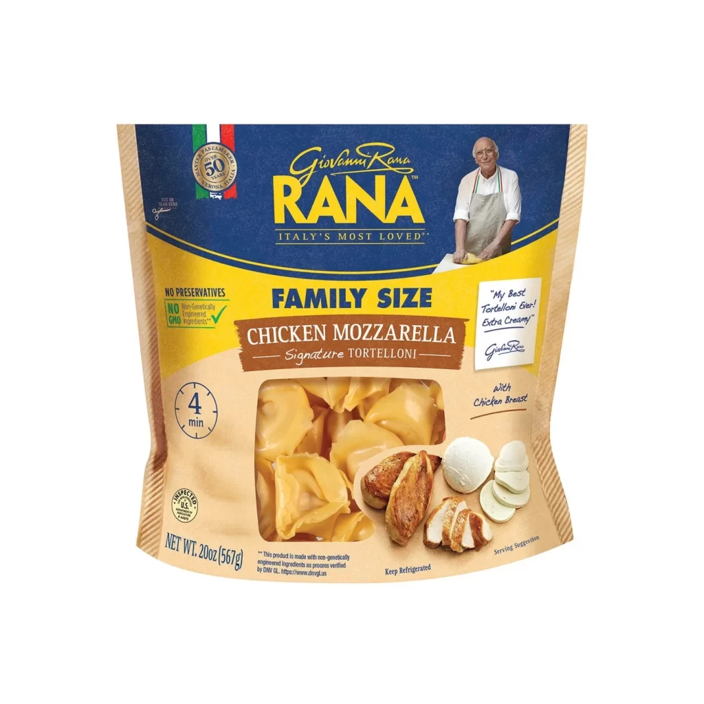
A family-sized pouch of Rana Chicken Mozzarella Tortelloni stands against a clean white background, photographed from a straight-on frontal perspective. The packaging features a bold color palette of deep navy blue at the top, transitioning into a bright yellow band, and finishing with a natural kraft paper texture at the bottom. Visible text includes the brand name 'Giovanni Rana' in elegant script above the large yellow block letters spelling 'RANA', while a transparent window in the lower center reveals the pale yellow pasta shapes inside alongside photographic images of sliced chicken breast and fresh mozzarella rounds.
Visual hierarchy on this package is established through contrasting typefaces and strategic color blocking that guides the eye from brand heritage to product specifics. The inclusion of an Italian flag motif and a portrait of the founder in a white apron adds authentic culinary authority, distinguishing it from generic store brands through personalized storytelling elements. Practical information like the four-minute cook time icon and 'No Preservatives' badge are positioned to catch the shopper's eye quickly during decision-making moments at retail.
Packaging designers studying food industry conventions would examine this layout to understand how premium positioning is communicated through typography and imagery choices. Marketing teams could analyze the effective use of appetite appeal photography combined with nutritional claims to balance indulgence with health-conscious messaging. Illustrators needing reference for commercial food photography might study the lighting techniques used to make the pasta appear freshly made and appetizing without artificial enhancement.