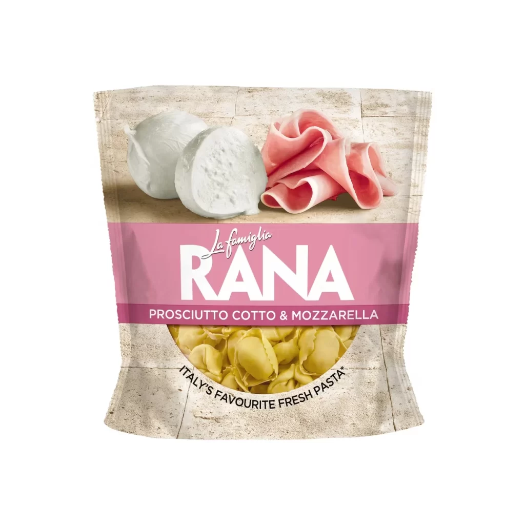
Rana Fresh Pasta Pouch Design
Topics
Details
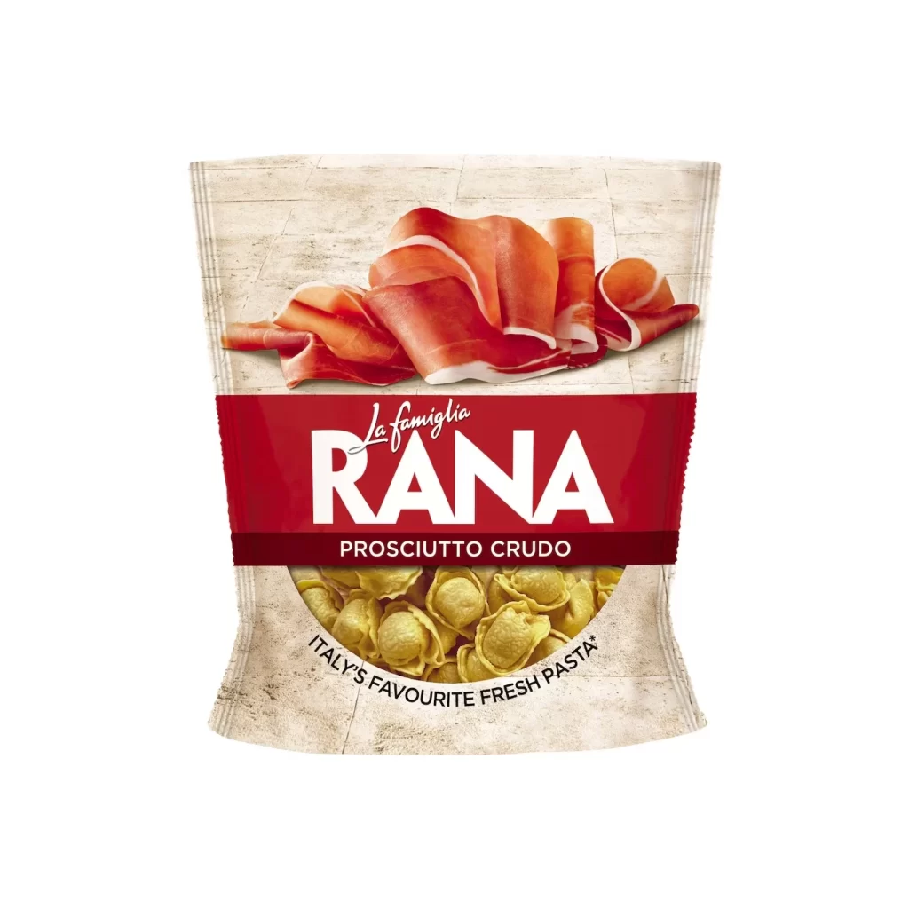
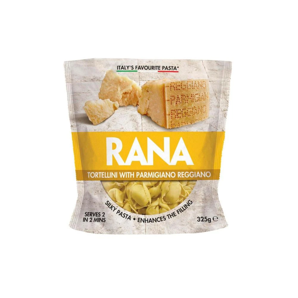
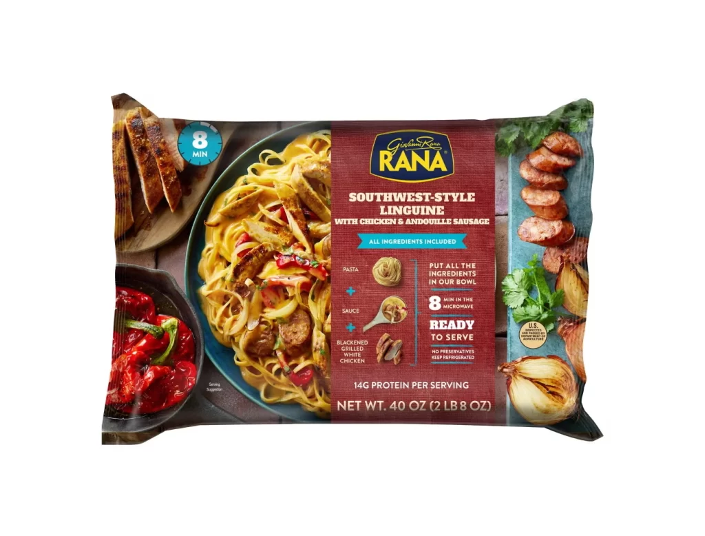
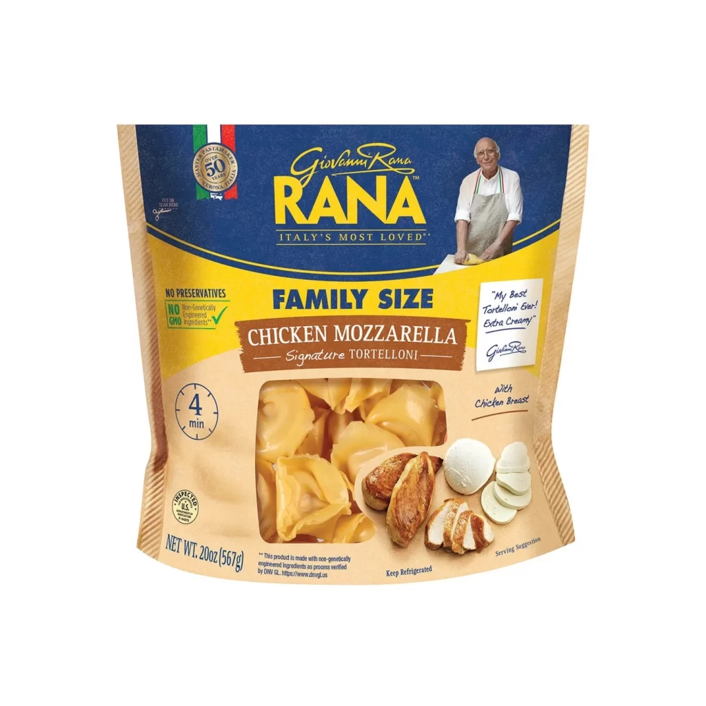
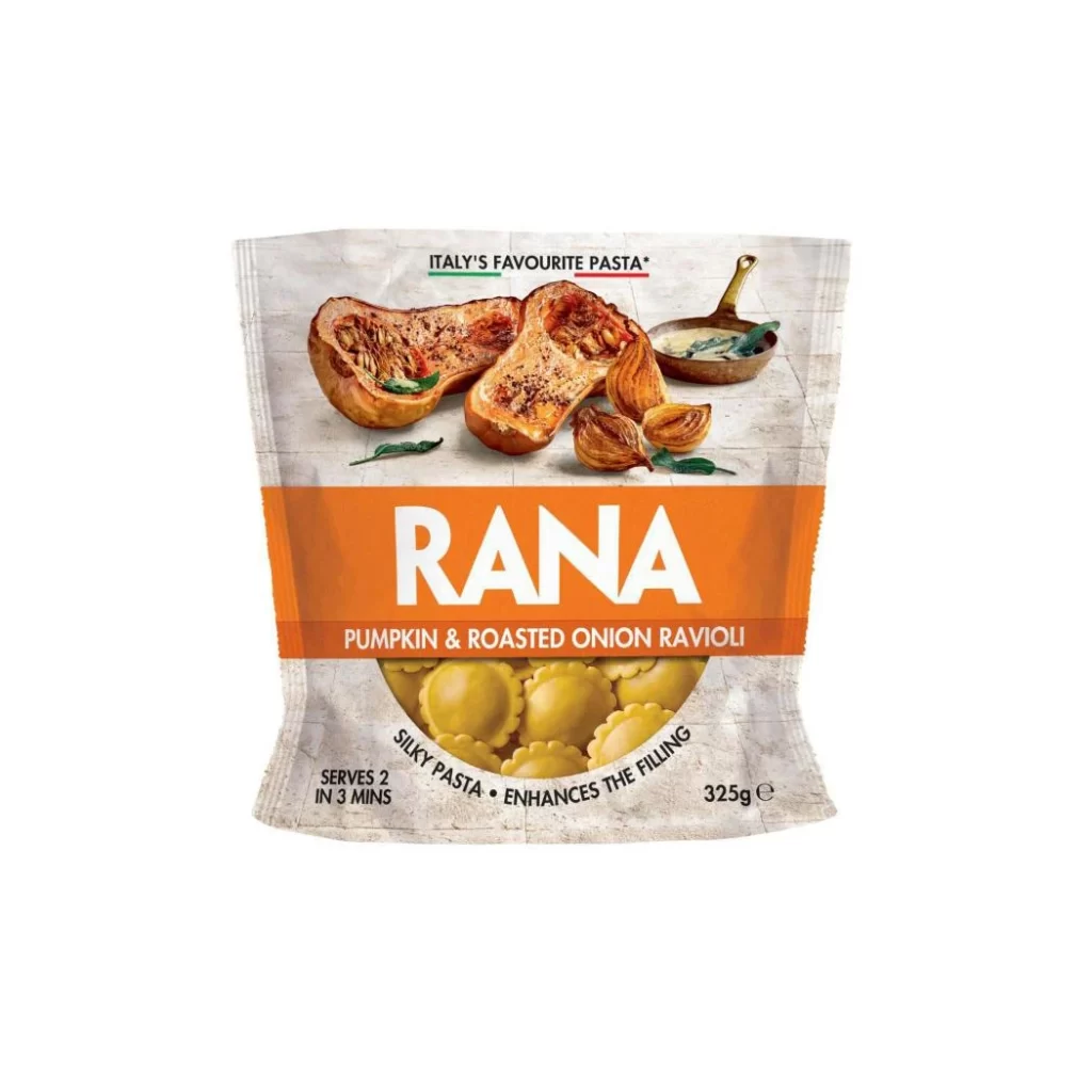
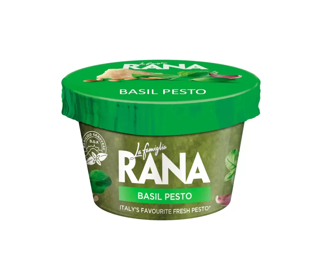
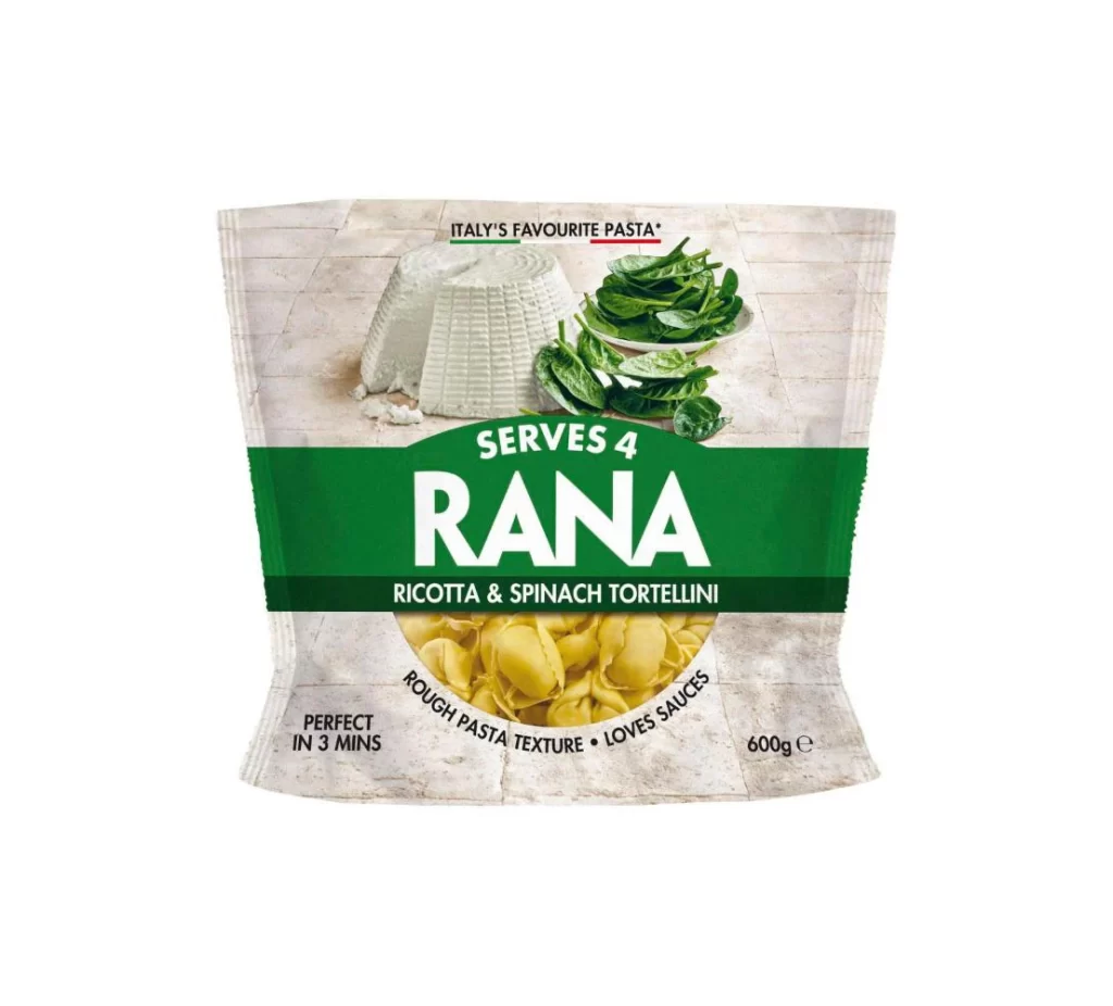
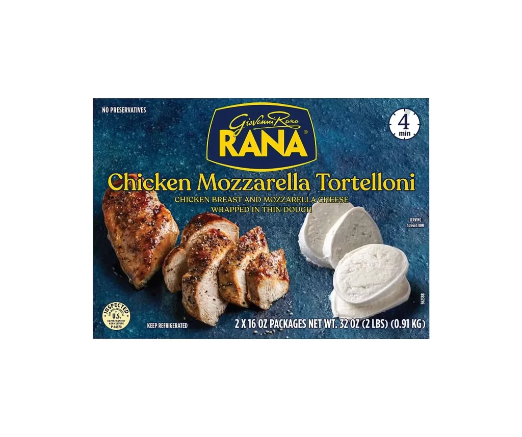
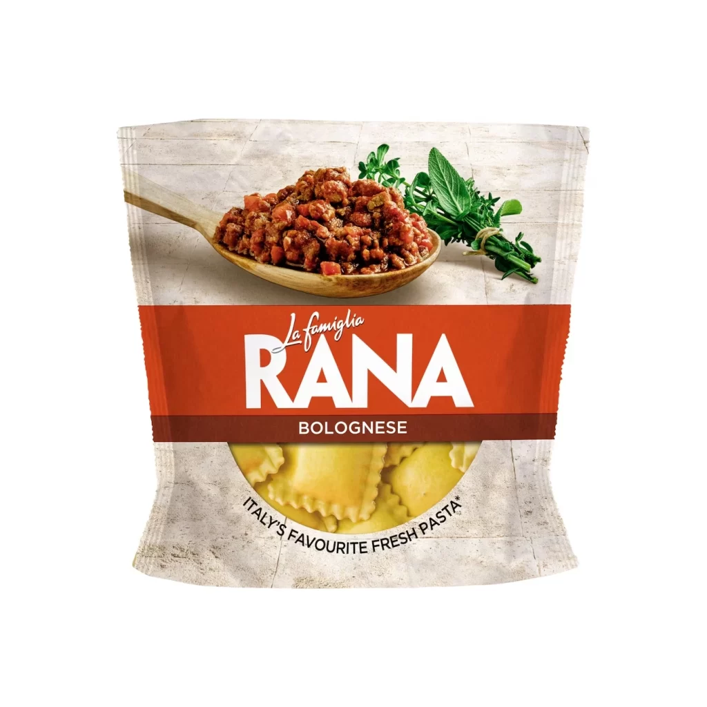
Against a textured, off-white stone backdrop that mimics aged masonry, a flexible pouch of Rana fresh pasta presents its contents with a clean, frontal perspective. The upper half of the packaging features high-quality photography of fresh mozzarella balls and delicate slices of prosciutto cotto, while the lower section reveals the golden tortellini through a semi-circular window. A bold magenta band cuts horizontally across the center, anchoring the white 'RANA' logotype and the specific flavor description in crisp white typography.
Visual hierarchy is established through the striking contrast between the organic food photography and the solid geometric color block of the brand label. The choice of a rustic, tiled background texture adds an artisanal feel that complements the 'Italy's Favourite Fresh Pasta' claim printed along the bottom curve. By placing the raw ingredients prominently above the finished product shape, the layout effectively communicates both the flavor profile and the premium quality of the fillings before the consumer even reads the fine print.
Packaging designers studying FMCG aesthetics will find this composition useful for analyzing how to balance appetizing imagery with essential regulatory text. Illustrators looking to practice rendering different material properties—such as the matte finish of cured meat versus the glossy sheen of fresh cheese—can use this as a direct study guide. Marketing teams developing campaigns for Italian-inspired food products might also reference this layout to understand how traditional culinary cues are modernized for contemporary supermarket shelves.