Kraft Mac & Cheese Label
Topics
Details
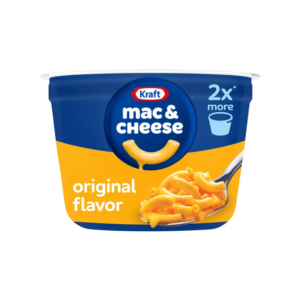
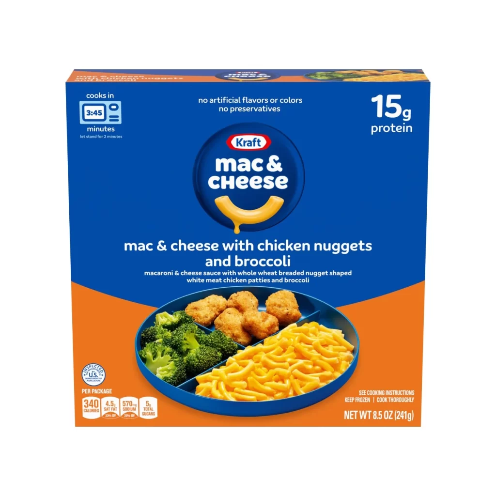
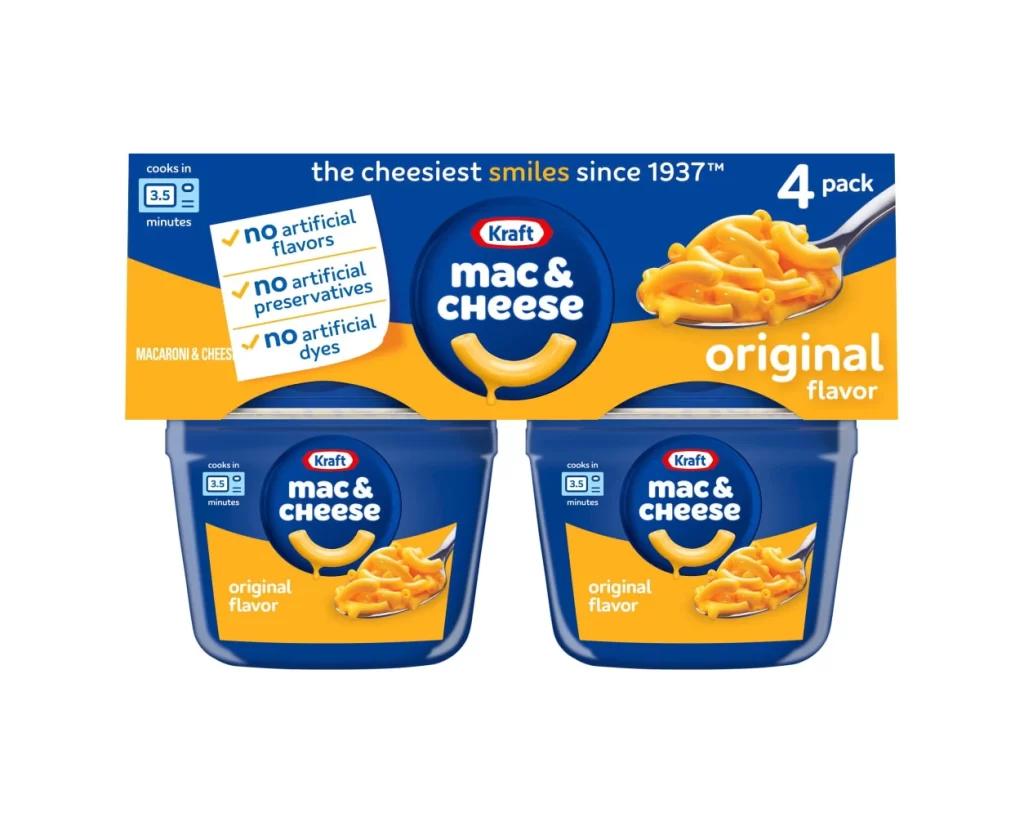
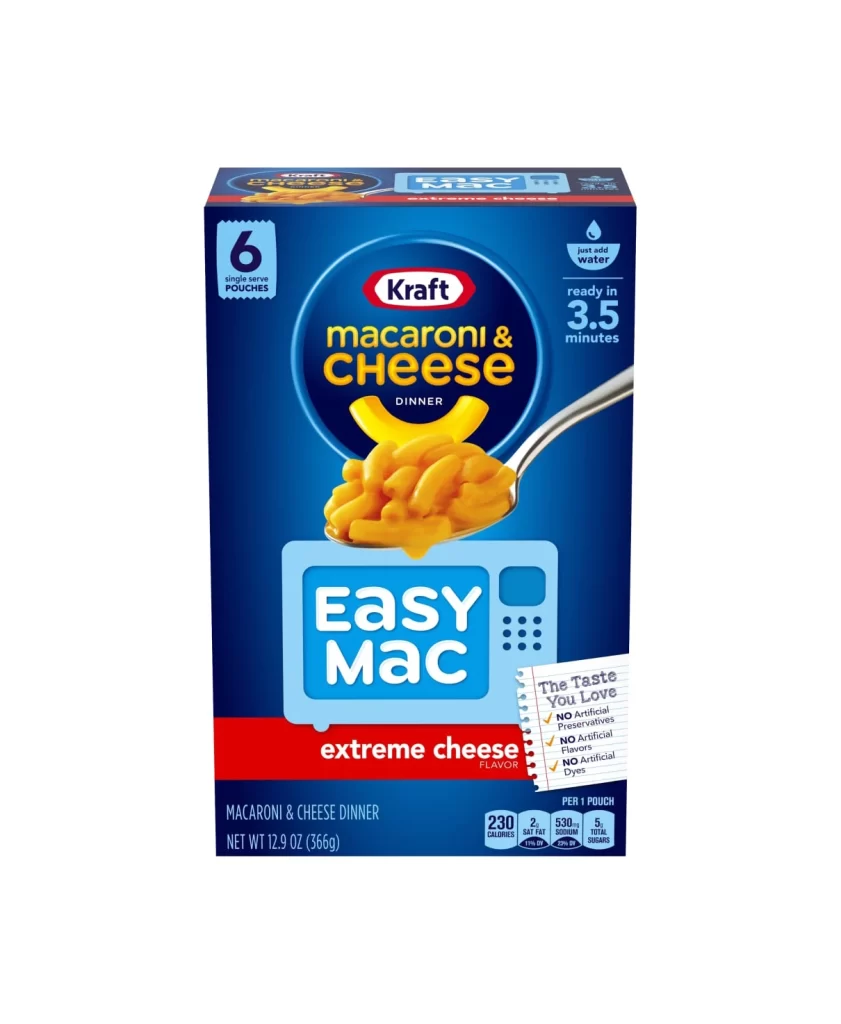
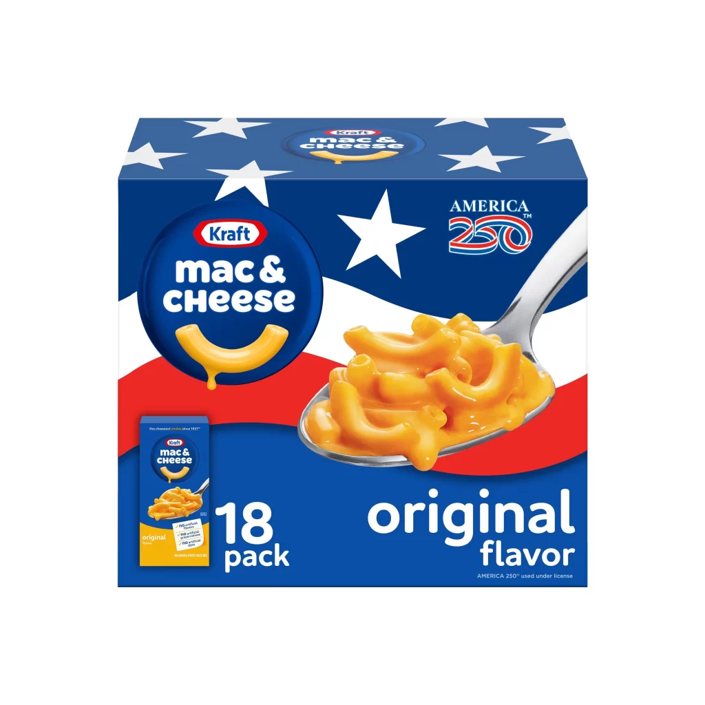
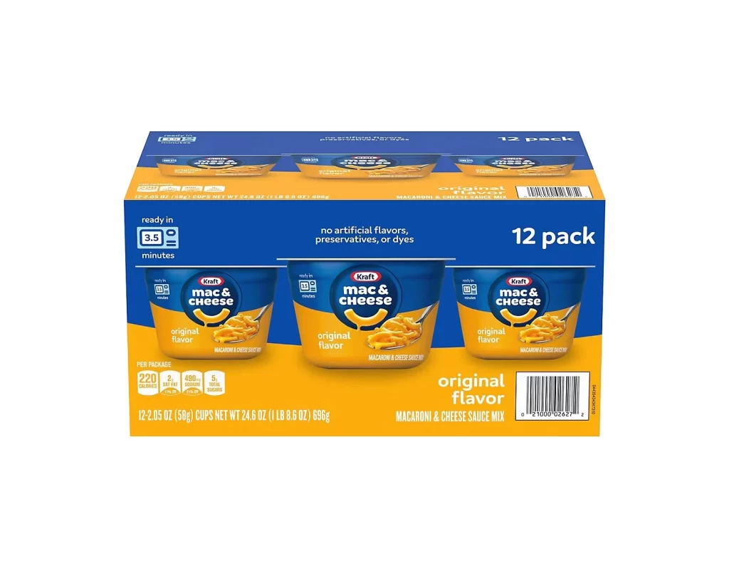
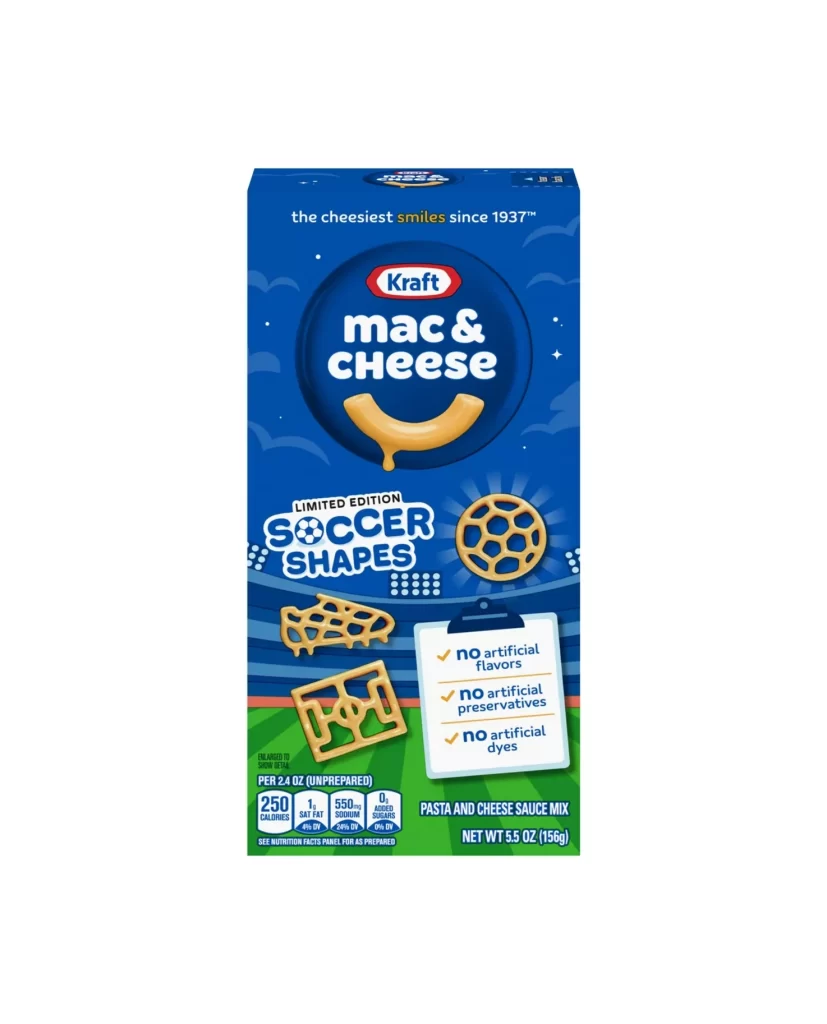
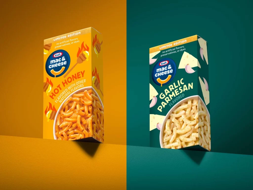
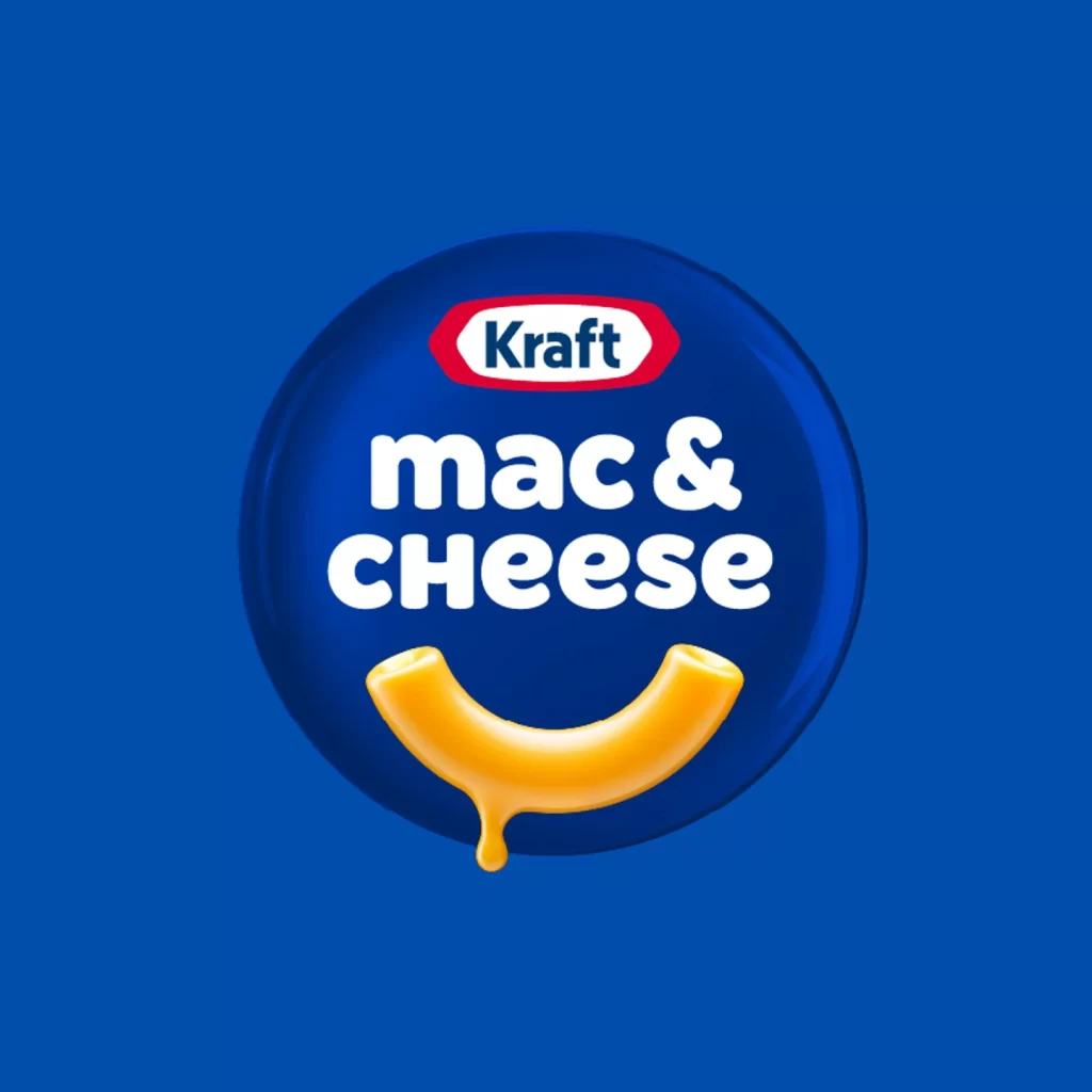
A glossy navy blue circular emblem serves as the backdrop for the Kraft macaroni and cheese branding. The iconic red-and-white Kraft logo sits at the top, while bold white lowercase letters spell out 'mac & cheese' across the center. Below the text, a single curved elbow macaroni noodle in golden yellow forms a smile shape with a cheese drip hanging from its lowest point.
Visual interest derives from the clever integration of product iconography into the typographic layout, where the pasta itself functions as both literal representation and emotive graphic element. The high-contrast palette of cobalt blue, crimson red, and creamy yellow creates immediate shelf recognition while maintaining a playful, approachable aesthetic that distinguishes it from more utilitarian packaging designs. Lighting across the circular field suggests a studio environment with controlled diffusion, emphasizing the label’s clean vector-style execution against the solid background.
Brand strategists might examine this composition when analyzing how established food corporations balance heritage identity with contemporary visual language for digital platforms. Packaging designers could reference the spatial relationships between the proprietary logo lockup and descriptive text when developing similar circular badge systems for retail products. Marketing teams studying emotional branding would find value in noting how the anthropomorphized noodle transforms a commodity item into a character-driven asset without requiring additional illustration.