Kraft Mac & Cheese Box
Topics
Details
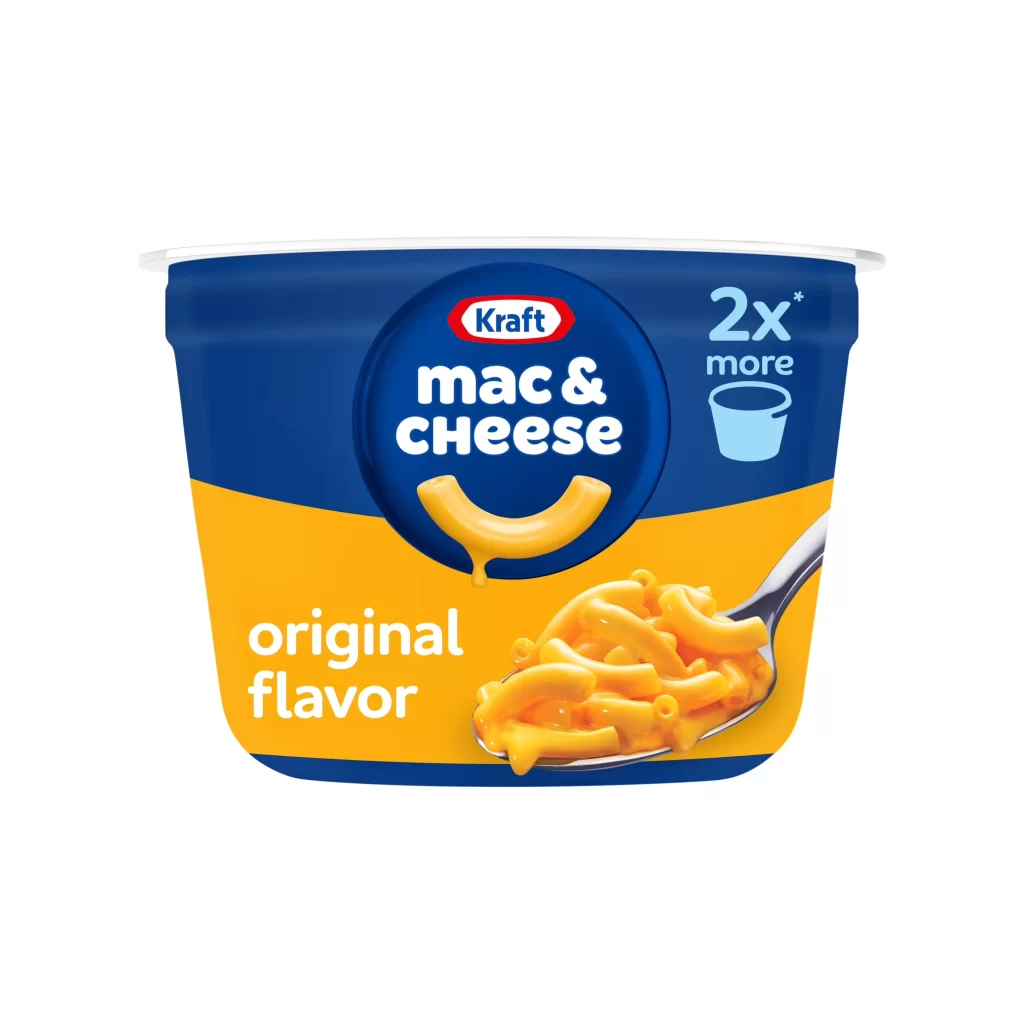
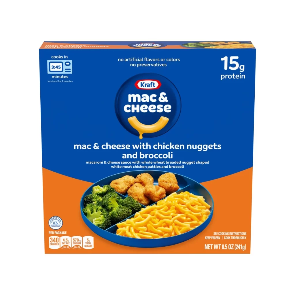
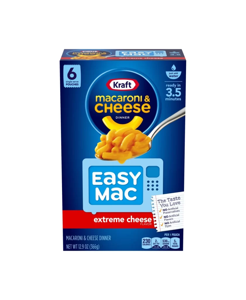
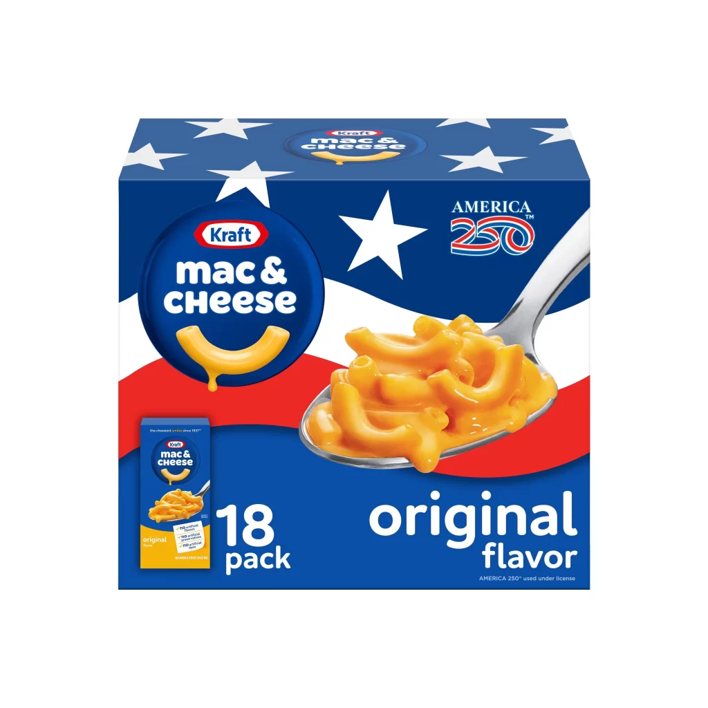
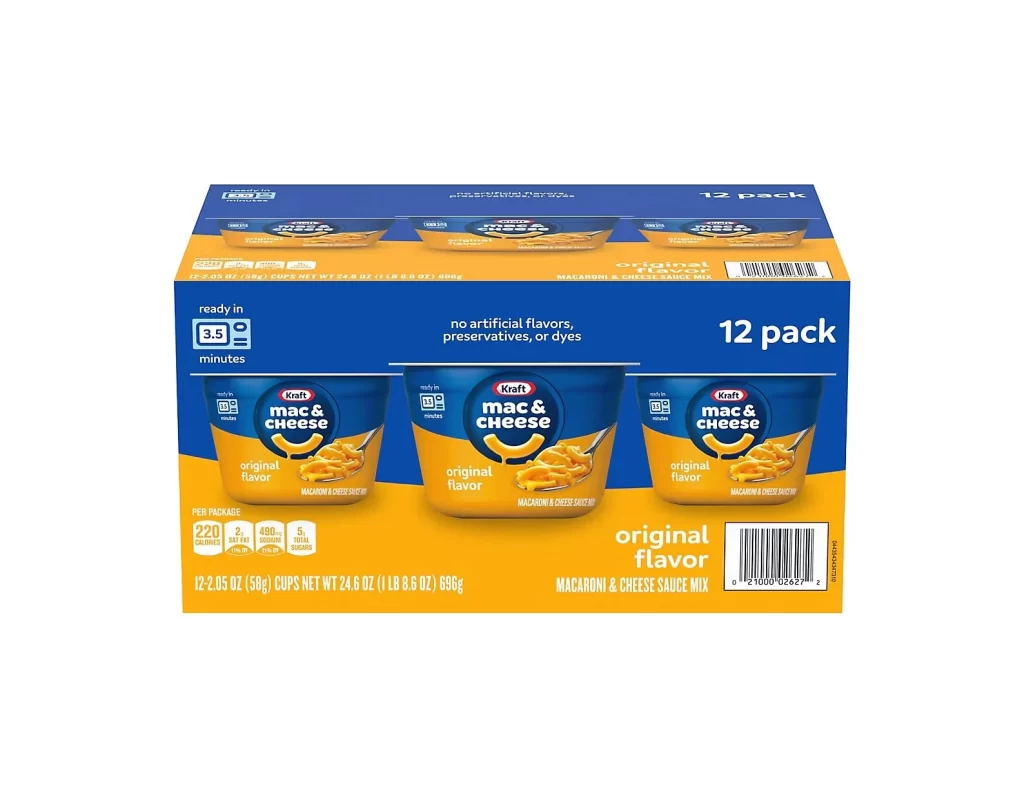
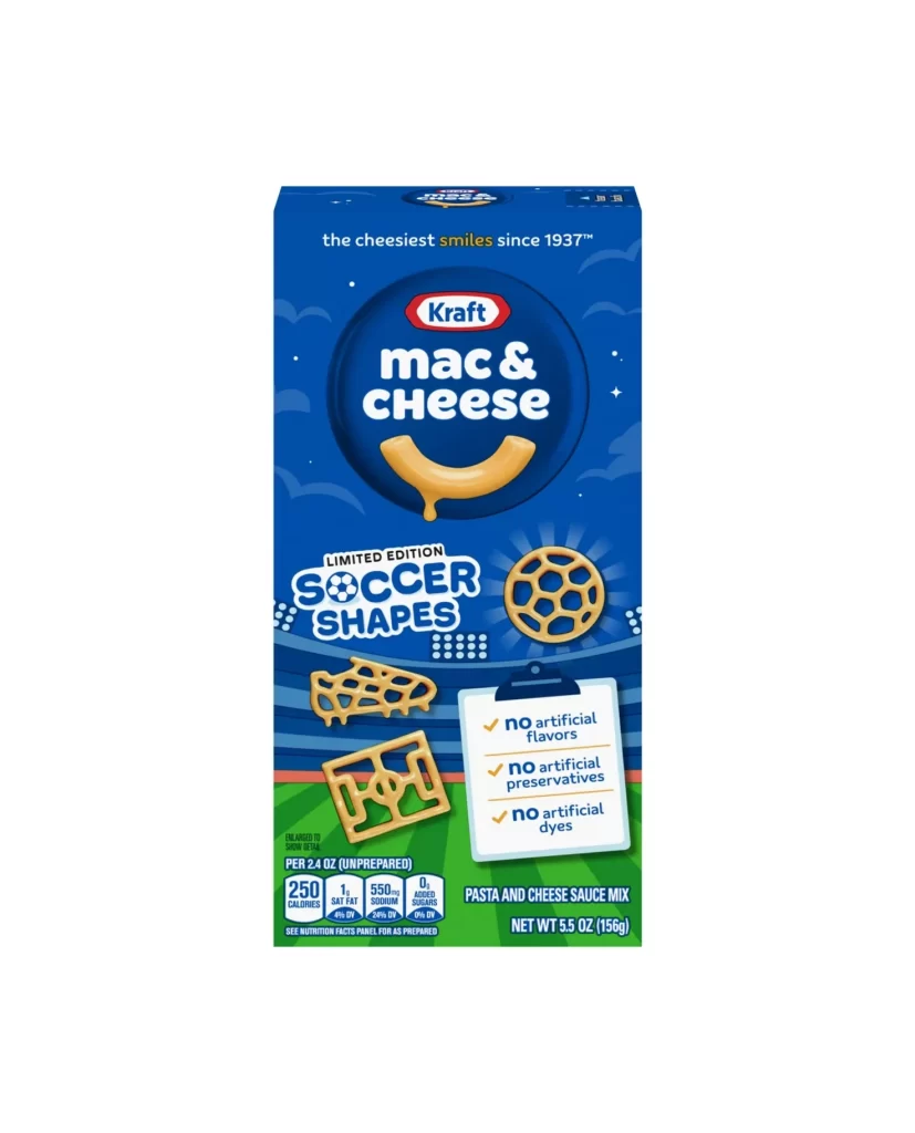
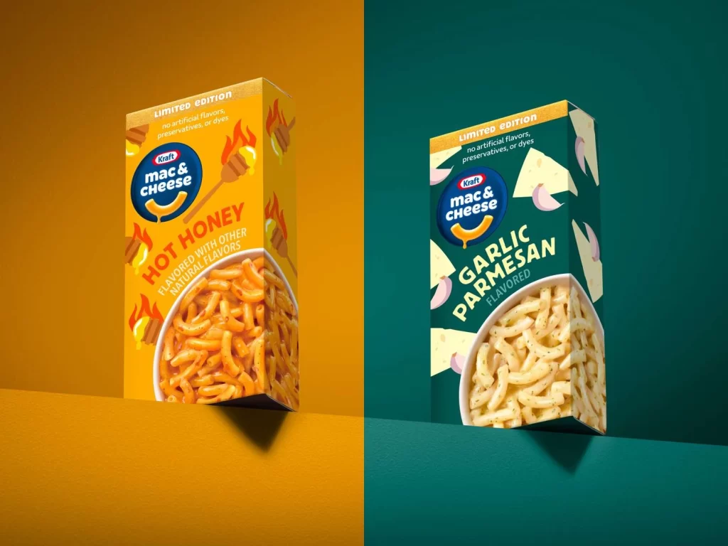
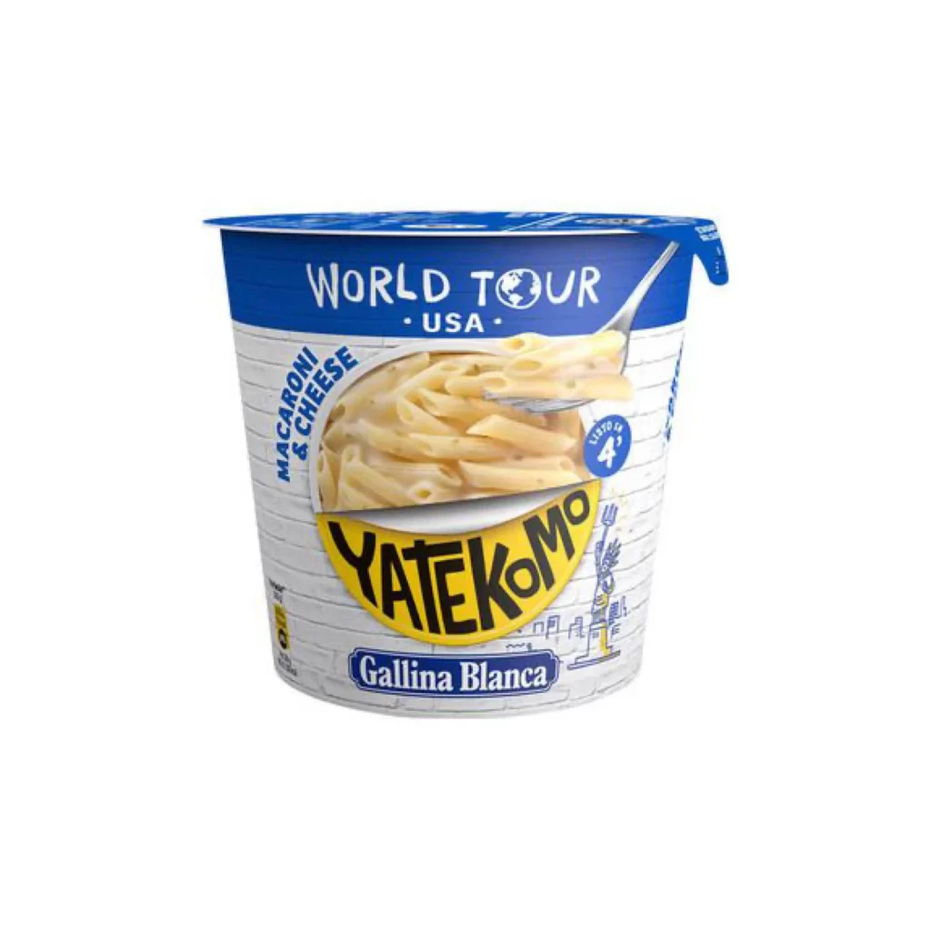
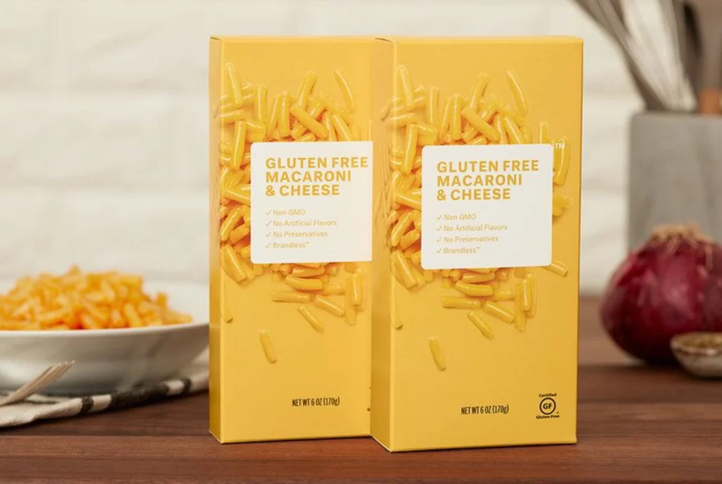
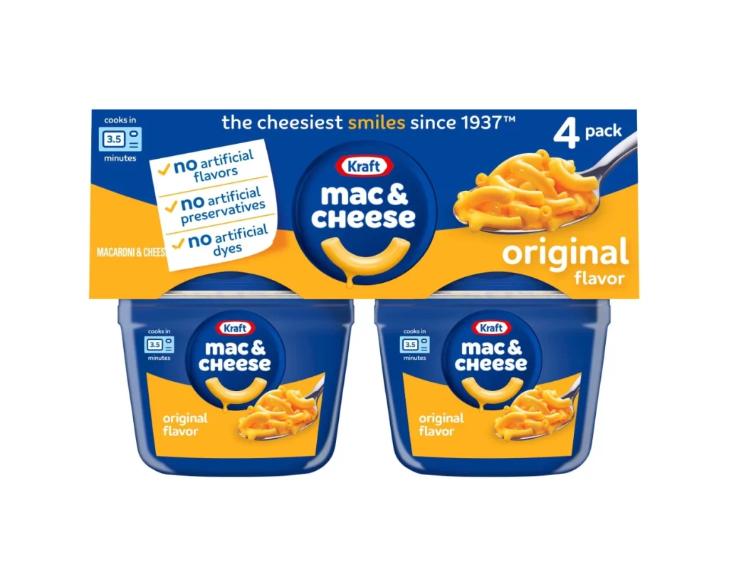
Set against a clean white background, the packaging features a dominant deep blue and vibrant orange color scheme. The upper cardboard sleeve displays the Kraft logo within a dark blue circle, accompanied by bold white text reading 'mac & cheese' and a curved macaroni graphic below. To the right, a metallic spoon holds prepared pasta, while the left side lists cooking time and ingredient claims on a white tilted rectangle. Two identical blue plastic cups sit beneath the sleeve, each mirroring the central branding and showing 'original flavor' in white text over orange fields.
Visual hierarchy relies heavily on the contrast between the cool navy background and warm yellow-orange accents that draw attention to the food photography. The circular logo lockup creates a strong focal point that repeats across both the outer box and individual containers, ensuring brand recognition at multiple scales. Notably, the three checkmarks on the sleeve communicate product benefits through simple iconography without cluttering the primary brand message.
Packaging designers studying microwaveable food products would examine this layout to understand how nutritional claims integrate with core branding elements. Retail merchandisers could reference the color blocking strategy when planning shelf displays for multi-pack items. Marketing teams might analyze the spoon photography angle to evaluate appetite appeal techniques for prepared convenience foods.