Kraft Parmesan Cheese Jar
Topics
Details
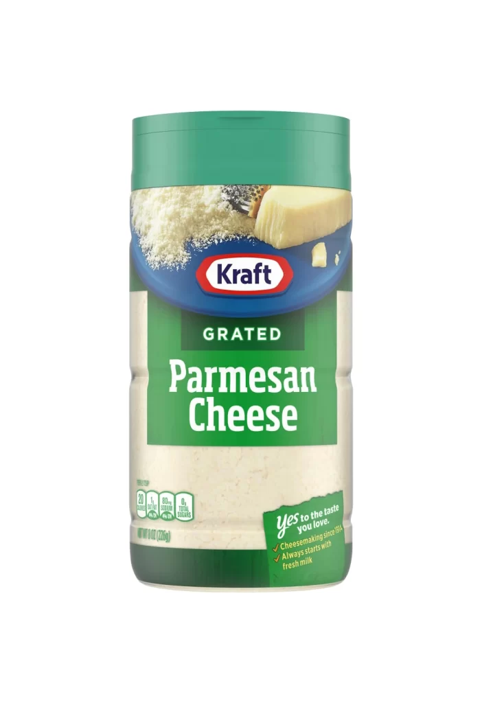
Centered within a seamless white void, a cylindrical Kraft Parmesan Cheese jar stands upright, its form defined by a forest-green plastic lid and a matching base. The label features a deep blue oval housing the iconic red-bordered Kraft logo, positioned above a vibrant green field where 'GRATED Parmesan Cheese' appears in bold white sans-serif type. Photographic elements of shredded cheese and a solid wedge occupy the upper label zone, while nutritional data and the slogan 'yes to the taste you love' anchor the lower portion in smaller green and white text.
Visual hierarchy is established through the strategic layering of brand colors—forest green, navy blue, and crimson red—which create immediate recognition while maintaining legibility. The transparent mid-section reveals the pale, granular texture of the product itself, offering tactile contrast to the smooth printed surfaces. Typography scales deliberately from the prominent product name down to supporting claims about cheesemaking heritage since 1914, guiding the viewer's eye through essential information.
Product photographers might study this composition to understand standard e-commerce lighting techniques for cylindrical food packaging. Brand analysts could examine the color psychology of the green-and-blue palette as it relates to freshness and trust in dairy marketing. Packaging designers may reference the spatial arrangement of nutritional facts versus promotional copy when laying out similar shelf-stable goods.