Kraft Shredded Cheese Bag View
Topics
Details
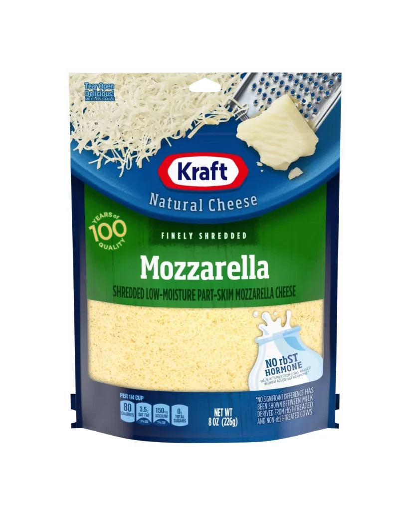
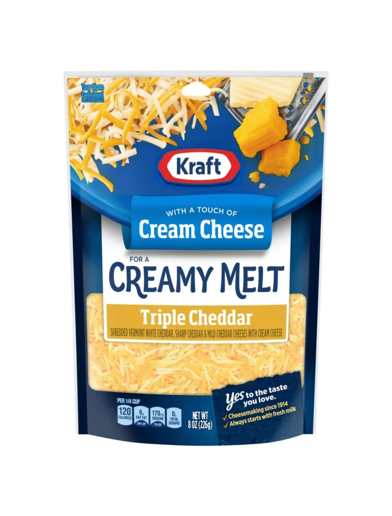
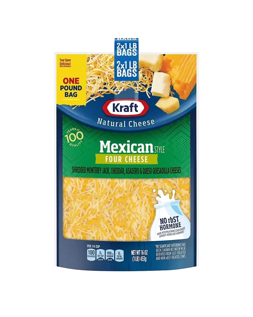
Centered within a clean white void, the packaging presents a bold visual hierarchy dominated by deep navy blue and vibrant emerald green. A prominent yellow rectangle in the upper left corner declares 'ONE POUND BAG' in heavy black typography, while the iconic red Kraft oval logo anchors the upper center. Below, the product name 'Mexican Style Four Cheese' sits atop a green geometric patterned field, with a transparent window revealing finely shredded yellow cheese and a small milk jug icon noting 'NO rBST HORMONE' in the lower right quadrant.
Graphic interest arises from the strategic layering of informational zones that guide the eye from brand identity to specific product attributes. The contrast between the cool blue header and the lively green middle section creates distinct visual territories for nutritional data versus flavor profiling. Furthermore, the inclusion of actual cheese photography—both shredded and in block form—alongside the '100 YEARS OF QUALITY' badge adds tactile credibility to the otherwise flat graphic design.
Food photographers might study this composition to understand how lighting interacts with translucent plastic packaging and organic textures. Brand strategists could analyze the typographic weight distribution to see how premium positioning is achieved through color blocking and logo placement. Meanwhile, packaging engineers would find value in examining how the tear-open indicator and resealable functionality are integrated into the overall aesthetic without disrupting the primary marketing message.