Kraft Singles Cheese Box
Topics
Details
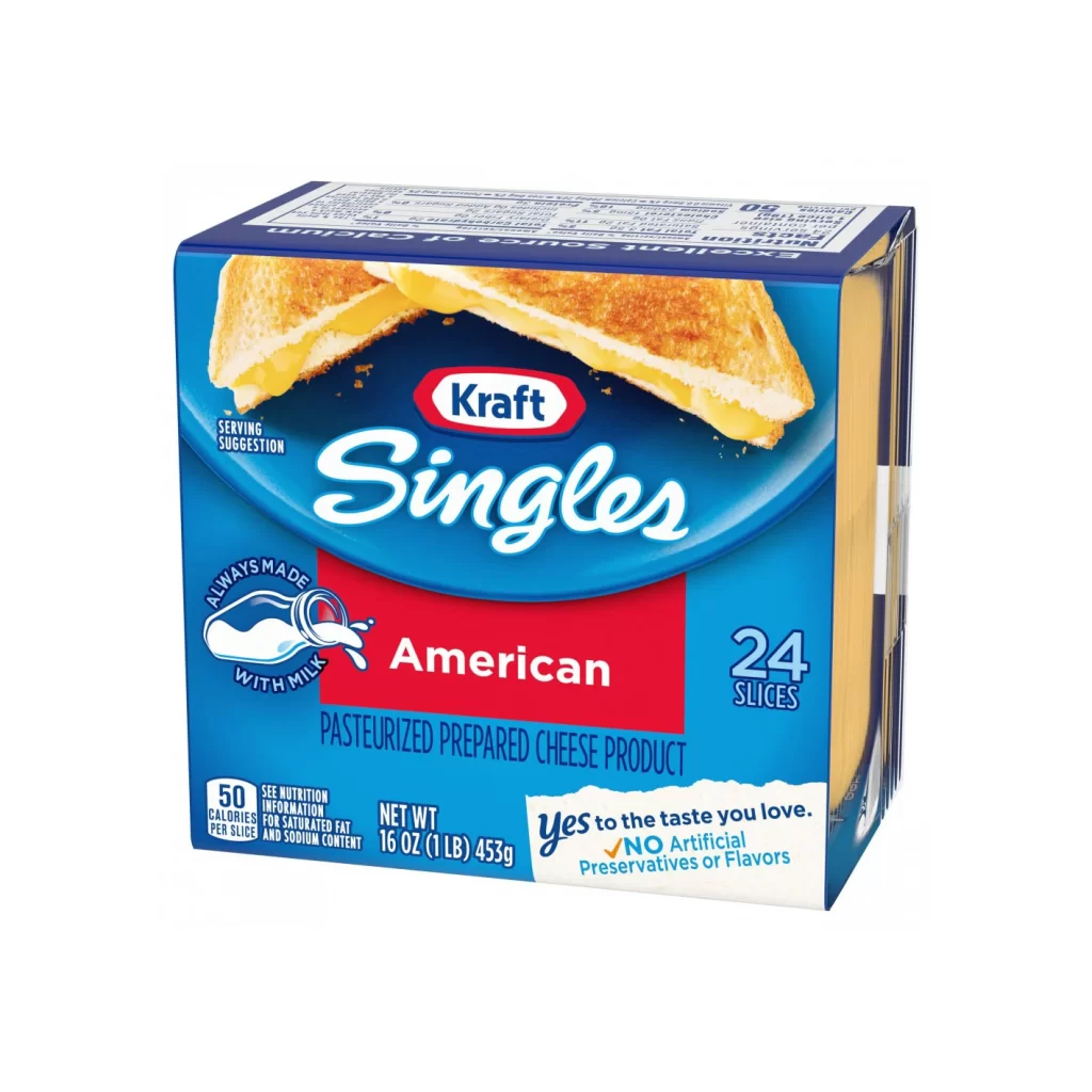
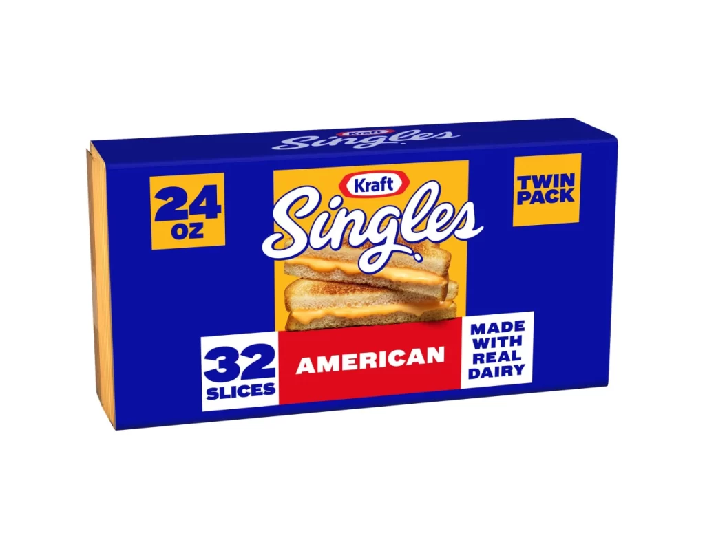
A deep blue rectangular carton dominates the frame, featuring a clean product shot against a stark white background. Bold yellow squares anchor the corners, displaying '24 OZ' and 'TWIN PACK' in heavy navy type, while the center showcases a vibrant yellow panel with the iconic Kraft Singles script in white. Below the brand name, a photographic image of two grilled cheese sandwiches with oozing orange cheese sits above a red banner proclaiming 'AMERICAN', with a white box to its left noting '32 SLICES'.
The packaging relies on a striking high-contrast palette of royal blue, golden yellow, and bright red to create immediate shelf presence. Typography plays a central role here, mixing a playful, retro cursive for the product name with rigid, authoritative sans-serif fonts for nutritional and quantity data. This specific twin-pack configuration emphasizes value through prominent numerical callouts, using color blocking to guide the eye from weight to slice count seamlessly.
Brand historians might study this layout to understand how mid-century American food packaging evolved into modern retail standards. Packaging designers could analyze the hierarchy of information to see how essential details like dairy content are positioned for quick consumer scanning. Even 3D artists modeling grocery store environments would find the precise color values and spatial arrangement of these graphic elements invaluable for creating realistic textures.