Kraft Mac & Cheese Box Lineup
Topics
Details
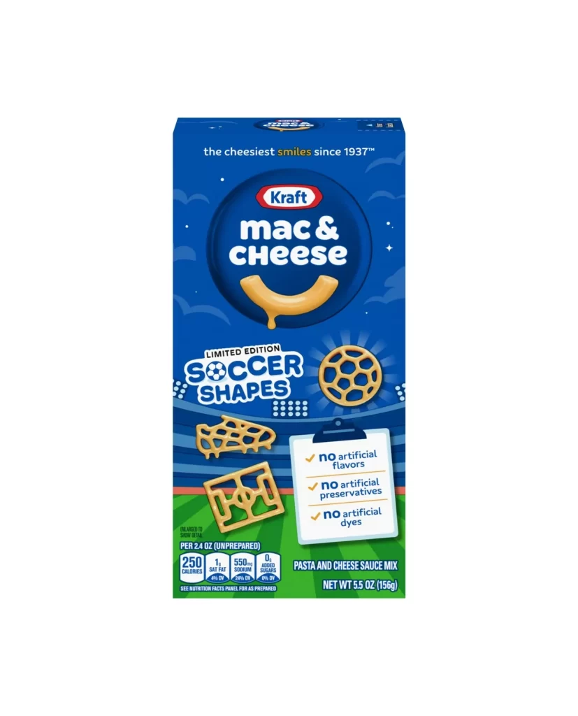
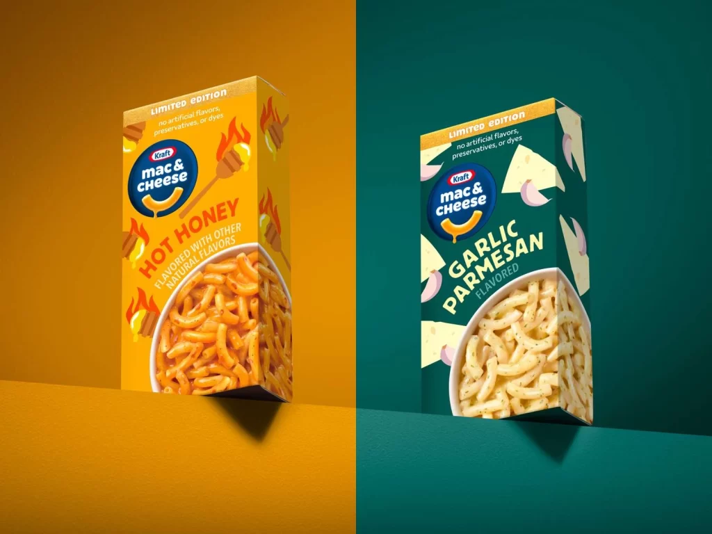
Split down the center by a sharp vertical divide, this composition presents two limited-edition Kraft Mac & Cheese boxes against contrasting warm amber and deep teal backdrops. The left carton features a vibrant golden-yellow field decorated with honey dipper and flame motifs, while its counterpart on the right employs a forest-green palette accented with pale cheese wedge and garlic clove graphics. Both packages display the iconic blue Kraft logo, bold flavor typography reading 'Hot Honey' and 'Garlic Parmesan,' and circular product photography windows revealing the prepared pasta, all captured from a three-quarter perspective with soft directional lighting casting subtle shadows beneath each box.
Visual distinction emerges through the deliberate chromatic coding that aligns background hues with flavor profiles, creating immediate semantic associations between color temperature and taste expectations. The typographic hierarchy balances the established brand equity of the circular macaroni logo against aggressive, angular sans-serif treatments for the experimental flavor names, signaling novelty while maintaining category recognition. Graphic elements extend beyond the primary face onto the side panels, suggesting three-dimensional continuity that enhances the perception of physical packaging presence within the digital frame.
Brand strategists analyzing flavor-extension visual language would examine how secondary color palettes support taste-cue communication without abandoning core identity markers. Packaging engineers studying structural graphic wrap-arounds could reference the way illustrative motifs traverse edges to create cohesive shelf presence from multiple viewing angles. Food photographers preparing stylized product shoots might note the specific lighting ratios used to emphasize texture in the pasta photography while maintaining legibility of regulatory text elements.