Kita No Tegami Cracker Box Closeup
Topics
Details
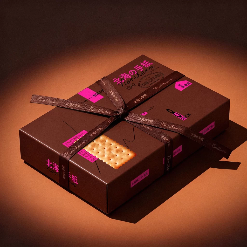
Against a deep umber backdrop, a matte chocolate-brown rectangular box tilts at a dynamic angle, revealing its surface details under soft, directional lighting. The packaging features the brand name '北海の手紙' (Northern Letter) in vibrant magenta, alongside the year 1982 and an English subtitle. A single butter cracker with characteristic perforations rests on the left face, while neon pink adhesive labels display Japanese product descriptions and an '8 PACK' indicator near the bottom edge.
Visual tension arises from the juxtaposition of earthy brown tones against electric magenta accents, creating a contemporary yet nostalgic aesthetic. The typographic hierarchy blends bold Japanese characters with elegant cursive English script and utilitarian sans-serif numerals. Layered graphic elements, including wavy line illustrations and geometric label shapes, add depth to the otherwise minimalist surface treatment.
Packaging designers studying Japanese confectionery branding will find value in this composition's color palette and typographic arrangement. Art directors developing premium snack products can reference the balance between photographic food imagery and abstract graphic elements. Students of industrial design might analyze how the box's physical proportions and material finish convey quality positioning in retail contexts.