Kita No Tegami Cracker Box
Topics
Details
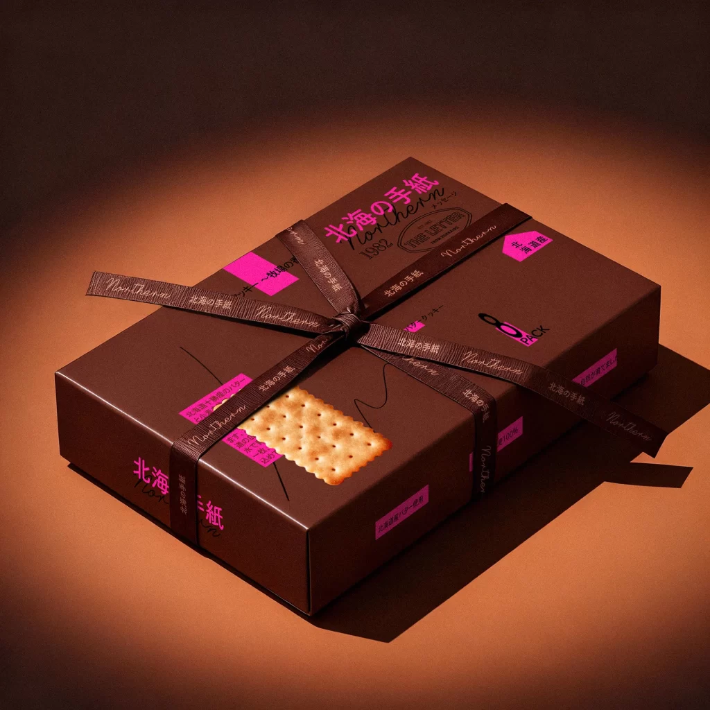
Against a dark, shadowed backdrop, a figure in a deep brown mandarin-collar shirt holds two stacked rectangular boxes of varying earthy tones. The upper container features a muted mauve surface adorned with a realistic cracker illustration, bold magenta Japanese typography reading '北海の手紙', and the English text 'Northern 1982 THE LETTER'. Below it, a darker chocolate-brown box displays scattered neon pink labels with black characters, while the subject's hands grip the lower package from a straight-on, chest-level perspective.
Visual interest stems from the striking juxtaposition of muted, sophisticated base colors against vibrant, almost fluorescent pink accent stickers that appear haphazardly placed. The inclusion of a photorealistic biscuit graphic alongside elegant serif and handwritten script fonts creates a layered, collage-like aesthetic that balances premium packaging conventions with playful, modern graphic elements. This specific iteration demonstrates how contrasting color temperatures and mixed typographic styles can elevate a standard rectangular form into something tactile and memorable.
Packaging designers studying luxury food branding would find this useful for analyzing how to integrate regional identity through bilingual text placement and color psychology. Art directors working on editorial spreads could reference the lighting setup and color grading to achieve similar moody, high-contrast product photography. Additionally, brand strategists looking to modernize traditional Japanese gift packaging might examine the balance between minimalist structure and maximalist sticker applications shown here.