Kita No Tegami Cookie Box
Topics
Details
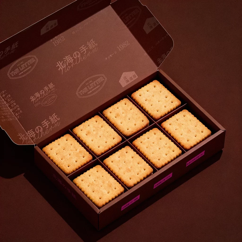
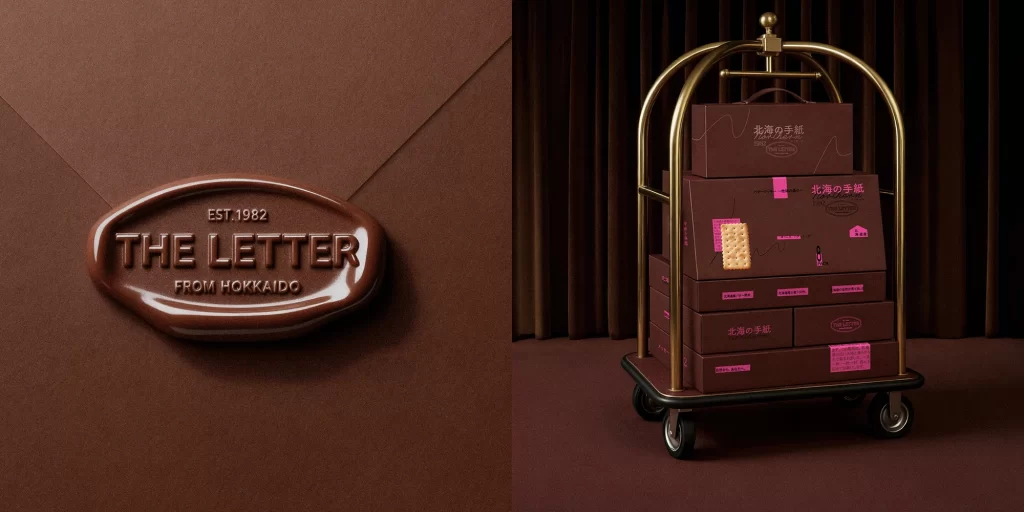
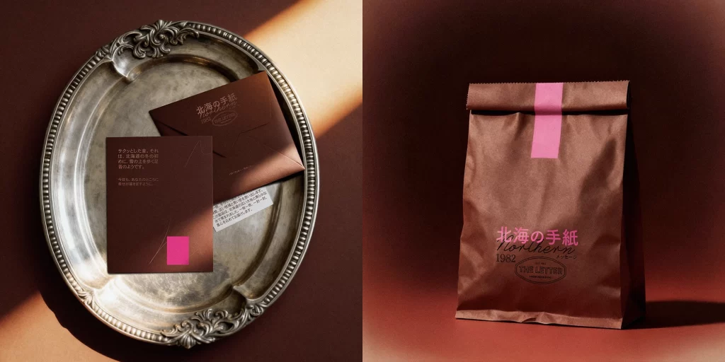
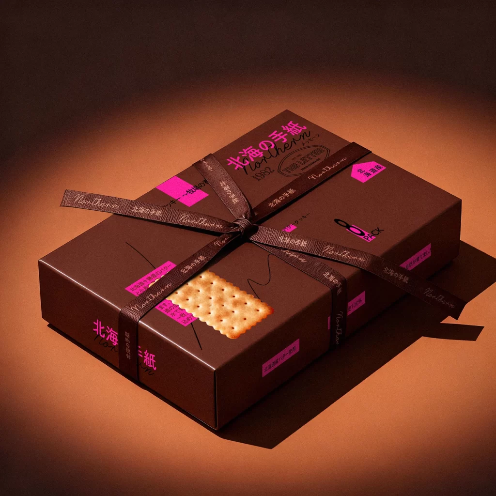
Set against a warm, gradient backdrop that shifts from deep umber to a glowing burnt orange, a rectangular chocolate-brown box sits at a three-quarter angle, its surface catching soft directional light that creates subtle highlights along the edges. A dark brown ribbon, embossed with the repeating cursive text 'Northern' and Japanese characters, wraps tightly around the package and ties into a neat bow at the center. The packaging itself features vibrant magenta accents, including the prominent title '北海の手紙' (Hokkai no Tegami), the year '1982', and various descriptive tags scattered across the lid and sides, while a realistic photographic image of a single perforated cracker rests near the front corner.
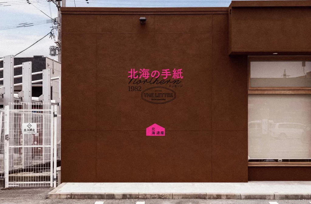
Visual tension arises from the sophisticated interplay between the matte, earthy tones of the cardboard and the electric pop of the neon pink typography, creating a modern yet nostalgic aesthetic that feels both artisanal and bold. The tactile quality of the textured ribbon adds a layer of physical luxury that contrasts with the flat, graphic nature of the printed elements, while the careful placement of bilingual text suggests a product designed for both local authenticity and international appeal. Such a composition demonstrates how restrained color palettes can be elevated by strategic, high-contrast accents that guide the eye across complex informational surfaces.
Packaging designers studying luxury confectionery branding would find this arrangement particularly useful for analyzing how ribbons and seals integrate with box architecture to convey value. Art directors working on editorial food photography might reference the lighting setup to understand how to make dark substrates appear rich without losing detail in the shadows. Additionally, typographers could examine the hierarchy between the large script headers and smaller informational blocks to inform their own layouts for premium gift items.