Cookies Modern Pastel Simple Clean
DownloadTopics
Details
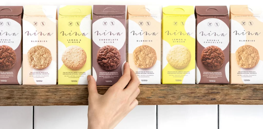
Eight rectangular cookie cartons stand in a tight row on a weathered wooden shelf, each displaying a different flavor through distinct color coding and product photography. The packaging alternates between chocolate brown, pale cream, and bright lemon yellow, with the brand name 'nina' rendered in a thin, lowercase cursive across the upper third of every box. A human hand enters from the bottom center to touch the fourth package, which features a dark chocolate cookie image against a brown background, while the other seven boxes show either golden blondies or lighter cookies in circular frames.
Visual hierarchy relies on generous negative space within large white circles that frame both the logo marks and the food photography, creating a breathable layout despite the dense product lineup. The typography pairs an elegant script for the brand with clean sans-serif for flavor descriptions like 'Double Chocolate' and 'Lemon & Ginger', establishing a sophisticated yet approachable aesthetic. Subtle pastel gradients in the background panels add depth without competing with the central imagery, making this an excellent study in balanced commercial packaging. Designers can grab the full-resolution file at no cost to examine the precise color values and typographic spacing in detail.
Packaging designers studying minimalist confectionery branding will find the color-blocking strategy particularly useful for organizing multi-SKU product lines. E-commerce photographers might reference the flat-lay composition and soft shadow placement when planning their own shelf-display shoots. Art directors developing artisanal food brands could analyze how the hand interaction adds scale and tactile interest without obscuring critical information.