Cookie Minimalist White Simple Circle
DownloadTopics
Details
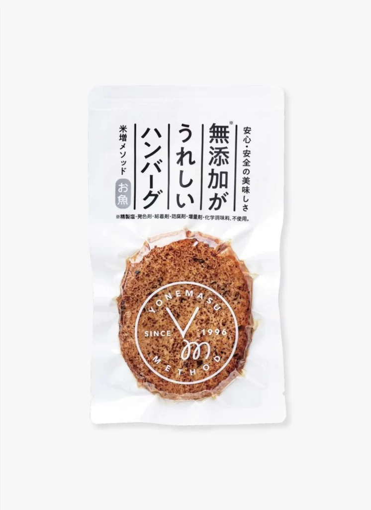
A circular, brownish-orange textured disc resembling a savory rice cracker sits sealed within a translucent white pouch, its granular surface visible through the clear plastic. Bold vertical Japanese characters dominate the upper portion of the packaging, reading from right to left as 'Additive-Free', 'Delicious', 'Hamburger', and 'Rice Cracker with Fish', accompanied by smaller horizontal text detailing the absence of chemical seasonings. Centered over the food item, a white circular stamp displays 'YONEMASU' arched along the top edge, 'SINCE 1996' bisected by a stylized V-shape, and 'METHOD' curved along the bottom with a calligraphic flourish beneath.
Visual hierarchy emerges through the disciplined interplay between the organic irregularity of the snack's texture and the geometric precision of the typographic layout and logo mark. The monochrome palette—restricted to the off-white substrate, deep black ink, and the warm earth tone of the product itself—creates a sophisticated restraint that directs focus entirely to material authenticity and brand heritage. Such deliberate minimalism transforms a standard commodity package into a study of negative space and cultural typography, where every element earns its position through functional necessity rather than decorative impulse.
Packaging designers analyzing Japanese market aesthetics will find this composition particularly useful for studying how traditional vertical script integrates with contemporary circular branding elements. Food photographers can reference the lighting balance between the matte paper finish and the glossy plastic window to understand how to render mixed-material surfaces without losing text legibility. The complete high-resolution file is accessible at no cost for those needing to examine the fine grain structure of both the printed type and the dried food matrix in detail.