Cookie Packaging Illustrative Blue Red Vintage
Topics
Details
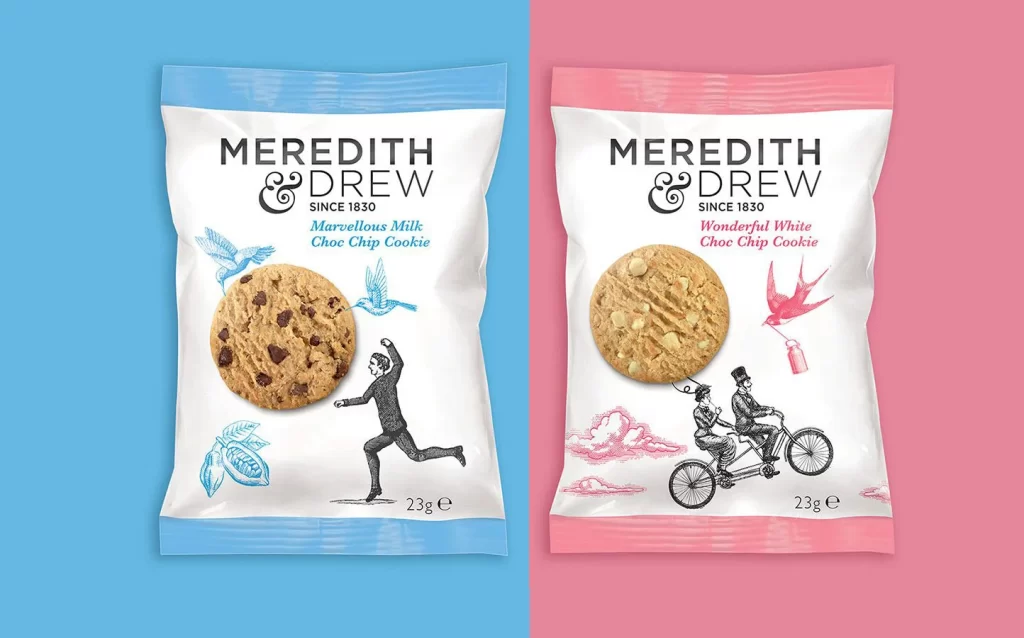
Two foil cookie pouches sit side-by-side, the left one framed by a light blue border and the right by a pale pink one. Both display the brand name "MEREDITH & DREW" in bold black serif lettering above an ornate ampersand and the founding date "SINCE 1830". The left package features a milk chocolate chip cookie alongside a running man illustration and light blue bird sketches, while the right shows a white chocolate chip cookie with a tandem bicycle couple and a red bird carrying a bottle.
Vintage woodcut-style figures provide a whimsical contrast to the realistic food photography and clean sans-serif product names. Color-coded borders and accent illustrations create immediate flavor differentiation without altering the core brand architecture. The combination of 19th-century line art with modern snack packaging produces a nostalgic yet contemporary aesthetic that feels both established and playful.
Brand identity designers studying heritage-food packaging tropes will find the typographic hierarchy and illustrative balance particularly instructive. Packaging engineers evaluating seal-top pouch constructions can analyze how the color bands integrate with the functional crimped edges. Marketing teams developing premium biscuit ranges might reference this dual-flavor presentation strategy for their own retail displays.