Cookies Organic Simple White Yellow Black
Topics
Details
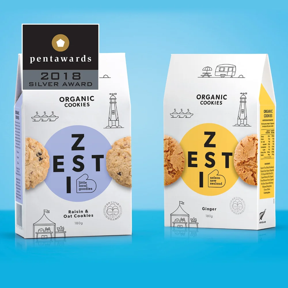
Two rectangular cookie boxes stand side-by-side against a bright cyan backdrop, each featuring a white paper base with distinct circular color accents. The left package displays a lavender circle containing the brand name 'ZESTI' in bold black typography, while the right counterpart swaps this for a vibrant yellow circle. Both designs showcase realistic cookie photography peeking from behind the central graphics, surrounded by delicate line-art illustrations of lighthouses, caravans, and market stalls that evoke a coastal New Zealand aesthetic.
Visual hierarchy plays a clever role here, with the oversized 'Z' anchoring each composition while smaller text elements like 'little local goodies' and 'nelson new zealand' provide geographic context without cluttering the layout. The restrained palette of white, black, and a single accent color per variant creates family resemblance while allowing flavor differentiation through subtle hue shifts. Minimalist iconography scattered across the surface adds narrative depth, suggesting artisanal origins and organic certification through clean stamp-like seals near the bottom edge.
Packaging designers studying award-winning food branding might analyze how typography scale interacts with photographic elements to create shelf appeal. Brand strategists could reference this when developing visual systems for product lines requiring regional storytelling through simple graphic motifs. Students of commercial illustration might examine the balance between realistic texture rendering and flat line-art styles within a unified identity framework.