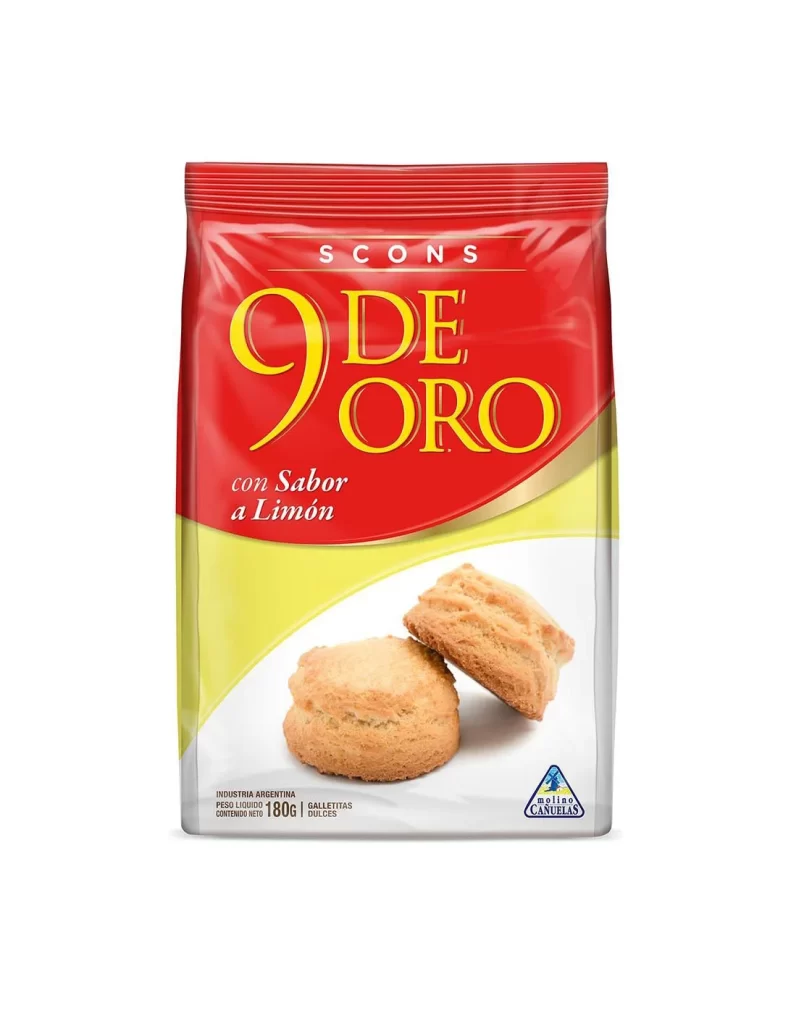
9 de Oro Lemon Cookie Yellow Red Typography
Topics
Details
A glossy red plastic bag dominates the frame, featuring bold yellow serif typography that spells out '9 DE ORO' above the smaller white script 'con Sabor a Limón'. The word 'SCONS' appears in white capital letters at the very top of the package, while a vibrant yellow swoosh cuts across the lower right corner, transitioning into a white field where two golden-brown biscuits are photographed. Small text at the bottom left indicates this is an Argentine product weighing 180 grams, and a blue triangular logo for 'Molinos Cañuelas' sits in the lower right corner, all captured from a straight-on perspective with even studio lighting.
The visual impact comes from the high-contrast pairing of saturated red and bright yellow, which creates immediate shelf presence while the elegant gold-outlined numerals add a touch of premium positioning. That curved yellow graphic element cleverly separates the brand-heavy upper portion from the photographic product shot below, guiding the eye naturally toward the textured scones. The mix of serif display type for the brand name and italicized script for the flavor description establishes a clear typographic hierarchy that feels both traditional and appetizing.
Packaging designers studying Latin American snack branding could analyze how the color blocking divides information density across the surface. Illustrators looking to render baked goods might study the way the lighting defines the crumbly texture and layered structure of the lemon-flavored scones. Anyone building a mood board for retro-inspired food packaging would find the specific combination of glossy finishes, metallic text effects, and bold geometric shapes particularly useful for understanding period-specific commercial aesthetics.