Title

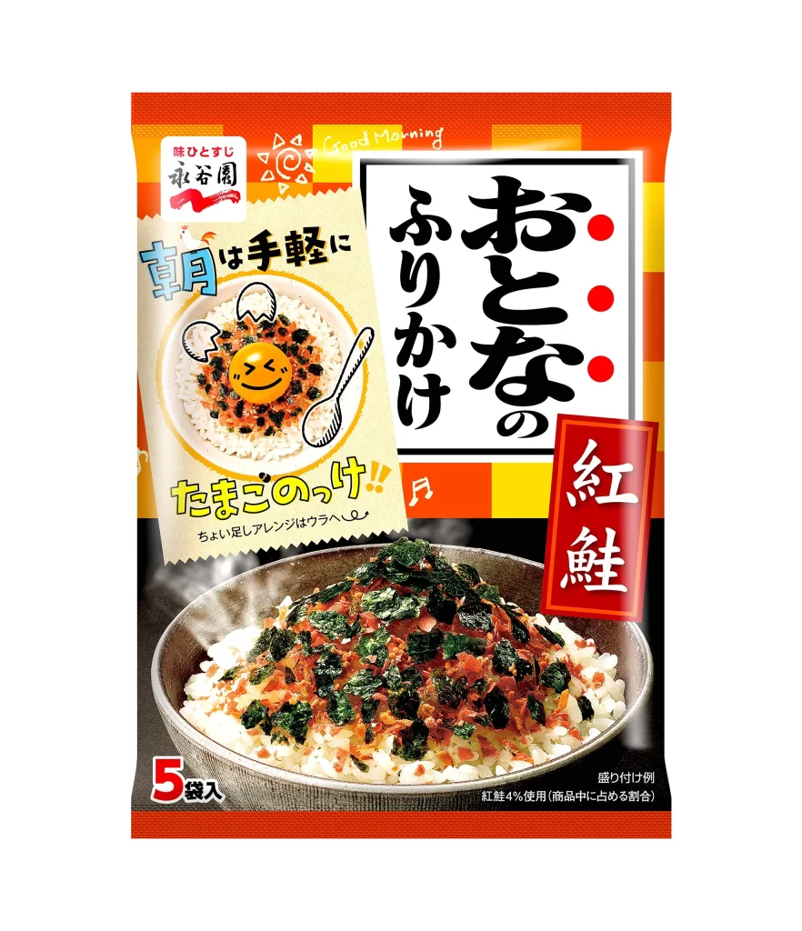
Nagatanien Adult Furikake Red Salmon Packaging


Topics

NagatanienSnack

Details

Uploaded user: Leo

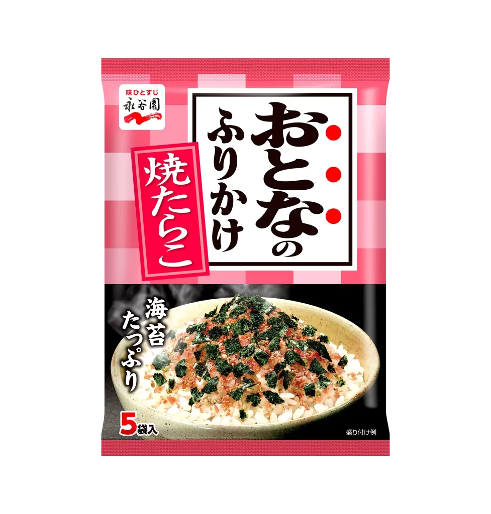
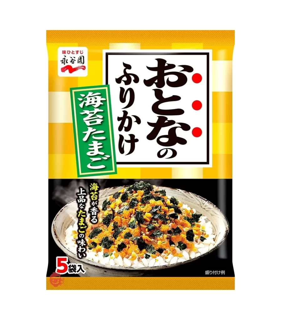
Vibrant orange and yellow stripes frame the upper border of this Japanese rice seasoning packet, immediately drawing the eye toward the central black-and-white typography. The main product name, 'Otona no Furikake' (Adult Furikake), dominates the right side in bold, brush-stroke kanji characters, while a deep red vertical badge highlights the specific 'Benizake' (Red Salmon) flavor variant. Below the text, a photographic image of steaming white rice generously topped with green nori and pinkish-orange salmon flakes provides a realistic appetizing anchor, contrasted against a playful illustrated graphic on the left featuring a smiling emoji face on a rice bowl.

What distinguishes this particular packaging is its clever dual-tone aesthetic that balances traditional Japanese food culture with modern, lighthearted graphic elements. The juxtaposition of the serious, calligraphic main title against the casual, handwritten 'Good Morning' script and the cartoonish egg-shell illustrations creates a unique visual tension aimed at adult consumers seeking convenience without sacrificing flavor personality. Furthermore, the strategic use of the bright red accent box for the salmon variety ensures instant shelf recognition amidst competitors, while the steam rising from the bottom photograph adds a sensory dimension of warmth and freshness.

Brand strategists and packaging designers would find this composition particularly useful when analyzing how to effectively communicate flavor profiles through color psychology and typographic hierarchy. Culinary photographers might study the lighting techniques used to make the rice grains appear fluffy and the seaweed texture look crisp without appearing greasy. Additionally, illustrators working on food-related campaigns could reference the way hand-drawn icons are integrated with photography to soften the overall commercial feel of a mass-market product.