Title

Almond 23ADAY Natural Simple Red Yellow


Topics

AlmondPackaging DesignSnack

Details

Uploaded user: Leo

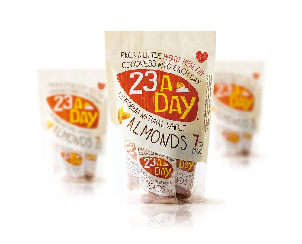
Three transparent plastic pouches of 23 A Day almonds sit on a bright white surface, with the central package rendered in sharp focus while the others blur into the background. The main label features a bold red oval containing white and yellow typography for the brand name, accented by a small sun-and-cloud icon and a hand-drawn heart symbol. Dark brown text curves around this central graphic, reading "Pack a little heart healthy goodness into each day" above "California Natural Whole Almonds 7 Go Packs," all printed on a cream-colored paper-like material that wraps around the clear bag.

Visual interest stems from the deliberate mix of typographic styles, combining clean sans-serif numbers with casual handwritten lettering that suggests an approachable, health-conscious personality. The restricted palette of red, yellow, brown, and cream creates strong contrast against the transparent packaging, allowing the actual almond contents to remain visible beneath the graphics. Layering the large brand mark over smaller product details establishes a clear hierarchy that guides the eye from the memorable "23 A Day" slogan down to specific product information.


Packaging designers studying snack-food branding might examine how the curved label conforms to the flexible pouch structure without losing legibility. Marketing teams developing healthy-eating product lines could reference the balance between playful iconography and serious nutritional messaging. Art directors planning e-commerce photography would note how the shallow depth of field isolates the primary subject while still implying product variety through the softened background units.