Muix Snack Packaging D
Topics
Details
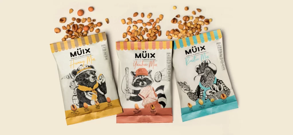
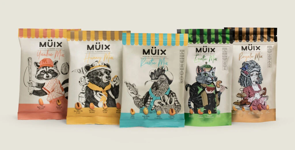
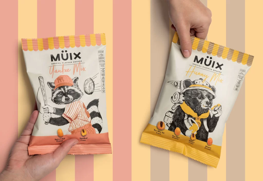
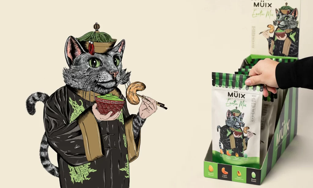
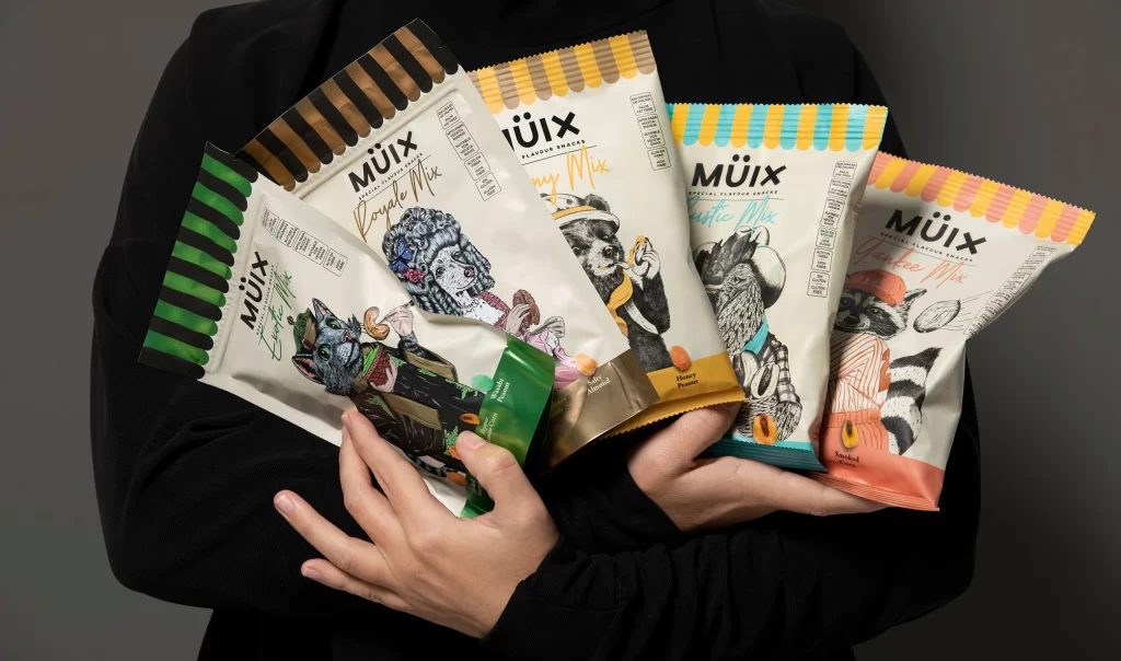
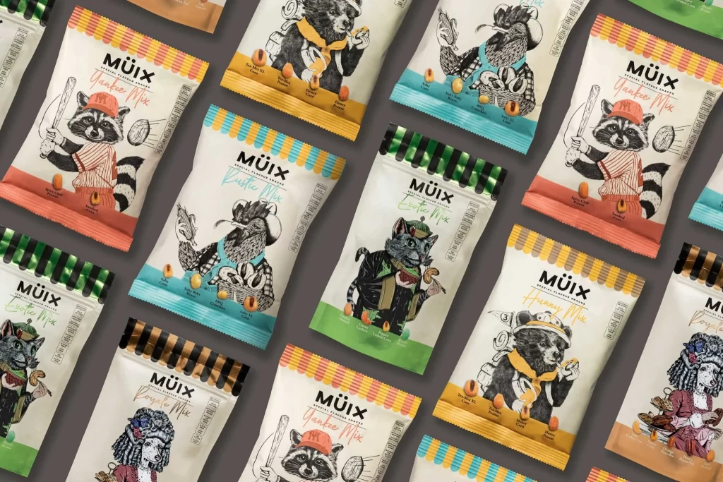
Arranged in a diagonal grid against a matte charcoal surface, multiple stand-up pouches display a sophisticated blend of hand-drawn illustration and modern typography. Each package features a cream-colored body topped with vibrant, scalloped seals in alternating palettes of coral, mustard yellow, turquoise, and forest green. The brand name 'MÜIX' appears prominently in a bold sans-serif typeface above cursive flavor designations like 'Yankee Mix' and 'Rustic Mix', while the central artwork showcases anthropomorphic animals—raccoons, bears, and cats—rendered in detailed black ink with selective color accents.
Visual distinction emerges from the juxtaposition of whimsical character narratives against clean structural packaging elements. The serrated top edges create a tactile, premium quality that contrasts with the sketch-like linework of the animal figures, each posed with props suggesting specific snack ingredients. Color-coded bottom bands and small nut icons provide systematic product differentiation without disrupting the illustrative charm, establishing a cohesive yet varied family of designs that balance playfulness with commercial clarity.
Brand strategists developing identity systems for artisanal food products would examine this layout to understand how character consistency functions across a product line. Packaging engineers might reference the seal configurations and material fold patterns when prototyping flexible pouch structures. Illustrators seeking to integrate traditional drawing techniques into contemporary retail environments could analyze the ink-and-wash style execution for their own narrative branding projects.