Snack Rustic Brown Red Green Vintage
DownloadTopics
Details
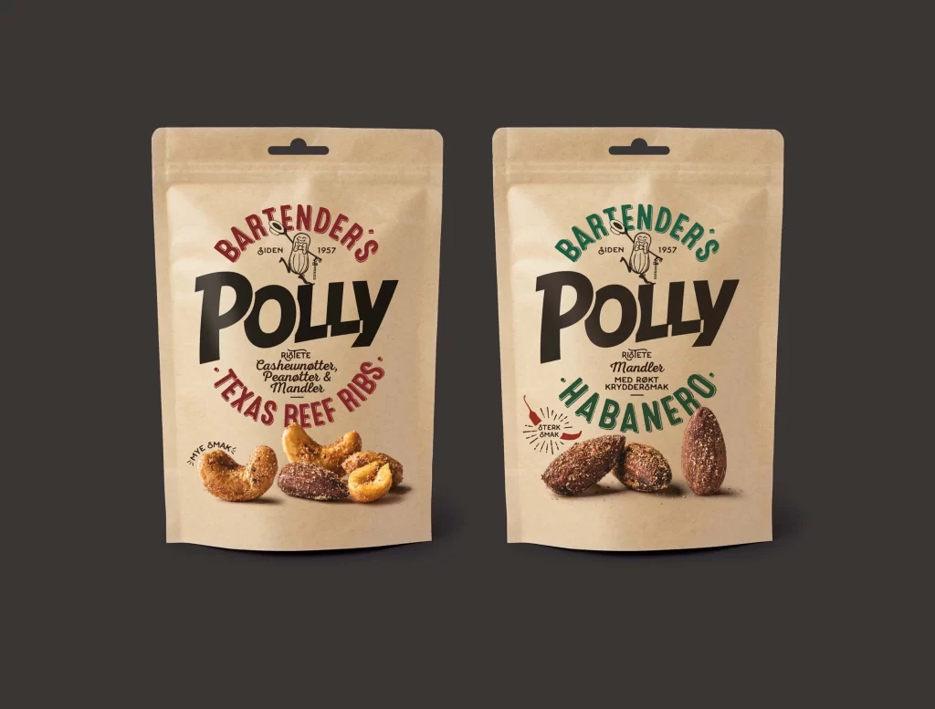
Two matte kraft paper pouches stand side-by-side against a dark charcoal backdrop, each featuring a die-cut hang hole at the top center. The left bag displays 'BARTENDER'S POLLY' in arched crimson serif lettering above bold black sans-serif typography, with 'TEXAS BEEF RIBS' curving beneath in matching red, while the right variant substitutes emerald green for the arches and reads 'HABANERO' below the brand name. Photorealistic cashews, peanuts, and almonds cluster at the base of each package, their textured surfaces catching soft directional light that creates subtle shadows on the unbleached paper material.
Circular typographic arrangements create a badge-like focal point around the central wordmark, with small line-drawn peanut mascots anchoring the 1957 establishment date between the arched text elements. The deliberate color coding—crimson for the savory beef ribs flavor versus forest green for the spicy habanero variety—establishes an immediate visual taxonomy across the product line while maintaining consistent structural hierarchy. Designers seeking authentic packaging aesthetics can access the complete high-fidelity asset at no cost through the resource library.
Brand identity specialists developing artisanal snack lines will find the typographic layering and earthy palette particularly useful for mood board construction. Packaging engineers studying stand-up pouch ergonomics might reference the proportional relationships between photography zones and textual information density. Food photographers could analyze the lighting setup used to emphasize nut textures without generating harsh specular highlights on the oil-rich surfaces.