Muix Snack Packaging F
Topics
Details
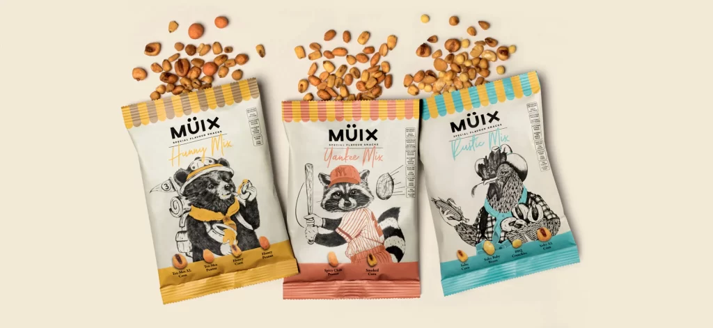
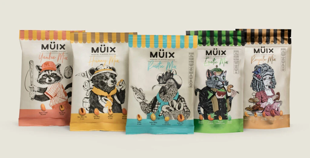
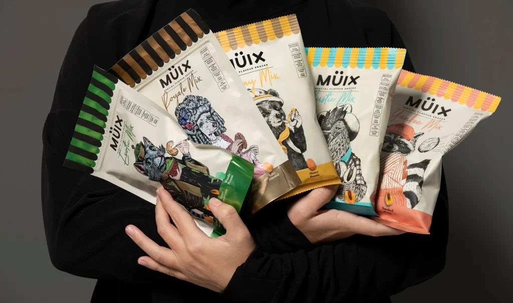
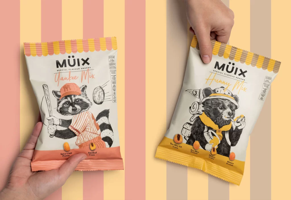
Two matte-finish snack pouches from the MÜIX Special Flavour Snacks line appear in a flat-lay composition, held by human hands against a background of alternating vertical stripes in pastel pink, cream, and pale yellow. The left package, labeled 'Yankee Mix' in coral script, features a scalloped seal with alternating orange and yellow bands above a white body that hosts a detailed black-and-white illustration of a raccoon wearing an orange cap and baseball uniform while holding a bat. To the right, the 'Honey Mix' variant displays a similar format with a yellow-and-beige scalloped top seal and an illustration of a raccoon outfitted as a scout or hiker with a hat, neckerchief, and backpack.
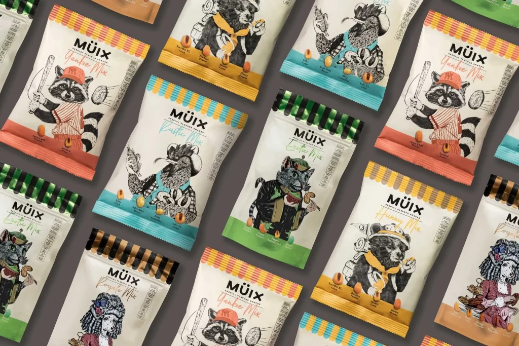
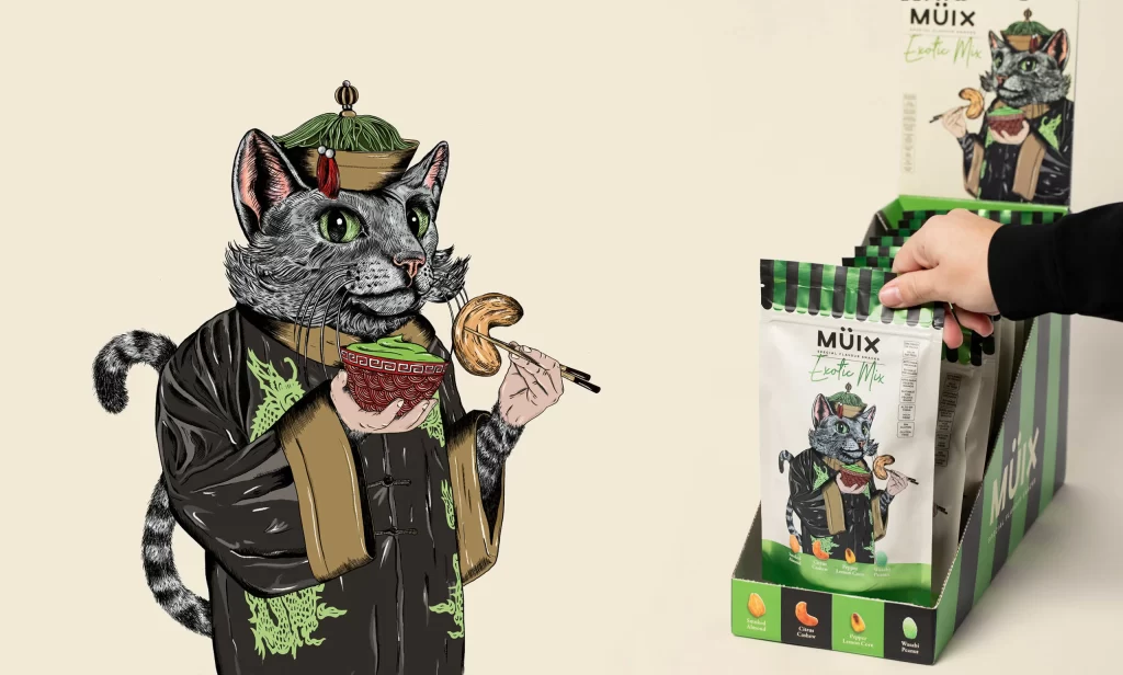
Visual distinction is achieved through the sophisticated interplay between monochromatic line art and selective color blocking, where the illustrations remain strictly grayscale while the branding elements utilize warm, appetizing hues. The anthropomorphic raccoon serves as a versatile brand mascot, shifting context from athletic to outdoor adventure through subtle changes in accessories like caps and backpacks. Furthermore, the typographic hierarchy balances bold, modern sans-serif headers with delicate script subheadings, creating a playful yet premium aesthetic that stands out in a crowded retail environment.
Brand strategists and packaging illustrators would examine this composition to understand how to maintain visual consistency across different product lines while allowing for thematic variation. Art directors might reference the specific way lighting interacts with the crinkled texture of the foil material to simulate realistic product mockups for client presentations. Additionally, students of commercial design could analyze the spatial distribution of nutritional information versus decorative graphics to learn effective layout techniques for consumer goods.