Muix Snack Packaging A
Topics
Details
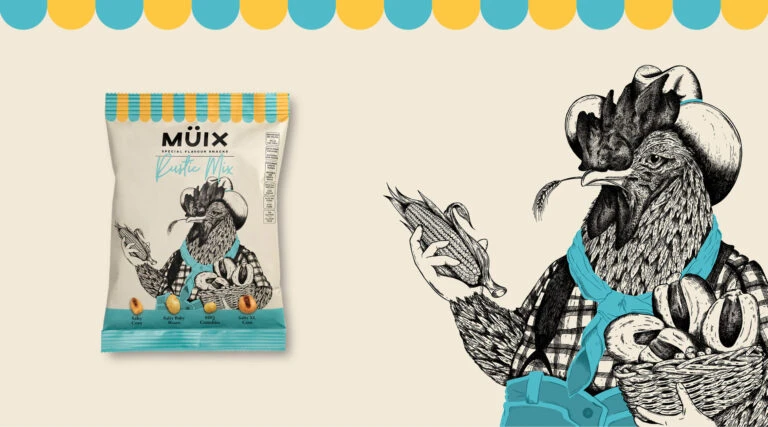
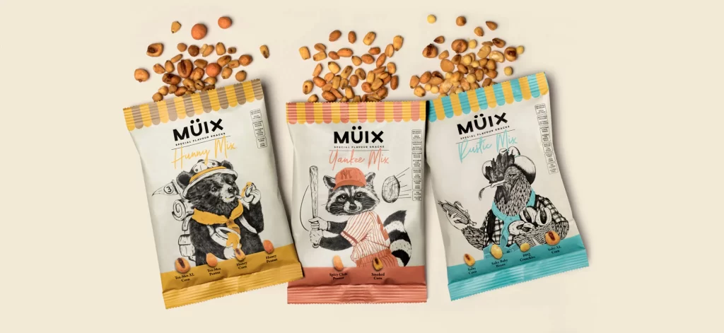
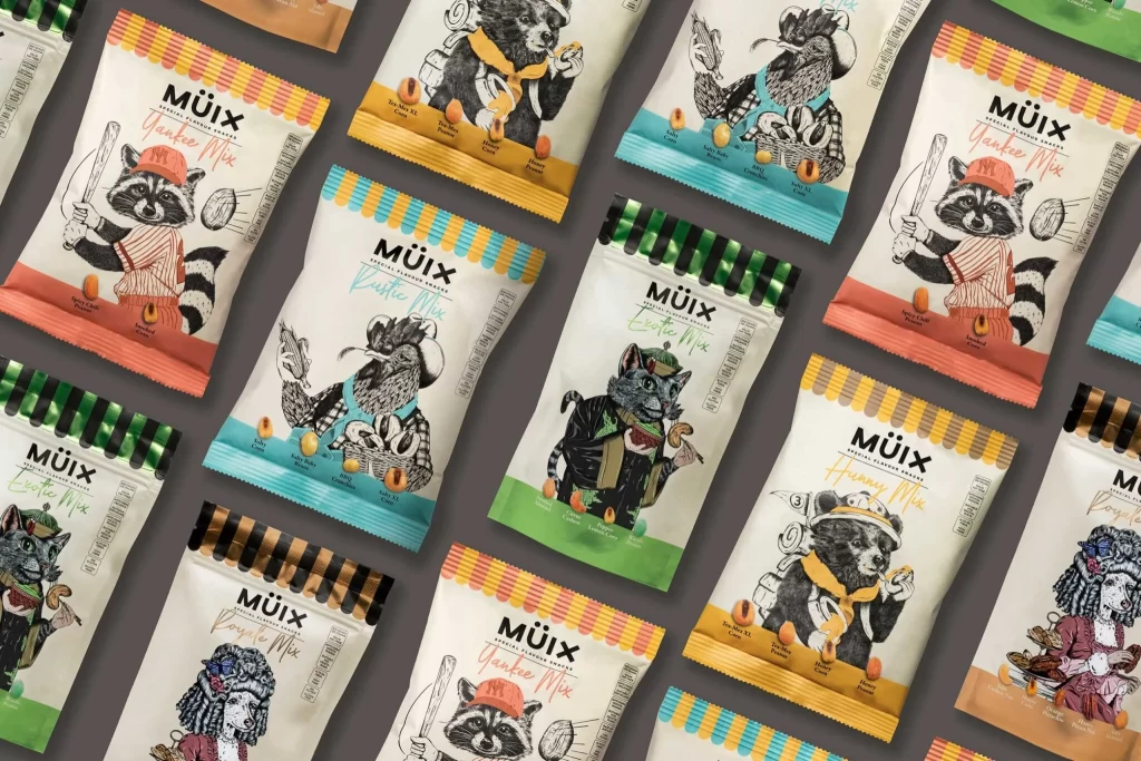
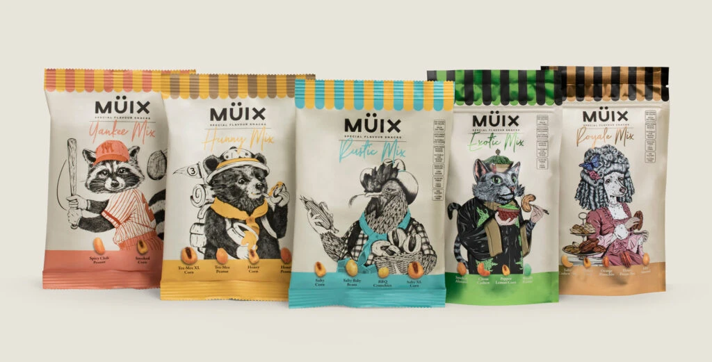
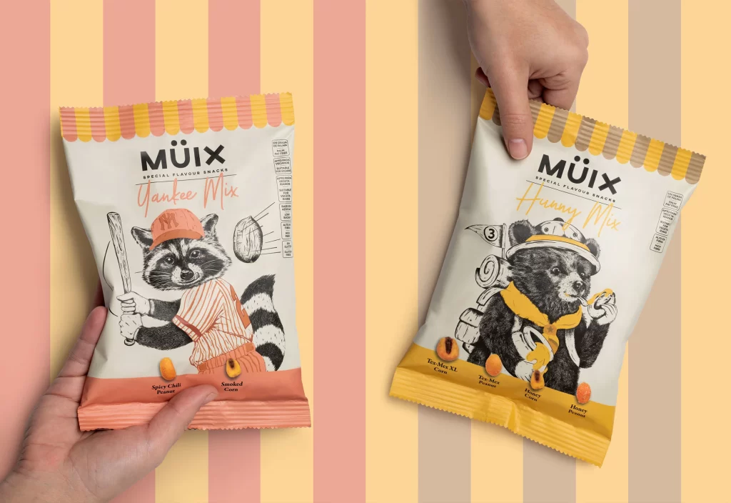
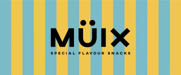
Vertical stripes of pale yellow and light blue create a rhythmic, high-contrast backdrop for the central typographic element. The brand name 'MÜIX' dominates the composition in a heavy, black sans-serif typeface, where the 'U' is topped with two distinct dots resembling an umlaut. Below this, the phrase 'SPECIAL FLAVOUR SNACKS' appears in smaller, spaced-out capital letters, anchoring the design with a clean, modernist hierarchy.
Visual interest stems from the deliberate interplay between the playful, almost toy-like color palette and the severe, geometric weight of the logotype. The background stripes provide a sense of movement and depth that prevents the solid black text from feeling too heavy or static. Furthermore, the use of the diaeresis on the 'U' adds a unique linguistic and graphic character that distinguishes the identity from standard snack packaging.
Brand strategists might utilize this layout to study how bold typography can effectively balance busy, patterned backgrounds without losing legibility. Packaging designers could reference the specific color harmonies when developing products aimed at a youthful or premium casual market. Additionally, illustrators may find value in analyzing the negative space management around the letterforms to improve their own logo compositions.