Yoplait Yogurt Mixed Berry
DownloadTopics
Details
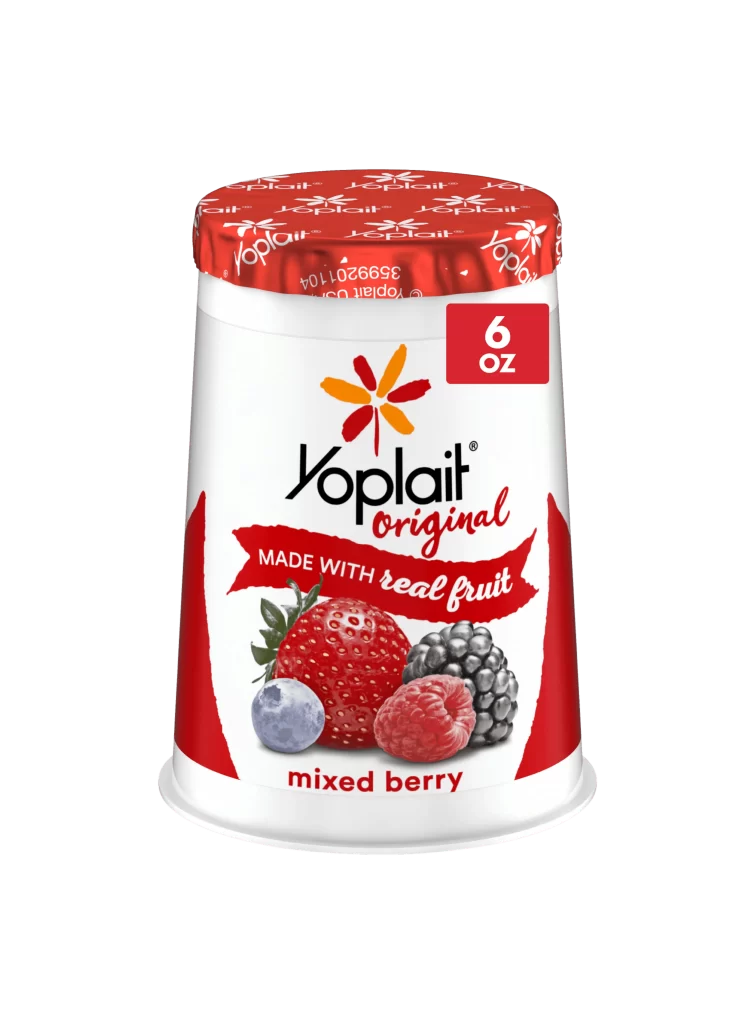
A white plastic yogurt cup with a tapered cylindrical form stands as the central subject, wrapped in a label dominated by a bold red and white color scheme. The red foil lid displays repeating 'Yoplait' text in white, while the main body features the brand name in black serif font above a red cursive 'original' script. Below this, a curved red banner carries the phrase 'made with real fruit' in mixed typography, positioned above a photorealistic cluster of four berries—strawberry, blueberry, raspberry, and blackberry—that anchor the lower half of the composition. A red square badge in the upper right corner indicates '6 OZ' in white numerals, and the flavor identifier 'mixed berry' appears in lowercase red letters at the bottom edge. Even studio lighting eliminates harsh shadows across the smooth surfaces, and the entire object sits on a clean, light-toned surface that fades into a neutral backdrop.
Visual hierarchy in this packaging design relies heavily on the contrast between the crisp white container base and the saturated red graphic elements that frame the central imagery. The distinctive flower-like logo with its orange and red petals creates an immediate brand recognition point above the text block, while the photographic fruit rendering adds tactile realism that distinguishes it from illustrated alternatives. Designers studying food packaging will note how the diagonal red side panels create visual momentum that draws the eye toward the product name and flavor indication. Anyone needing to analyze commercial dairy branding or practice product retouching can access the full-resolution file without cost directly from the resource page.
Food photographers and packaging students frequently utilize such clean product shots to study lighting setups for reflective materials like foil lids and glossy plastic containers. 3D modelers building grocery store environments often reference these images to accurately recreate label textures, font placements, and proportion relationships between graphical elements and physical forms. Marketing teams reviewing competitor branding might also employ this visual to compare color palette strategies across different yogurt product lines within the same category.