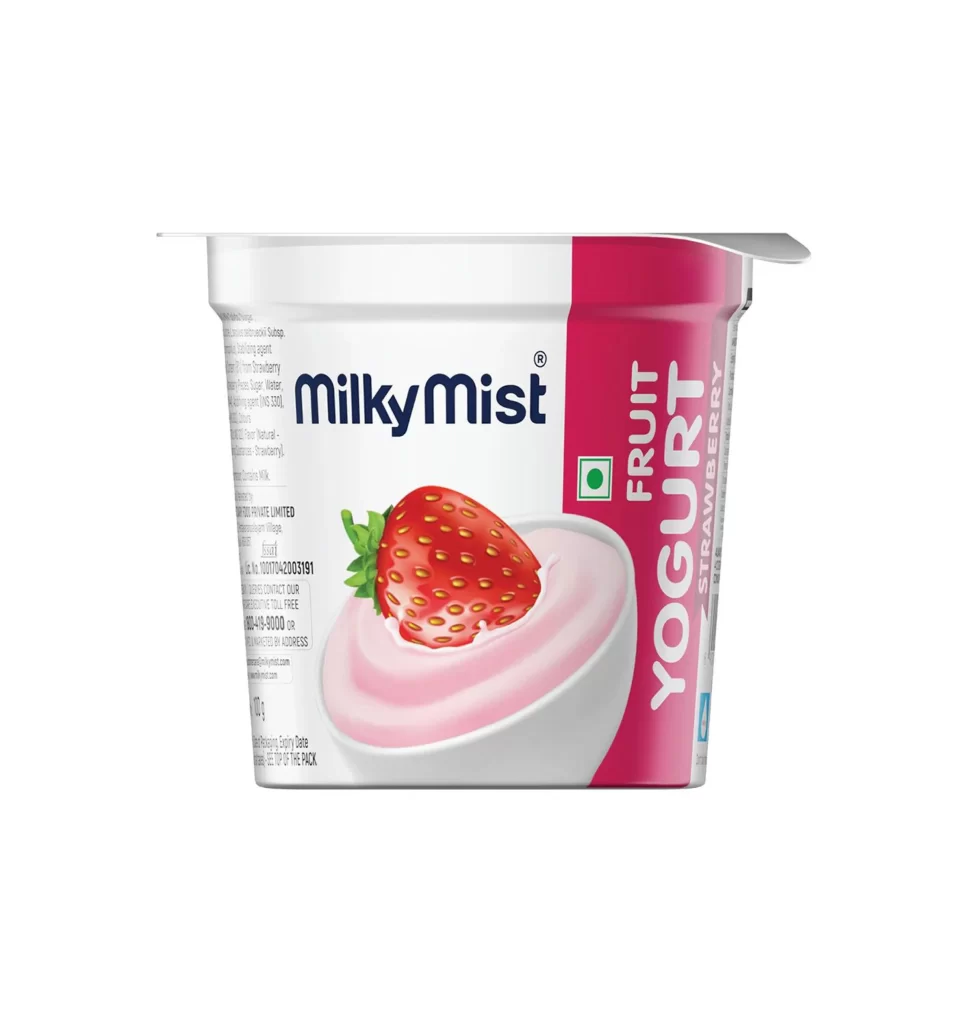
MilkyMist FruitYogurt Strawberry
DownloadTopics
Details
A white plastic yogurt cup with a silver foil lid sits at a slight three-quarter angle, revealing its front and right-side labeling. The main body features the brand name 'MilkyMist' in bold dark blue sans-serif font above an illustration of pink yogurt topped with a glossy red strawberry and green leaves. A vibrant magenta vertical stripe runs down the right edge, containing the words 'FRUIT YOGURT' and 'STRAWBERRY' in large white capital letters, alongside a small green square symbol with a white dot.
The packaging relies on a clean split-composition strategy, balancing the clinical white of the container against the saturated berry tone of the side panel. This color blocking creates immediate flavor recognition while the realistic fruit rendering adds appetizing texture to the otherwise flat graphic elements. Designers studying commercial dairy branding will appreciate how the typography scales between the brand identifier and the product descriptor. The complete high-resolution asset can be accessed without cost for detailed inspection of print finishes and material textures.
Food photographers might reference this shot to understand standard e-commerce lighting setups for refrigerated products, noting how highlights define the cup's curvature without creating harsh glare. Packaging engineers could examine the foil-seal mechanics and label placement for similar container formats. Marketing teams evaluating competitive positioning in the fruit-yogurt sector would find this useful for analyzing color psychology and visual hierarchy across different regional brands.