Yogurt FrenchFlavor AdoptACow Original 230g
DownloadTopics
Details
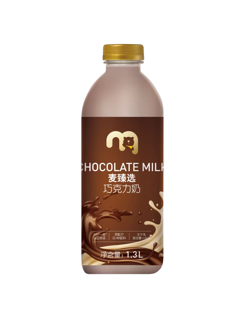
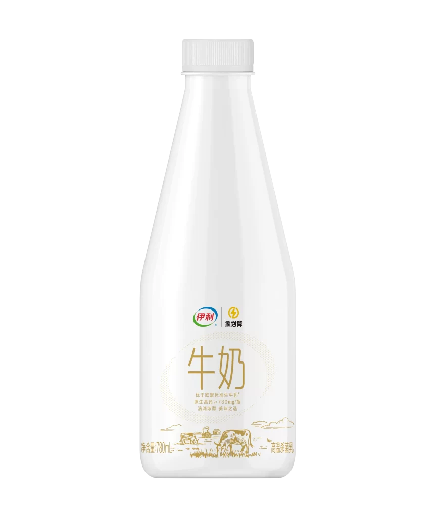
A contoured plastic bottle of yogurt stands vertically, its body wrapped in a label that transitions from crisp white at the center to soft periwinkle blue at the shoulders and base. The cap is a matching pale tone with subtle texturing, while the central white panel features a bold yellow shield bearing the brand name "ADOPT A COW" in black characters above the English translation. Below this, an oval frame encloses the words "FRENCH FLAVOR" and "Yogurt" in elegant script, followed by prominent Chinese characters for "French Style" and "Original Yogurt," with the net weight of 230g printed clearly near the bottom edge. The entire product rests on a reflective surface that mirrors its lower half against a uniform light blue backdrop, illuminated by even studio lighting that eliminates harsh shadows.
Visual interest arises from the deliberate contrast between the vibrant yellow brand mark and the cool, muted palette of blues and whites that dominate the packaging. The curved silhouette of the bottle creates a gentle hourglass shape that breaks away from standard cylindrical dairy containers, while the abstract watercolor-style gradients on the label edges suggest a creamy texture without literal illustration. Typography plays a crucial role here, mixing modern sans-serif fonts for technical information with flowing cursive for flavor descriptors to establish a premium yet approachable market position. Designers studying this composition will appreciate how the color blocking guides the eye from the brand identifier down through the product specifics in a logical hierarchy.
Packaging engineers and branding specialists might examine this reference to understand how curved surfaces affect label adhesion and print distortion on non-flat substrates. Color theorists could analyze the specific hex values of the periwinkle-to-white gradient to replicate similar calming effects in health-food marketing materials. Those needing precise visual assets for mood boards or client presentations can access the full-resolution file without cost directly from the resource library. Retail merchandisers might also study the legibility of bilingual text placement when planning shelf layouts for international dairy aisles.