Oikos Yogurt
Topics
Details
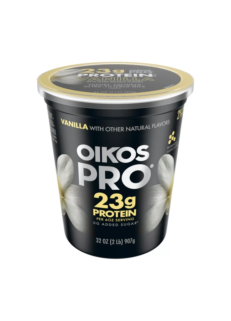
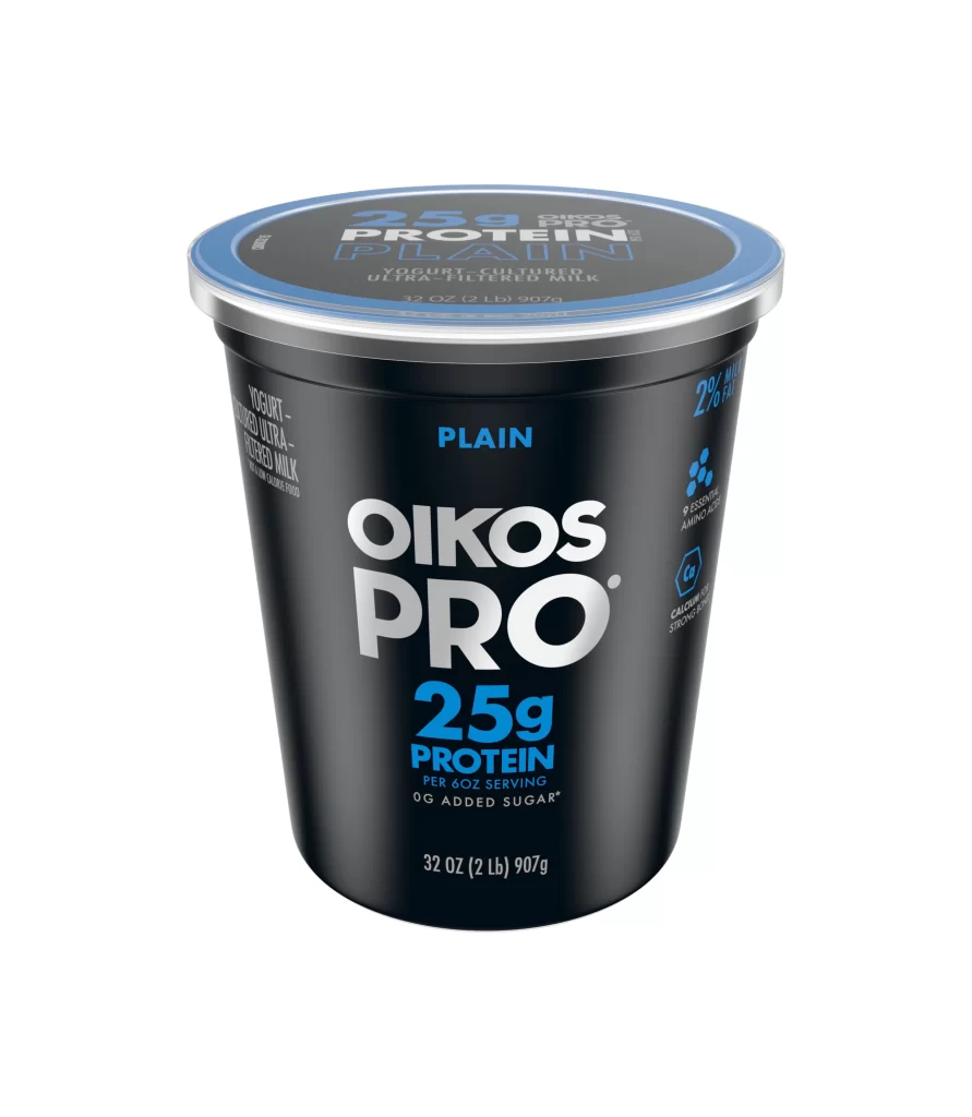
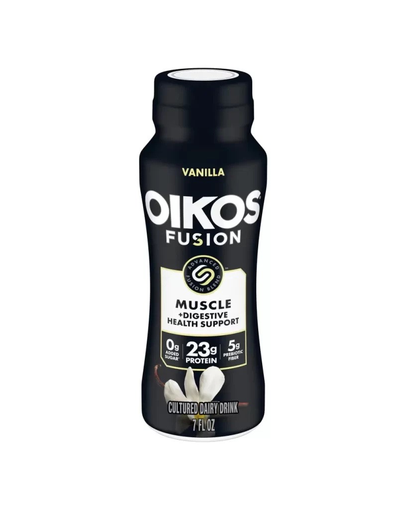
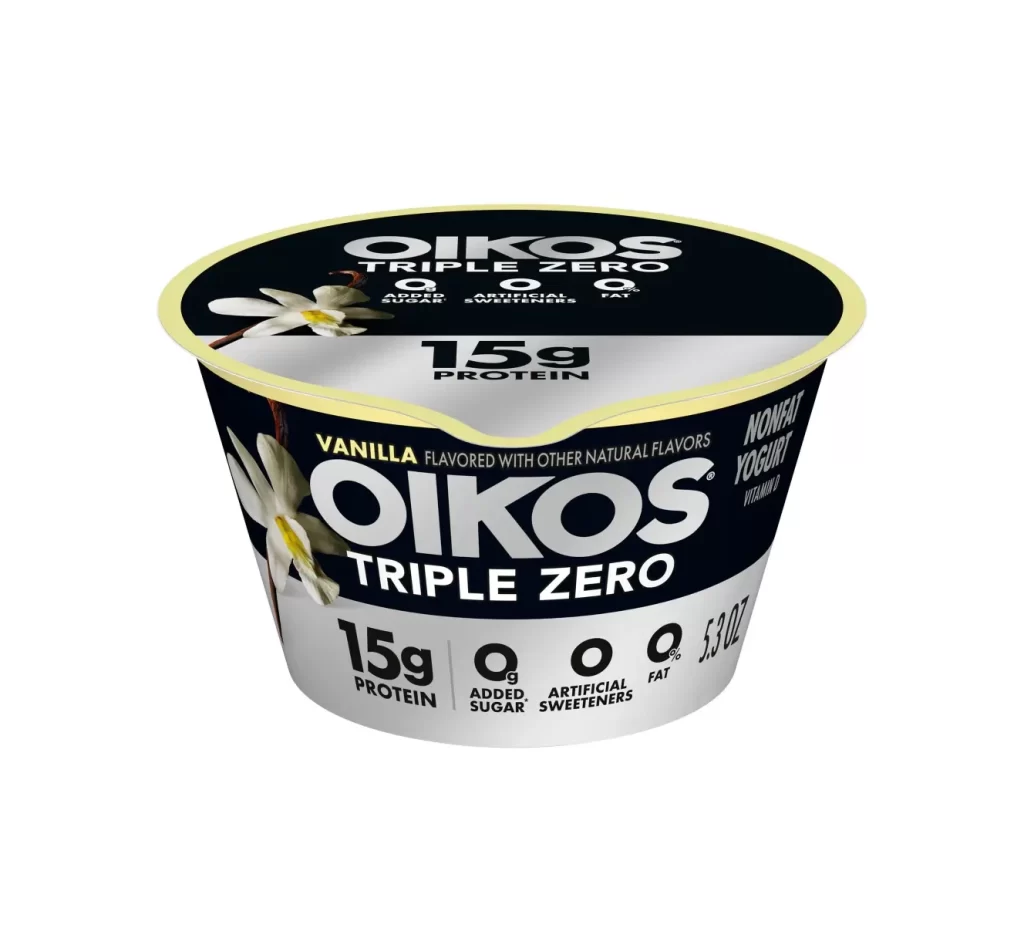
A cylindrical yogurt container with a black and silver body and pale yellow rim displays the Oikos Triple Zero brand prominently in bold white lettering. Vanilla flower graphics adorn both the lid and front label, while nutritional claims including 15g protein, 0g added sugar, 0g artificial sweeteners, and 0g fat appear in clean typography across the surface. The product is photographed at a slight three-quarter angle under even studio lighting that highlights the metallic sheen of the packaging without casting harsh shadows.
Visual interest derives primarily from the stark monochromatic palette interrupted only by subtle cream accents and botanical photography. The typographic hierarchy creates immediate readability, with the massive brand name occupying central visual real estate while smaller nutritional data frames the composition. Notably, the scalloped indentation on the foil lid breaks the otherwise perfect circular geometry, adding a tactile quality that suggests the product’s sealed freshness. This specific ‘Triple Zero’ variant emphasizes health-conscious marketing through its clean, clinical color scheme and uncluttered information architecture.
Packaging designers studying dairy industry branding conventions would find this useful for analyzing how premium positioning communicates through minimal color usage. Marketing teams developing health-focused food products could reference the iconography system for communicating nutritional benefits at a glance. Photographers requiring examples of commercial product lighting might examine how the even illumination eliminates harsh shadows while maintaining material distinctions between matte paper and glossy foil surfaces.