Atena Snack Packaging
Topics
Details
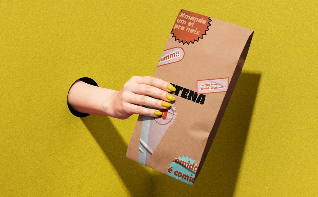
A pale arm extends from a circular void in a saturated mustard-yellow backdrop, its hand with yellow-painted nails grasping a tall, kraft-brown paper bag. Bold black typography spelling 'ATENA' dominates the packaging, surrounded by playful Portuguese stickers in terracotta, powder blue, and white bearing phrases like 'manda um oi pra noix' and 'comida boa é comida saudável'. Bright studio lighting casts a crisp shadow of the arm and bag across the vibrant yellow surface.
Visual interest stems from the juxtaposition of utilitarian brown paper with vibrant, retro-inspired graphic elements that mimic casual handwritten notes and comic-book bursts. The composition creates a surreal, almost theatrical presentation by isolating the limb through the wall cutout, turning an ordinary snack delivery into a moment of tactile discovery. This specific iteration balances minimalist material choices with maximalist sticker culture, resulting in a look that feels both artisanal and approachably informal.
Brand strategists developing casual dining or health-food identities might study this layout to understand how colloquial language can soften premium positioning. Packaging engineers could analyze the structural proportions of this tall format for grab-and-go product lines. Art directors planning lifestyle campaigns would find the color interplay between skin tone, nail polish, and background useful for coordinating human element shots with environmental design.