Atena Packaging A
Topics
Details
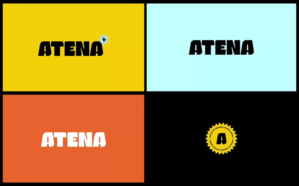
Heavy black sans-serif capitals spelling ATENA dominate the composition with slightly rounded terminals and a condensed width, while a small light-blue serrated seal containing a bold letter A sits atop the final character's upper right shoulder. The text rests on a flat mustard-yellow field, centered horizontally with even margins under diffuse lighting that eliminates shadows entirely.
Visual weight dominates this specimen through the extreme contrast between the dark letterforms and the warm background tone. The badge element introduces a secondary color accent while reinforcing brand identity through its circular geometry against the rigid typographic structure. Such deliberate simplicity focuses attention purely on typeface characteristics and logo placement logic.
Brand identity developers might study this arrangement to understand how secondary marks integrate with primary wordmarks without cluttering the visual field. Packaging designers could reference the proportional relationships between text size and badge placement when laying out product labels requiring certification stamps or quality seals.