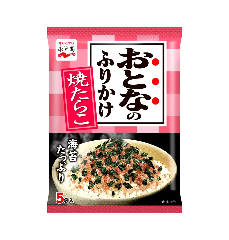
Nagatanien Adult Furikake Extra Seaweed Packaging
Topics
Details
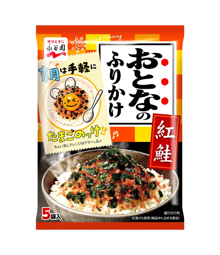
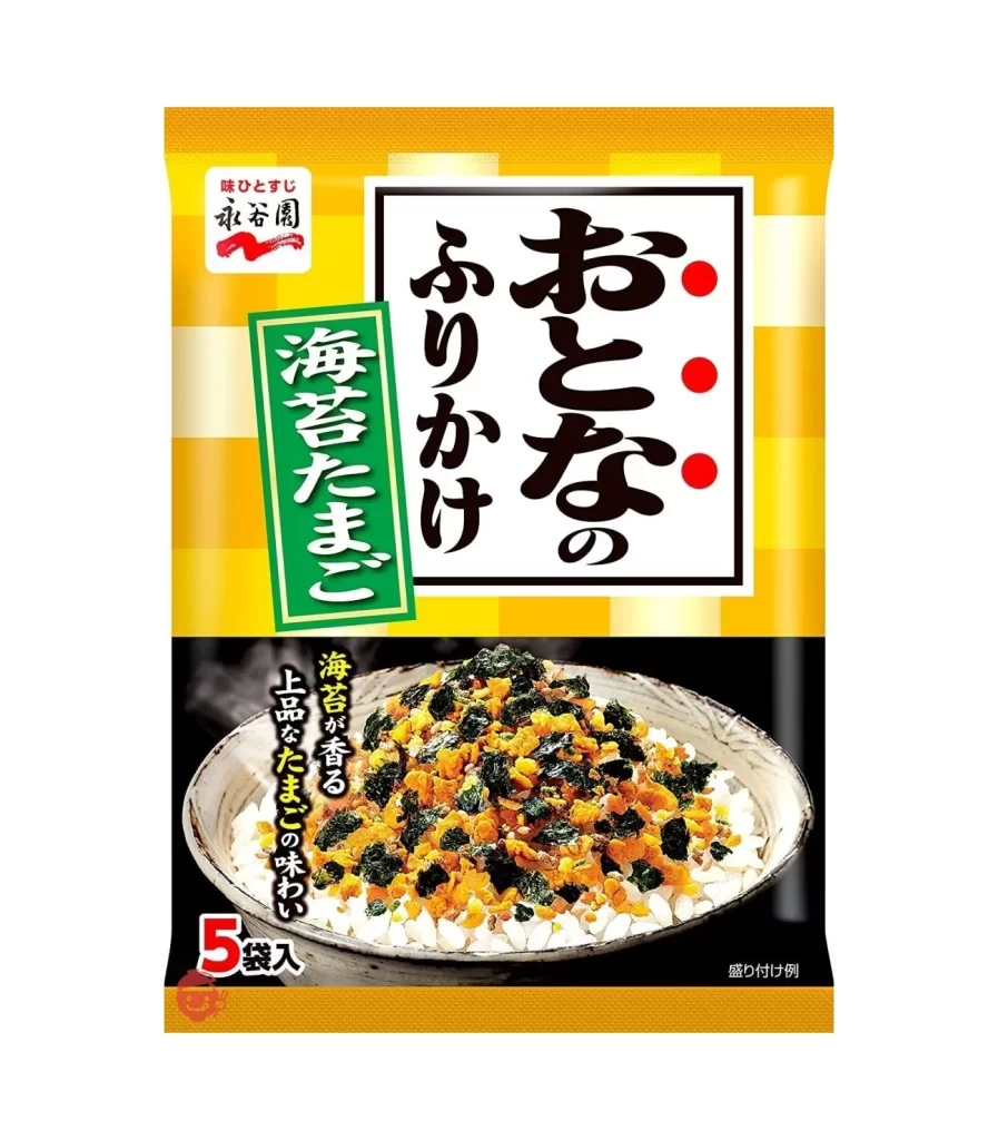
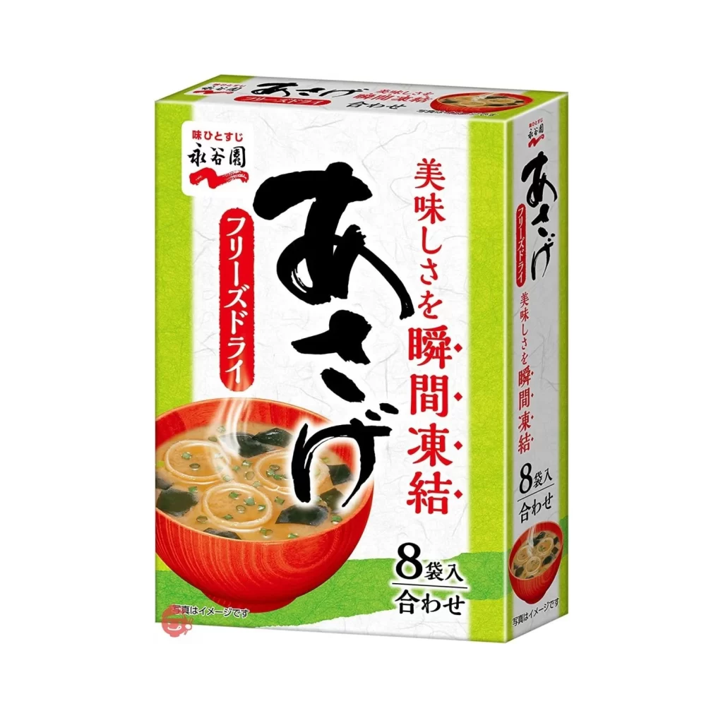
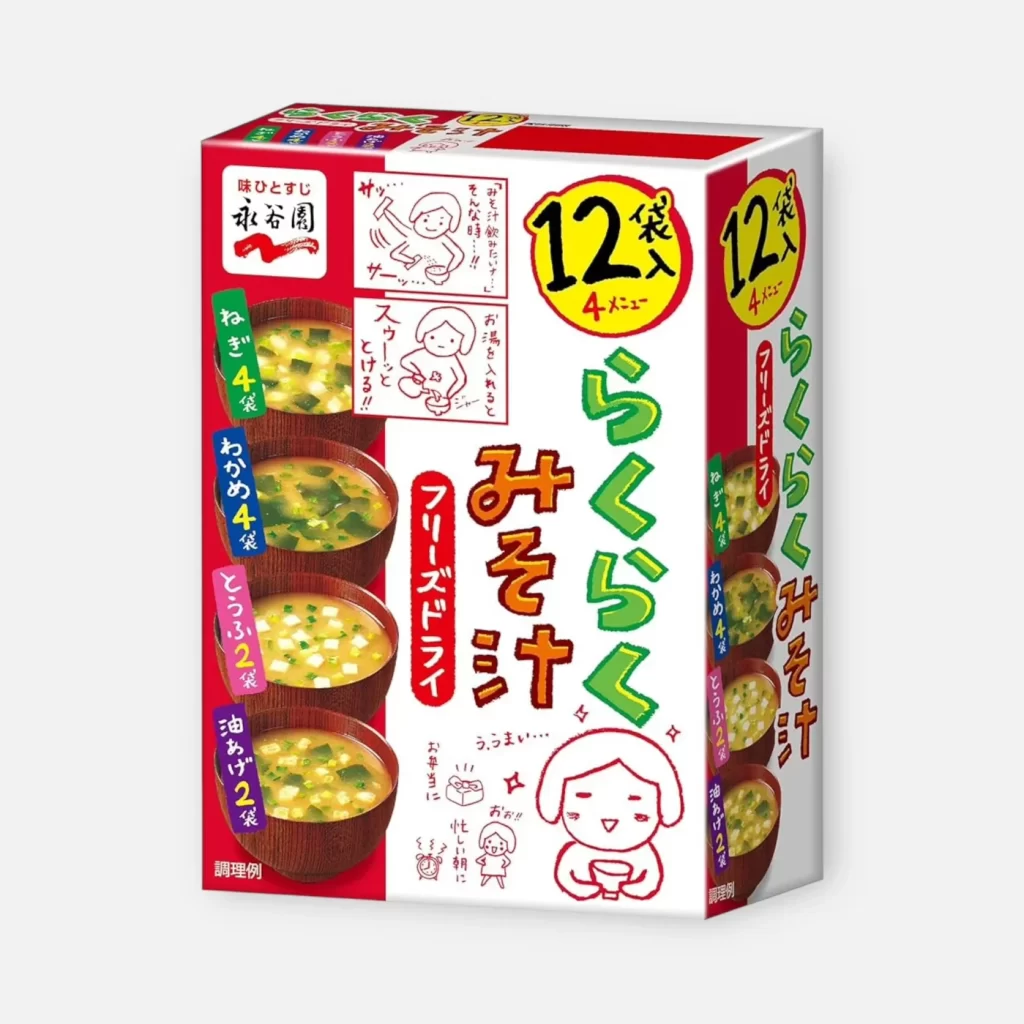
Dominating the frame is a rectangular retail package featuring a vibrant pink and white checkered pattern across the upper half. A central white field contains bold, black calligraphic characters for 'Otona no Furikake' (Adult Rice Seasoning), accented by three red dots on the right margin. Below this, a vertical crimson banner displays the text 'Yakitariko' in white script. The bottom section transitions to a dark background showcasing a ceramic bowl of steamed rice topped with green seaweed flakes, while the lower left corner indicates a five-packet count with a prominent red numeral.

Visual hierarchy is established through the stark contrast between the playful gingham texture and the serious weight of the traditional typography. The photographic element at the base provides an appetizing, realistic anchor that balances the graphic abstraction above it. Specific branding elements, such as the Nagatanien logo in the upper left and the descriptive text for nori seaweed, create a cohesive identity that bridges modern packaging aesthetics with classic Japanese culinary presentation.
Product photographers might study this composition to understand how to effectively layer text over complex patterns without losing legibility. Brand strategists could utilize this example when developing visual systems that require both whimsy and authority in consumer goods. Illustrators seeking to render food packaging will find the specific interplay between matte paper textures and glossy photographic inserts particularly instructive for their own work.