Nagatanien Adult Furikake Seaweed Egg Packaging
Topics
Details
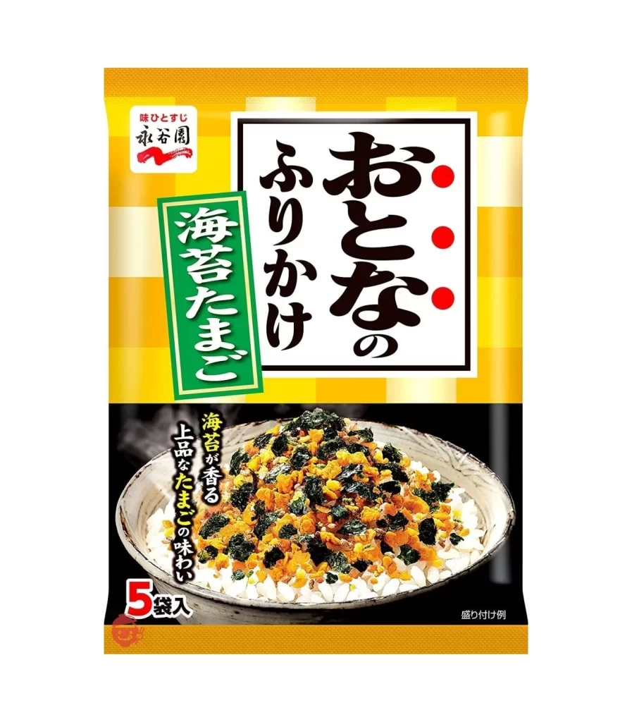
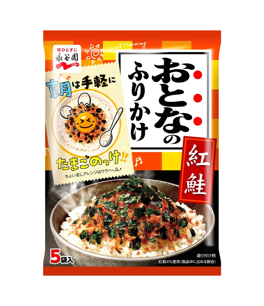
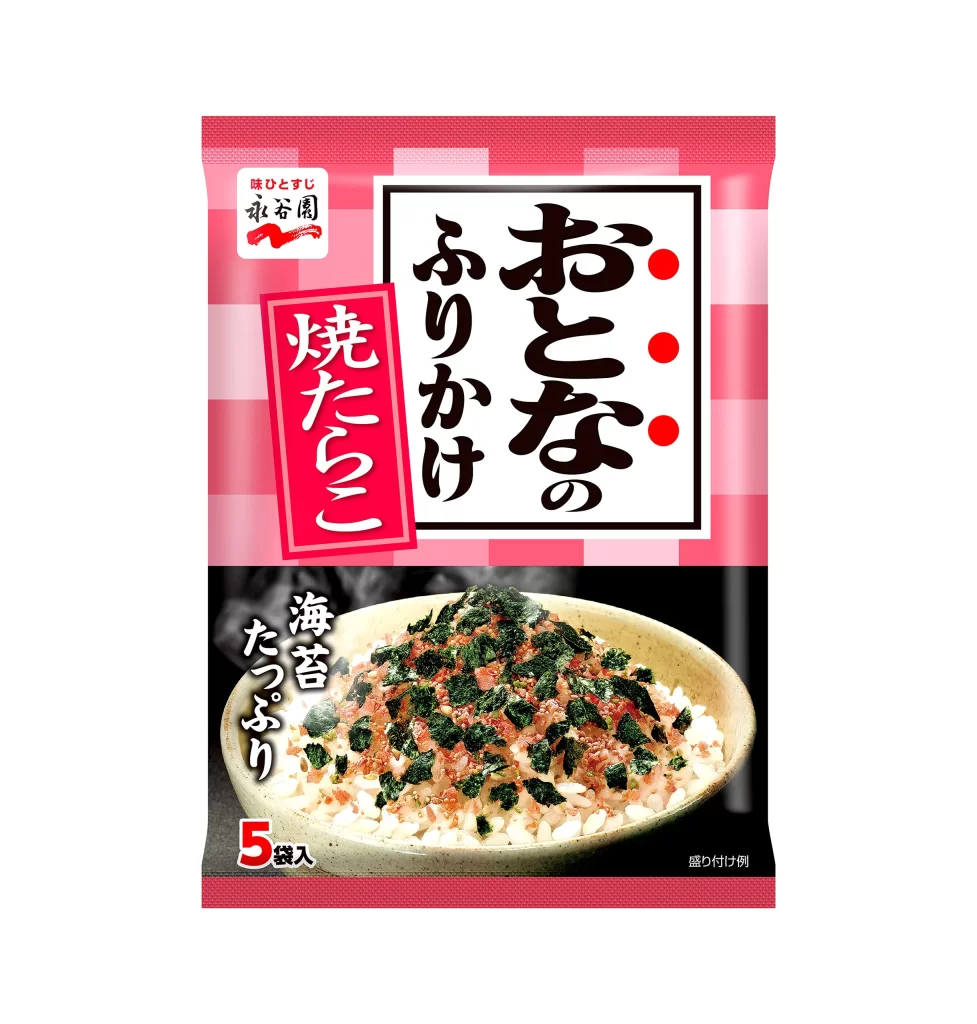
Vibrant yellow and cream stripes form the background of this vertical rectangular package, which is framed by a solid orange border at the top and bottom. A large white square dominates the upper half, containing bold black calligraphy for 'Otona no Furikake' (Adult's Rice Seasoning) alongside three red dots, while a green vertical banner to the left specifies the flavor as seaweed and egg. The lower section features a high-contrast photograph of steamed white rice topped with the golden egg and dark green seaweed mixture, set against a black background that makes the food colors pop vividly.


Visual hierarchy is established through the stark contrast between the playful, warm-toned geometric pattern and the serious, traditional weight of the main Japanese typography. By placing the appetizing product shot in a dark field at the bottom, the layout ensures the texture of the seasoning is the focal point for the consumer. The specific use of the word 'Otona' (adult) in a refined font suggests a more sophisticated or less sugary taste profile compared to standard children's versions.
Food photographers might study the lighting setup used here to highlight the individual grains of rice and the crumbly texture of the topping without creating harsh shadows. Brand designers working on Asian grocery products could analyze how traditional calligraphy integrates with modern, bright color blocking to appeal to adult demographics. Packaging engineers may also find value in examining how the '5 bags included' text and serving suggestion are positioned to maximize information density without cluttering the primary branding area.