Nagatanien Tonkotsu Pork Broth Ramen Cup Packaging
Topics
Details
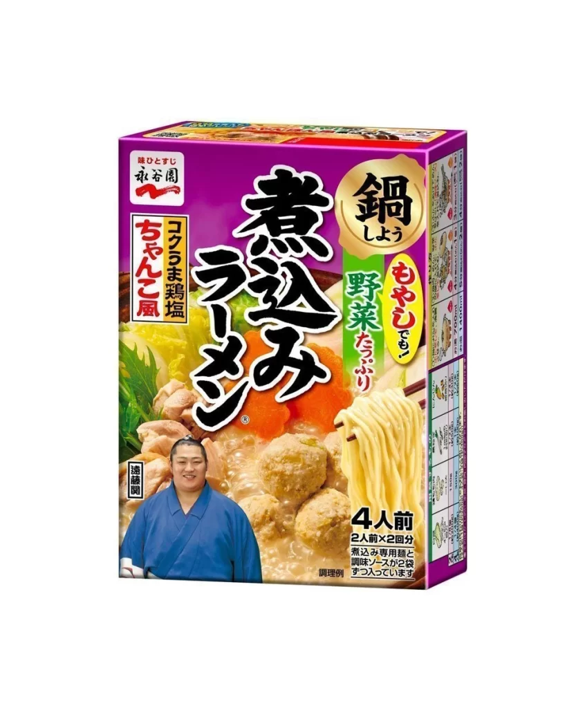
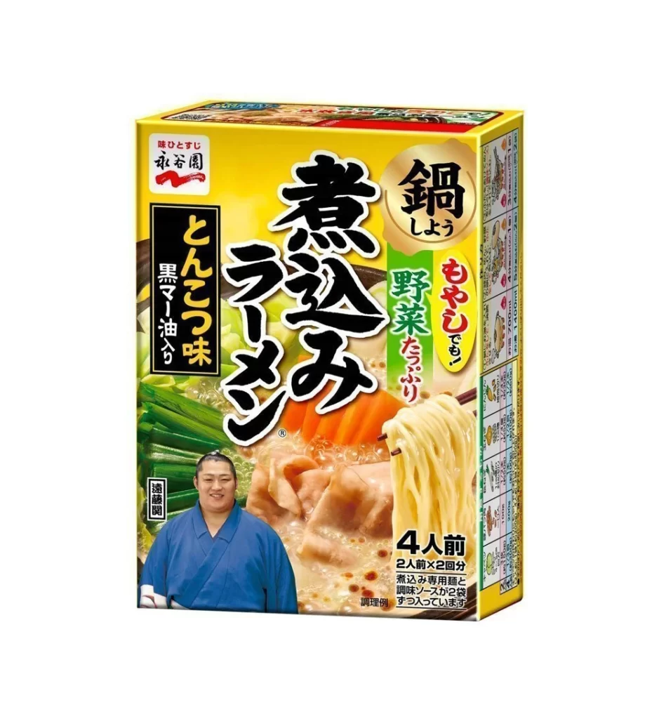
A vibrant yellow rectangular carton dominates the frame, featuring bold black calligraphy for the product name 'Nabe Ramen' and a circular gold badge highlighting the hot pot format. The packaging displays a smiling man in a blue kimono on the lower left, while the right side showcases glistening noodles held by chopsticks alongside simmering dumplings. Green vertical text on the left specifies the tonkotsu flavor with black sesame oil, while red accents emphasize the inclusion of plenty of vegetables.

Visual hierarchy is established through the stark contrast between the saturated primary background and the heavy, brush-stroke style typography that conveys an artisanal, traditional Japanese aesthetic. The composition balances photographic food elements with graphic text blocks, creating a dense yet organized layout typical of Asian grocery retail design. Specific details like the '4 servings' indicator and the endorsement portrait add layers of commercial information without cluttering the central appetizing imagery.
Brand strategists analyzing competitive packaging in the instant noodle sector would utilize this visual to study color psychology and typographic weight in crowded market environments. Illustrators seeking to render authentic Japanese food packaging can reference the specific placement of nutritional grids and promotional badges on the side panel. Cultural researchers documenting the use of celebrity endorsements in consumer goods will find the integration of the spokesperson's image particularly instructive.