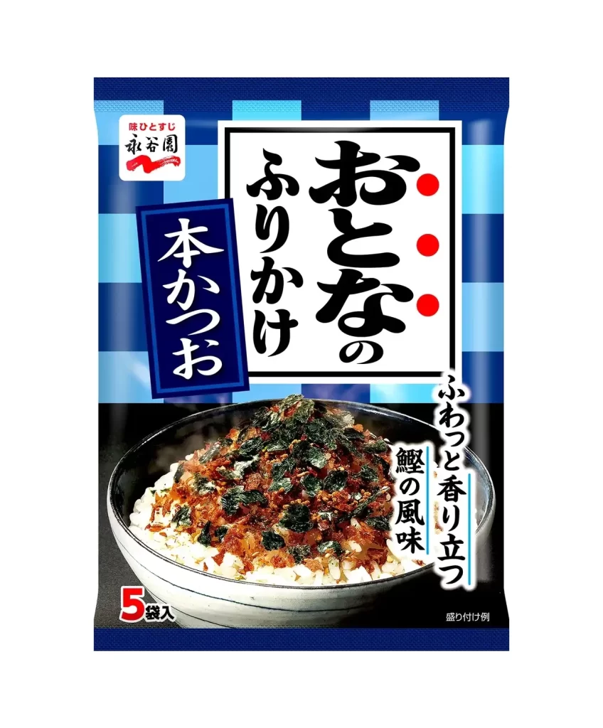
Nagatanien Adult Furikake Bonito Flake Packaging
Topics
Details
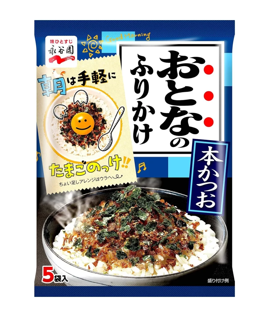
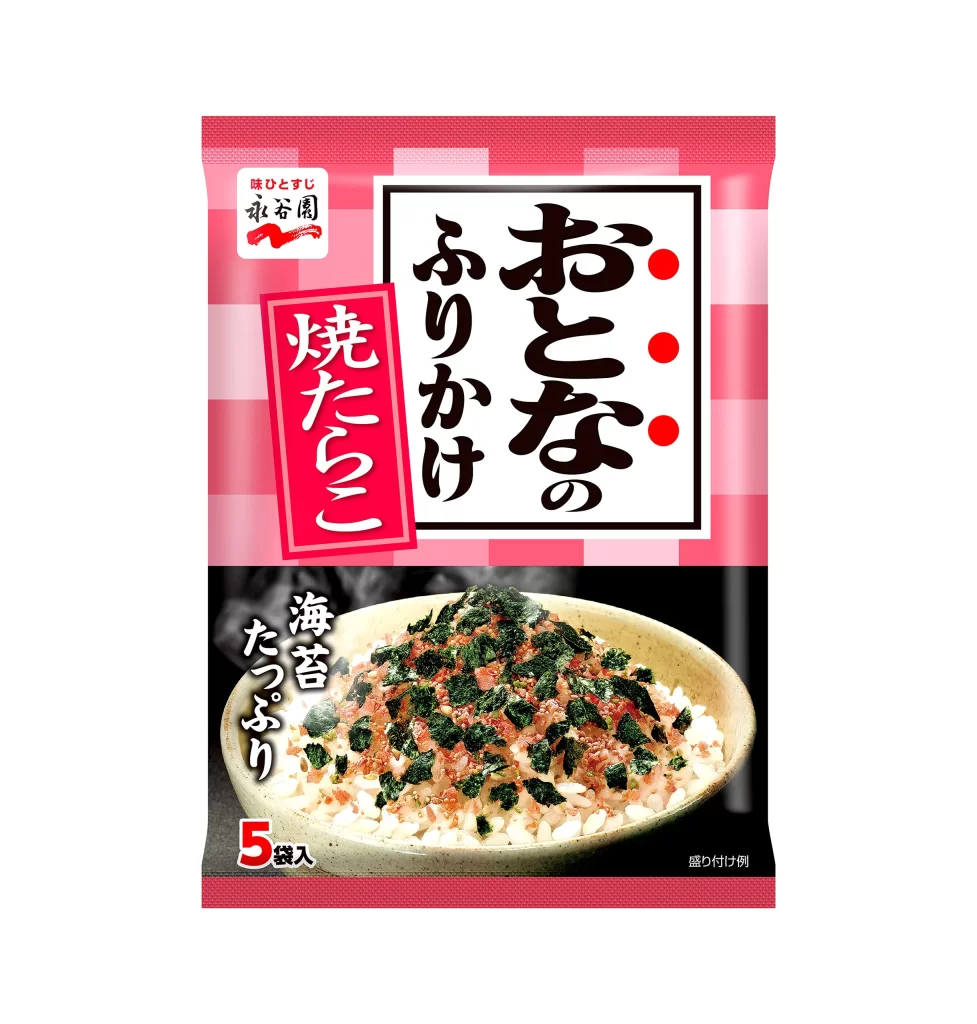
Deep navy blue dominates the upper register of this vertical composition, transitioning into a stark photographic base that anchors the visual weight. A central white rectangular field contains bold, black calligraphic characters for 'Otona no Furikake' (Adult Seasoning), punctuated by three vivid red dots on the right margin. Below this typographic anchor, a realistic bowl of steamed white rice topped with dark green seaweed and brown bonito flakes sits in sharp focus, while a secondary cream-colored graphic overlay to the left features a simplified smiley face and playful, hand-drawn typography.

Visual tension is established through the juxtaposition of traditional Japanese calligraphy against modern, illustrative elements like the yellow sunburst icon and the casual English script reading 'Good morning.' The packaging deliberately employs a dual-layered information hierarchy, separating the premium product photography from the instructional and brand-identity graphics. Such a layout creates a dynamic rhythm that guides the eye from the authoritative main title down to the appetizing food imagery, effectively balancing cultural authenticity with contemporary snack-food aesthetics.
Brand strategists analyzing Japanese market entry would find value in dissecting how this specific color palette conveys maturity and savory flavor profiles. Illustrators tasked with creating mascot systems for food products could study the integration of the smiley face within the circular rice bowl motif. Furthermore, packaging engineers might examine the spatial allocation between the large-scale product shot and the necessary regulatory text to optimize shelf presence in crowded retail environments.