Nagatanien Instant Miso Soup Packaging
Topics
Details
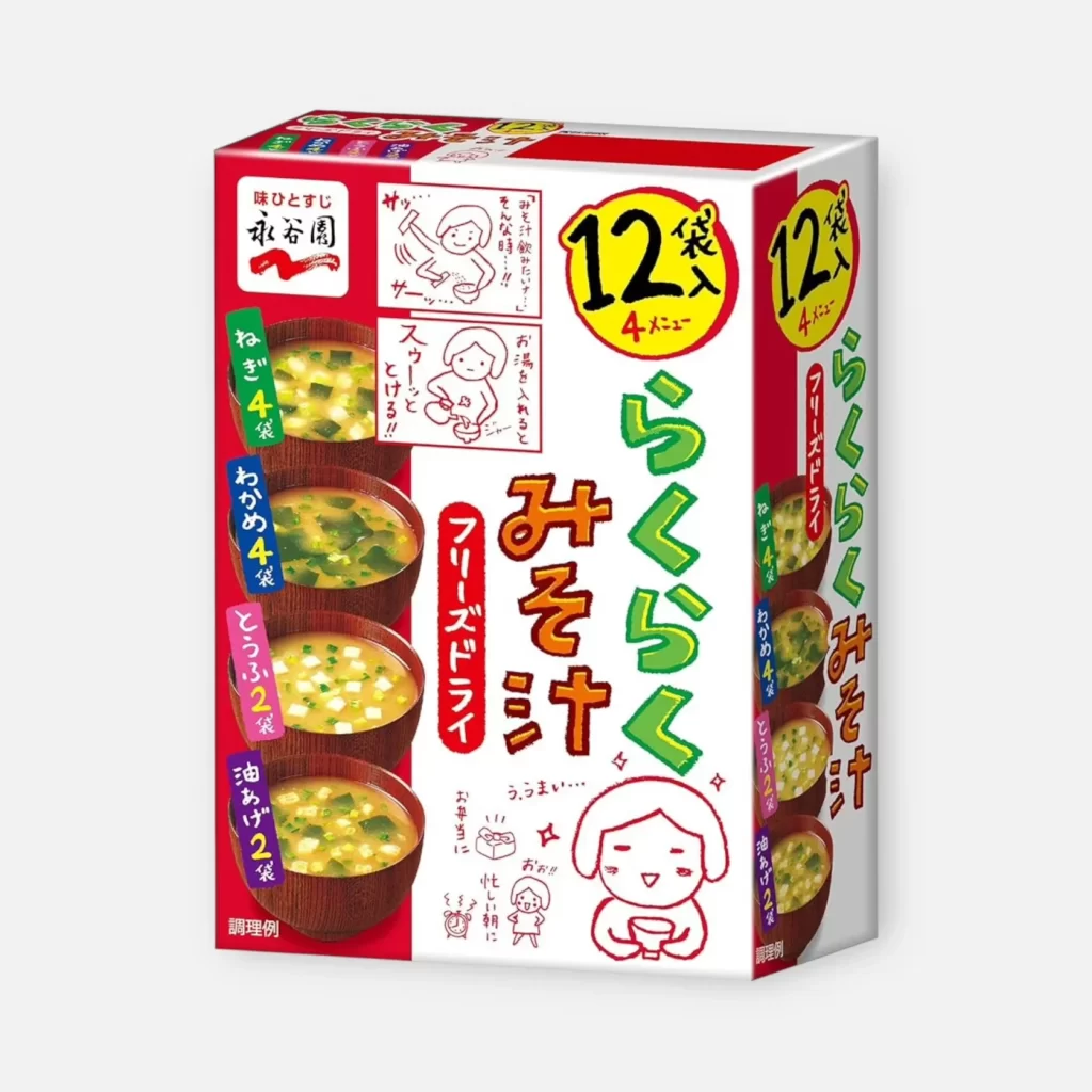
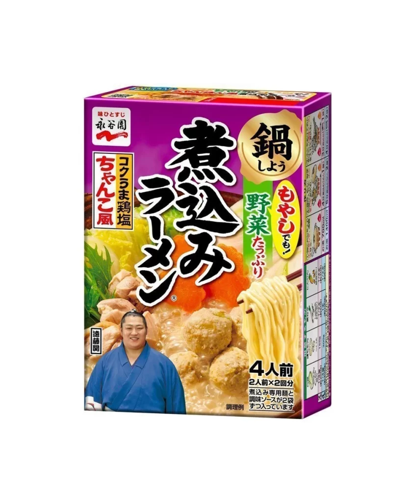
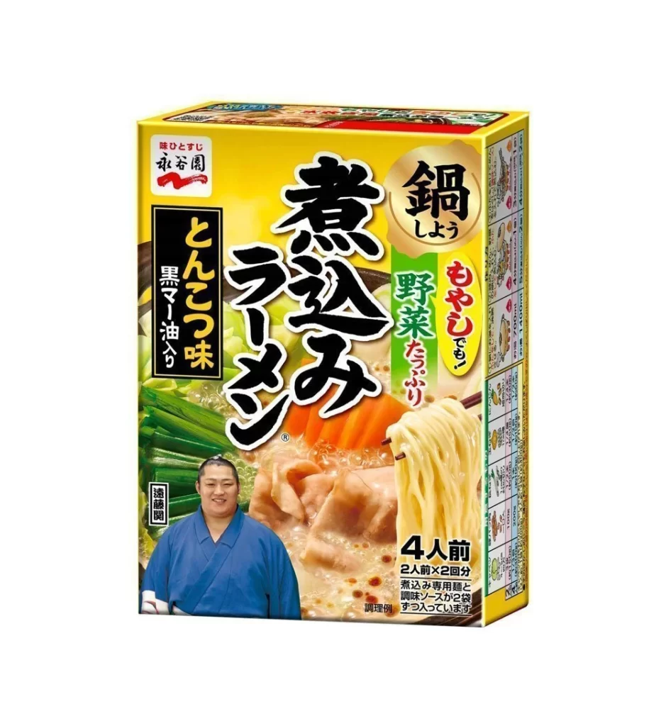
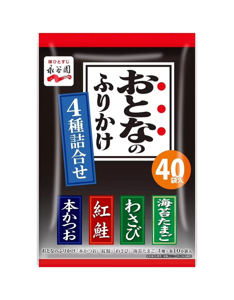
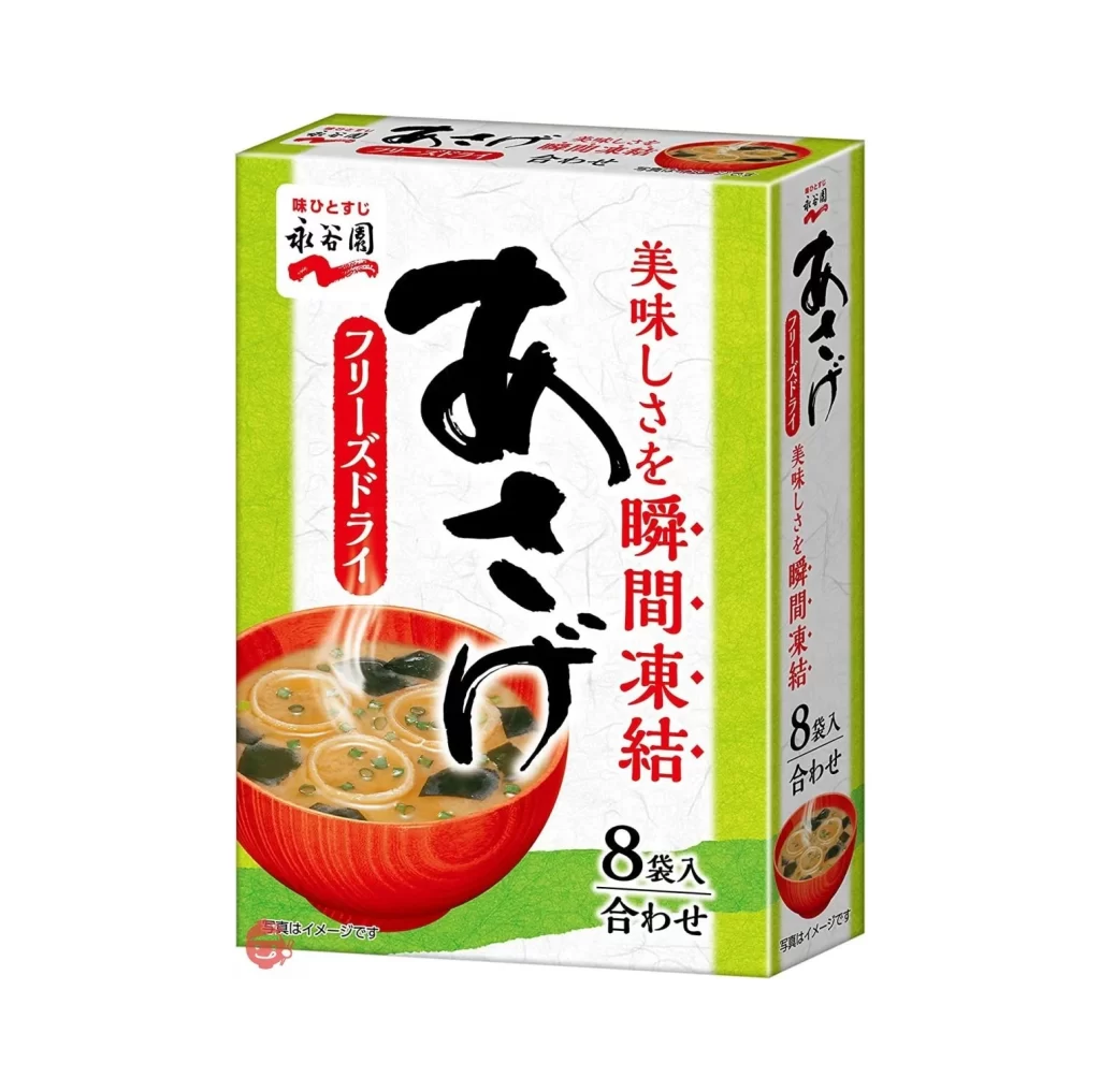
A rectangular cardboard carton of Nagatanien Instant Miso Soup displays its front and left side panels from a three-quarter perspective against a neutral white background. The packaging employs a high-contrast palette of saturated red, crisp white, and forest green, anchored by a bold yellow circular badge in the upper right quadrant announcing a twelve-pack count. Typography varies si
Visual hierarchy is established through the strategic layering of photographic realism and hand-drawn illustration, creating a distinct ‘homemade’ aesthetic that contrasts with industrial food packaging norms. The inclusion of anthropomorphic characters—specifically the smiling, bowl-holding figure at the bottom right—injects a sense of warmth and approachability that transcends mere nutritional labeling. Furthermore, the dense arrangement of informational elements, from the specific soup bowl photography to the color-coded flavor indicators on the spine, demonstrates a sophisticated method of organizing complex product data within a limited physical space.
Brand strategists analyzing Japanese consumer goods would find this artifact invaluable for studying how traditional culinary items are modernized for mass retail through specific chromatic choices. Illustrators tasked with creating mascot systems for food products can dissect the line weight and emotional expression of the central character to understand effective anthropomorphism. Additionally, packaging engineers might utilize this reference to evaluate how vertical text orientation impacts readability when designing multi-variant boxes for international markets.