Green Tea Bottle Japanese Beverage
DownloadTopics
Details
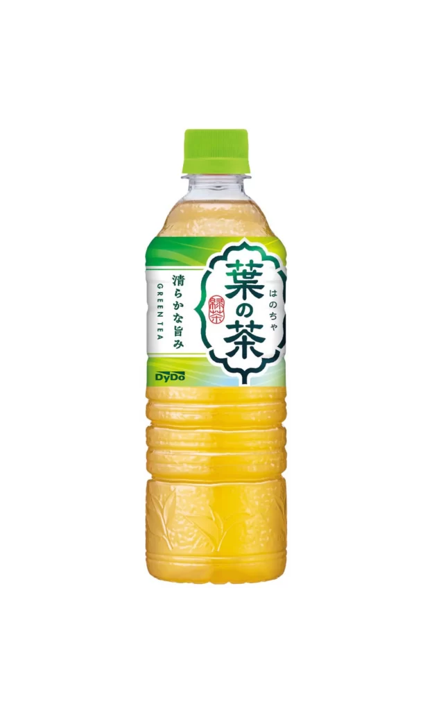
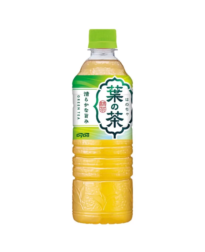
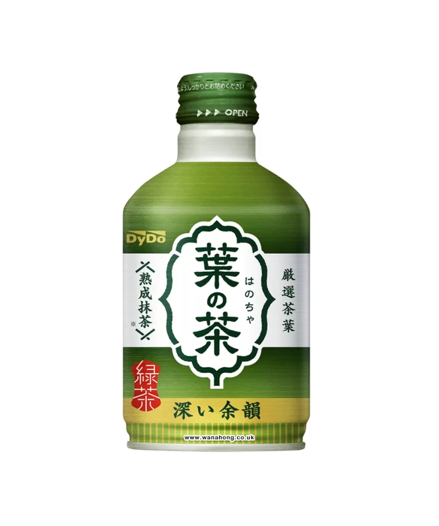
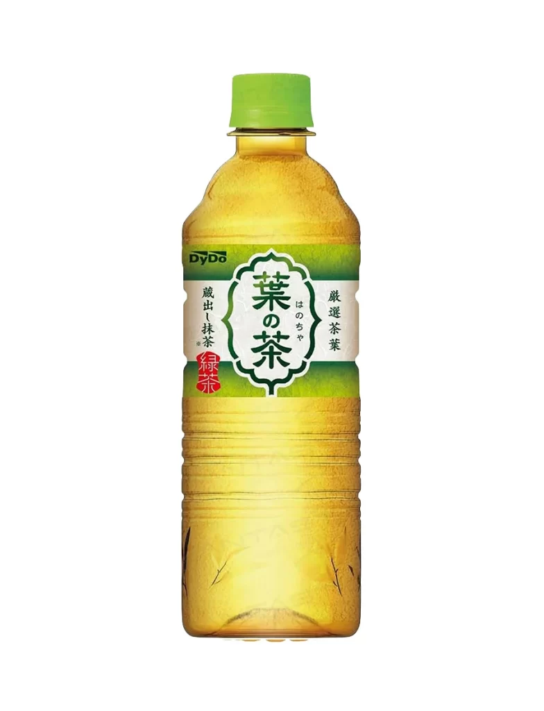
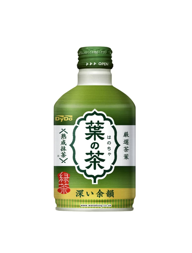
A short, cylindrical aluminum bottle with a matte green finish and a white shoulder stands upright against a light backdrop. The green screw cap features embossed Japanese text and an open instruction marked by three arrows. Dominating the label is a large white cartouche containing the bold black characters 葉の茶 (Ha no Cha), flanked by vertical text reading 厳選茶葉 (strictly selected tea leaves) on the right and 熟成抹茶 (matured matcha) on the left, while a red square seal stamps 緑茶 (green tea) near the bottom left corner above the yellow banner stating 深い余韻 (deep aftertaste).
The visual hierarchy relies on traditional Japanese typographic arrangements within modern beverage packaging constraints. Color blocking divides the surface into distinct zones—green for the product category, white for the primary brand name, and yellow for the flavor profile description—creating clear information scanning paths. Designers studying this reference can examine how the DyDo brand logo integrates into the upper left quadrant without competing with the central emblem. The complete high-resolution asset is accessible at no cost for closer inspection of material textures and print finishes.
Product photographers and packaging students often consult such isolated beverage shots to understand standard e-commerce presentation angles and lighting setups. 3D modelers building digital consumable assets use these references to accurately map label proportions, font weights, and metallic cap reflections onto their geometry. Brand identity researchers might also catalog how contemporary Japanese drink manufacturers balance heritage calligraphy with contemporary color palettes across different product lines.