DyDo Coffee Drinks Cans
DownloadTopics
Details
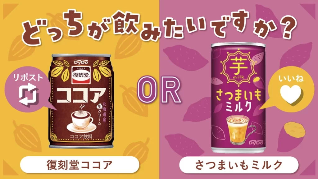
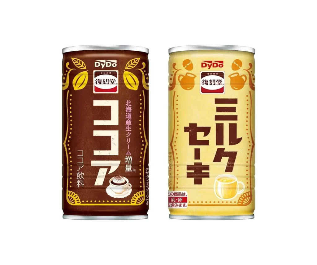
Two cylindrical aluminum beverage cans stand side-by-side, each featuring a distinct color palette and typographic system. The left container displays a deep chocolate-brown base with golden-yellow cocoa pod illustrations and large vertical katakana characters spelling "Cocoa," while the right can presents a pale cream-yellow surface decorated with orange pitcher motifs and bold brown text for "Milk Tea." Both items bear the DyDo corporate logo above the red-and-white Fukutoku-do brand mark, with smaller vertical product descriptions running along their sides. A clean, neutral backdrop isolates the subjects under even frontal lighting that eliminates harsh shadows across the metallic surfaces.
Visual hierarchy relies on oversized Japanese typography that dominates each label's central real estate, creating immediate flavor recognition through scale rather than photography alone. Decorative botanical and serving-vessel graphics frame the text blocks within dotted borders, establishing a cohesive retro-modern aesthetic that balances industrial packaging constraints with artisanal beverage cues. Color psychology reinforces the contents—warm browns signal rich cocoa intensity, while soft yellows suggest creamy tea sweetness—demonstrating how chromatic choices function as silent communicators in convenience-store retail environments. Designers seeking to study this specific layout approach can access the complete high-fidelity asset at no cost from our repository.
Brand strategists analyzing Japanese market positioning will find value in comparing how identical corporate identity elements adapt across contrasting product lines while maintaining visual consistency. Packaging engineers might examine the curvature distortion effects on vertical text placement or evaluate how metallic substrate finishes interact with printed graphic layers. Illustrators researching food-beverage iconography could reference the stylized cocoa fruit and ceramic vessel treatments as starting points for similar thematic work. Anyone reconstructing 3D retail simulations or conducting competitive audits of Asian canned-coffee segments would benefit from incorporating these specific dimensional and typographic details into their working files.