Nissin Honey Lemon Beverage Packaging
Topics
Details
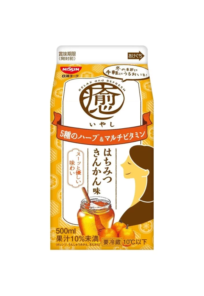
A 500ml Nissin carton stands out with a vibrant yellow-orange base patterned by subtle citrus-slice motifs and geometric lines. The central white panel features a large, stylized brown kanji character for 'healing' (癒) above the hiragana 'iyashi', while a red ribbon banner across the middle announces five types of herbs and multivitamins. Below this, vertical text identifies the flavor as honey yuzu cinnamon, accompanied by an illustration of a glass honey jar, a wooden dipper, and three round citrus fruits next to the serene profile of a woman with closed eyes.
Warm earth tones dominate the palette, creating an inviting contrast between the energetic yellow background and the deep browns of the typography and figure. The composition balances traditional Japanese calligraphy with modern graphic elements like the circular 'RELAX and REFRESH' badge and the practical 'easy to open' arrow in the upper right corner. Such a blend of soothing imagery and clear nutritional messaging positions the product as both a comfort drink and a functional health beverage for colder seasons.
Brand strategists might examine how the packaging communicates warmth and wellness through its specific color choices and illustrative style. Packaging engineers could study the layout efficiency required to display expiration dates, storage instructions, and juice content percentages alongside the primary marketing visuals. Marketing teams analyzing seasonal product launches would find the integration of flavor-specific imagery with broader lifestyle benefits particularly instructive.