Coca-Cola Peach Packaging
Topics
Details
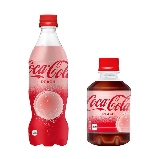
Two plastic bottles of Coca-Cola Peach stand side by side, showcasing the brand's signature red and white color palette with a soft pink gradient. The larger bottle on the left features a contoured silhouette and displays the classic Coca-Cola script logo above the word 'PEACH' in bold white letters, while a graphic of a dewy peach slice dominates the lower label area. A shorter, wider bottle sits to its right, containing dark amber liquid visible through the clear plastic, and both containers are sealed with bright red screw caps.
Visual interest stems from the deliberate contrast between the two packaging formats, where the taller bottle emphasizes vertical branding space while the compact version reveals the actual beverage color through its transparent body. The peach motif incorporates realistic water droplet textures that suggest freshness, creating a tactile quality against the smooth matte finish of the red plastic. Japanese text appears vertically on the smaller bottle's label, indicating this as a regional market variant that adapts global brand identity for local consumers.
Product photographers could study the lighting setup used to eliminate reflections on curved plastic surfaces while maintaining color accuracy across different bottle geometries. Packaging designers might examine how the gradient transition from clear to saturated red guides the eye toward the flavor identifier without disrupting brand recognition. Marketing teams analyzing seasonal product launches would find value in comparing how the same flavor concept translates across distinct container sizes for retail shelf optimization.