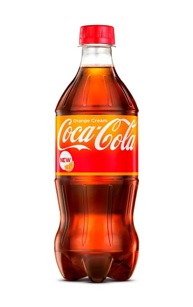
Coca-Cola Orange Cream Bottle
Topics
Details
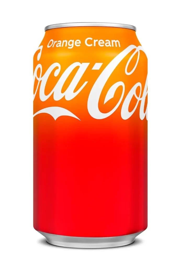
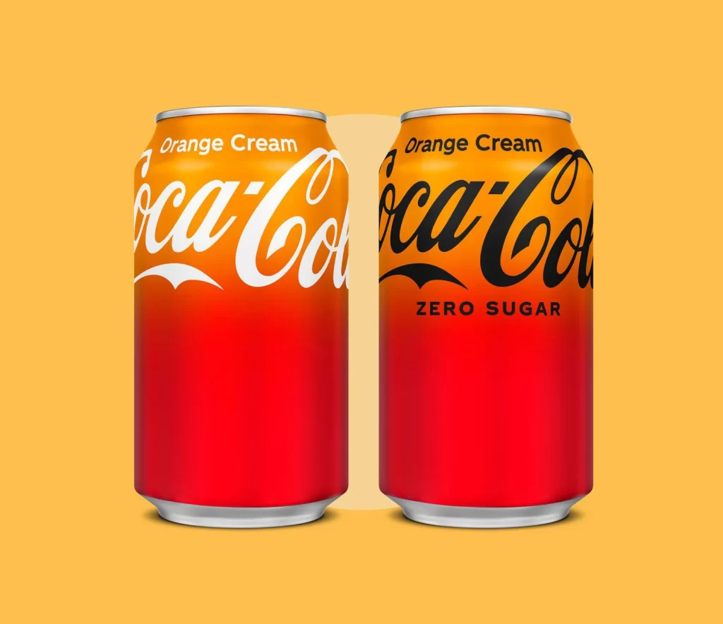
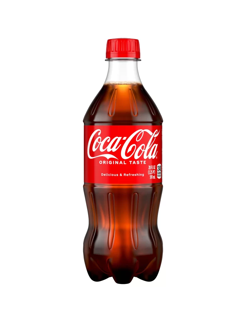
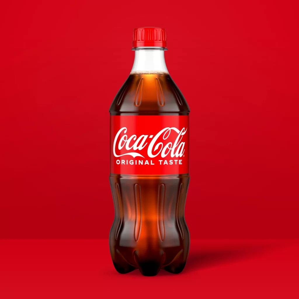
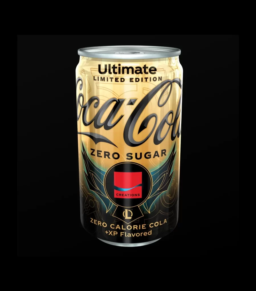
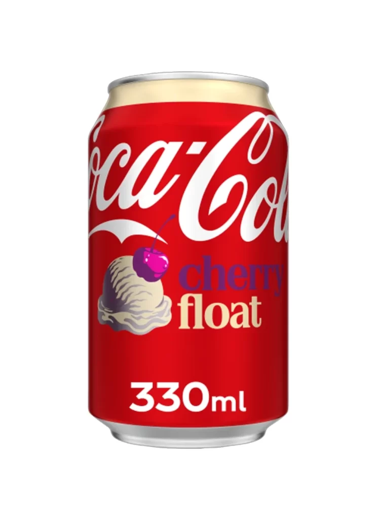
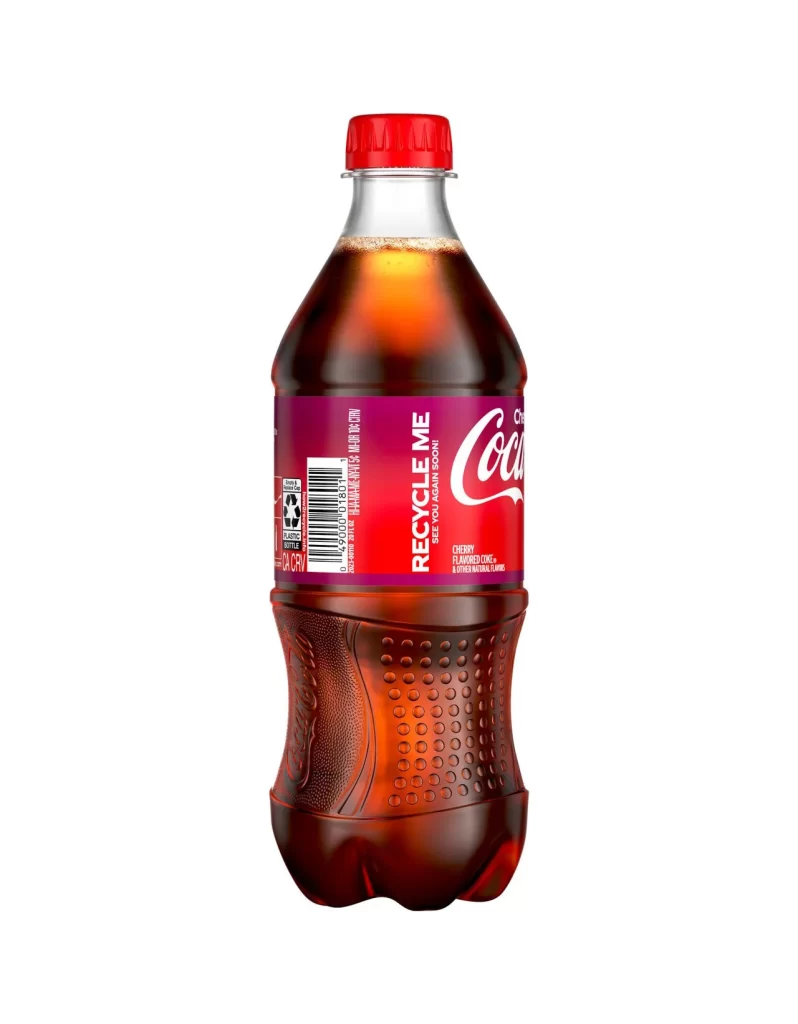
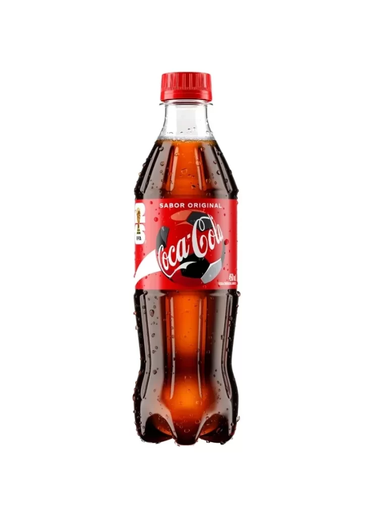
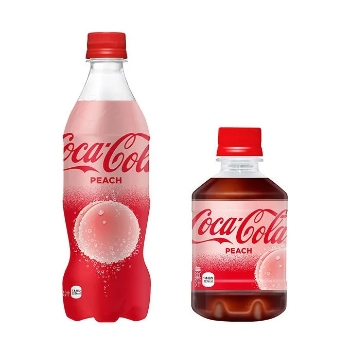
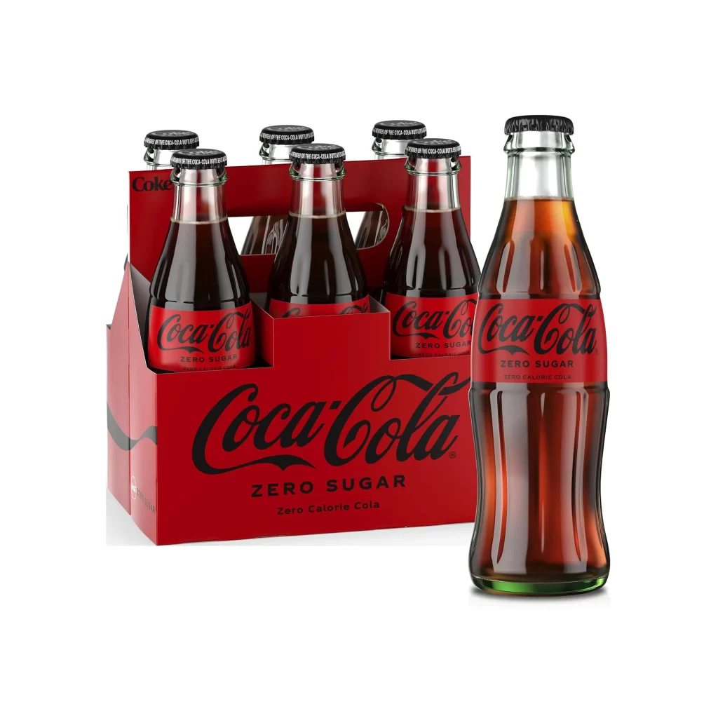
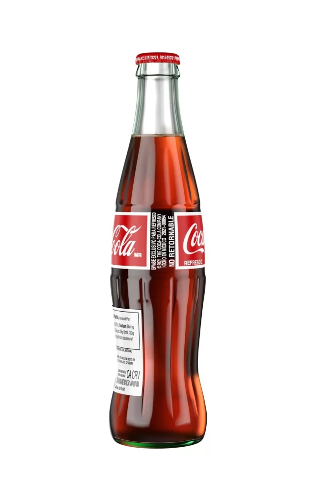
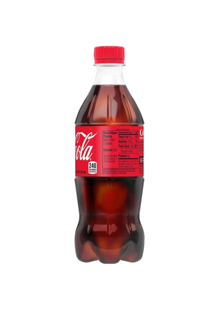
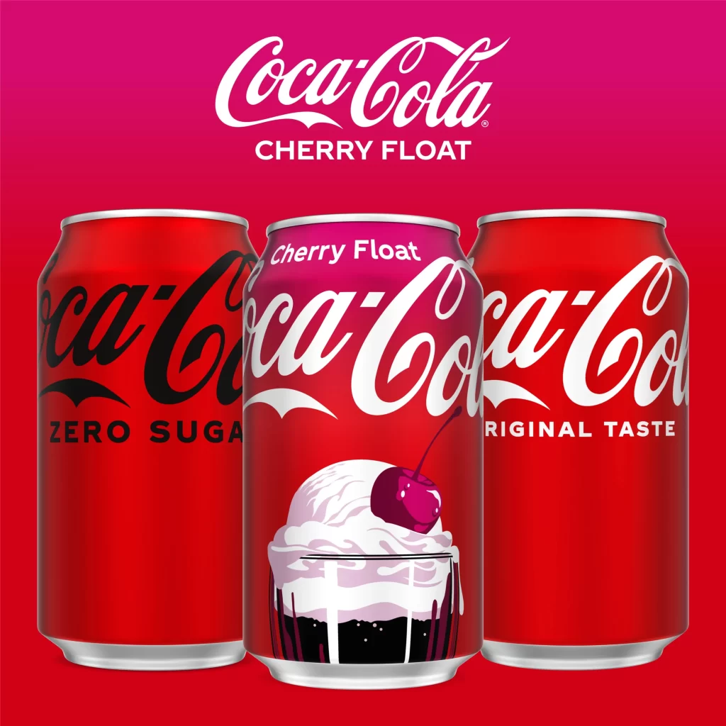
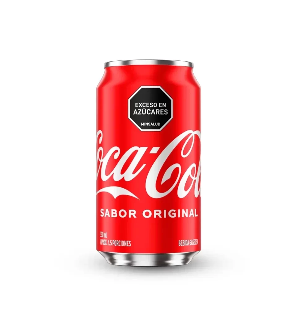
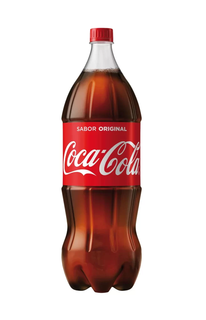
A standard 20-ounce PET bottle filled with amber carbonated liquid stands on a white surface, sealed by a vibrant red screw cap at its transparent neck. The main label transitions from a saturated orange gradient at its upper edge to a solid crimson base, where white Spencerian script spells out the brand name flanked by smaller sans-serif text reading 'Orange Cream'.
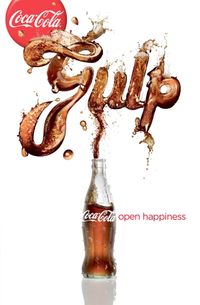
Visual distinction emerges from the aggressive warm palette that deviates sharply from the brand’s classic red-and-white identity. The orange-to-red gradient on the label creates immediate flavor association before any text is processed, functioning as a chromatic shorthand for the citrus-vanilla profile. Typographic hierarchy remains strictly controlled, with the iconic script dominating the central visual field while secondary information recedes into the periphery. Material authenticity is conveyed through the visible condensation droplets near the shoulder and the refractive qualities of the liquid within the molded plastic form.
Packaging designers analyzing limited-edition beverage releases would examine this composition for color-theory applications in seasonal product lines. Marketing teams developing flavor-extension campaigns could reference the specific badge placement and gradient techniques for their own variant packaging. 3D artists constructing commercial product visualizations might study the interplay between the liquid’s subsurface scattering properties and the label’s matte finish to achieve similar material realism in digital renders.