Coca-Cola Orange Cream Can
Topics
Details
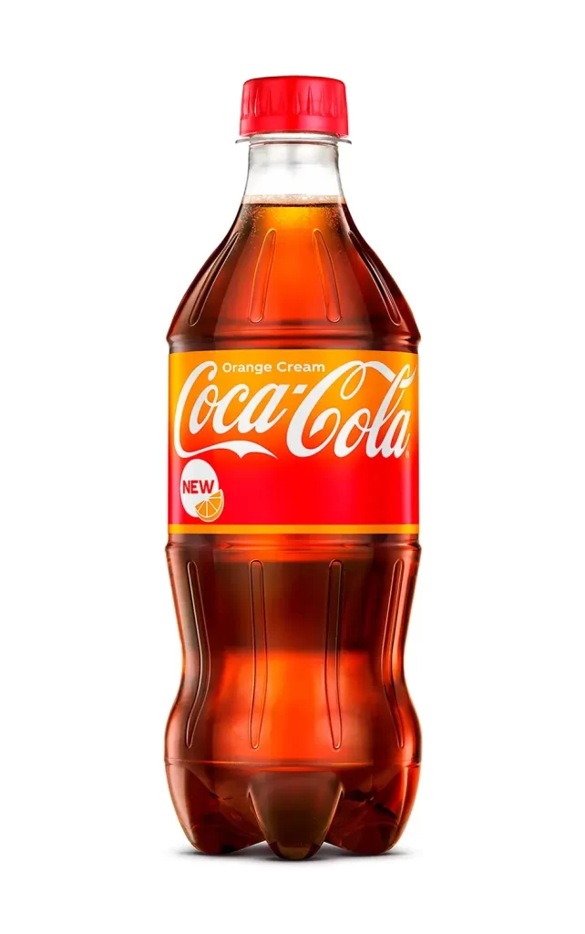
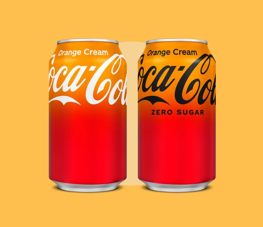
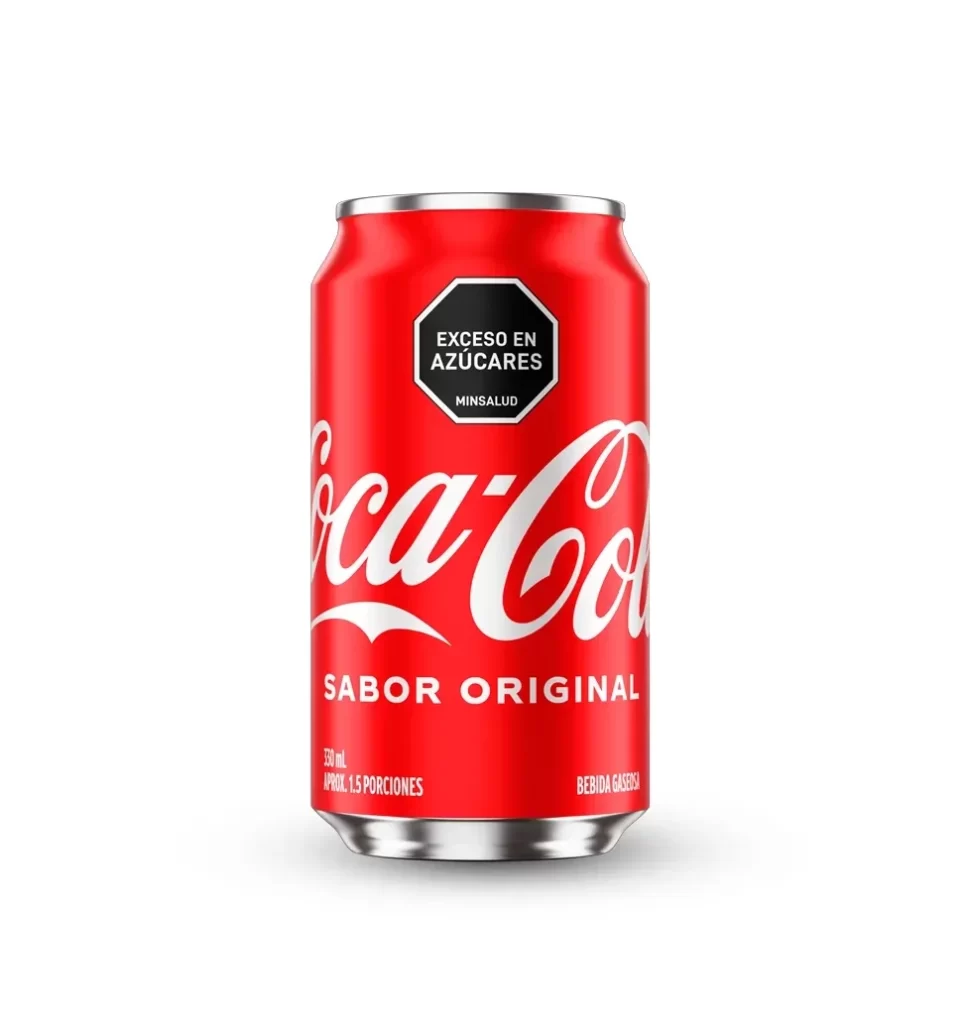
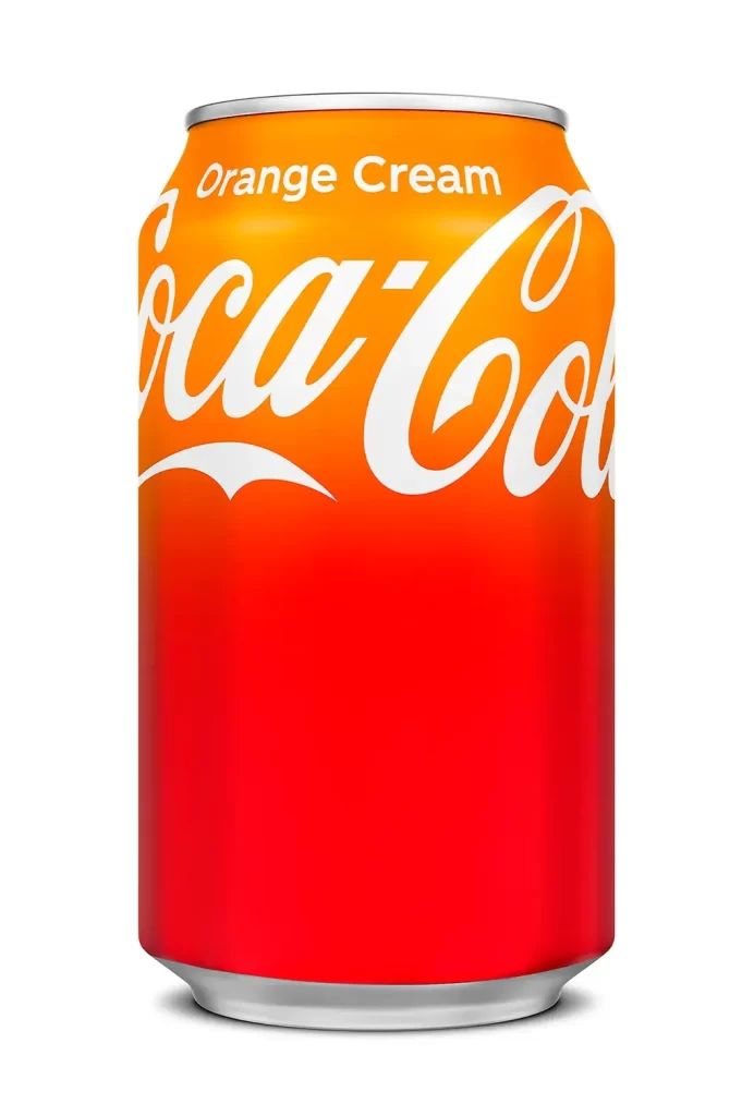
A standard aluminum beverage cylinder stands in a direct frontal view, featuring a smooth vertical gradient that transitions from bright, saturated orange at the top to the brand's signature deep red at the base. White typography dominates the upper half, displaying 'Orange Cream' in a clean sans-serif font above the iconic, sweeping Coca-Cola script. The can rests on a white surface with a silver rim visible at both the top and bottom edges.
Visual interest lies primarily in the dual-tone color treatment, which deviates from the traditional monochromatic red branding. This specific gradient serves as a functional design element, immediately signaling the unique flavor profile of the product without altering the core logo structure. The metallic silver rim and base provide a crisp industrial frame that contrasts with the vibrant, warm hues of the body.
Brand historians and packaging analysts might utilize this visual to document limited-edition flavor releases within the company’s product line. 3D artists and texture mappers could employ the image as a source for accurate surface reflectivity and color values when modeling consumer goods. Marketing teams reviewing seasonal campaigns would find value in analyzing how the gradient effectively communicates taste expectations through color theory alone.