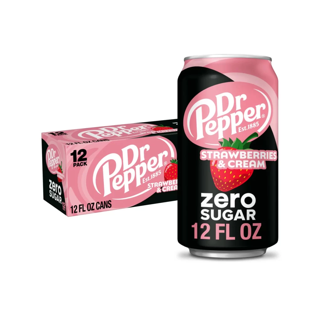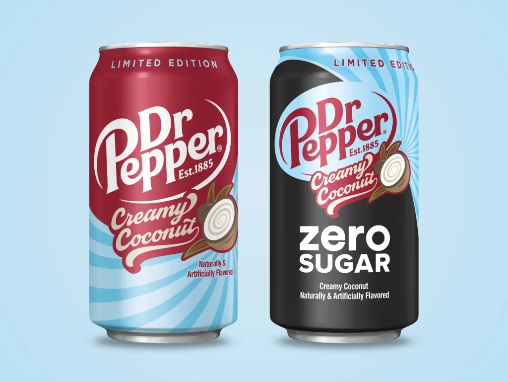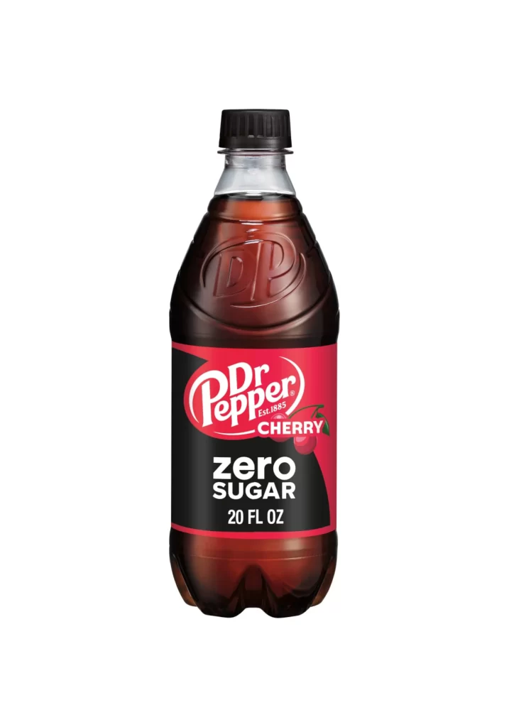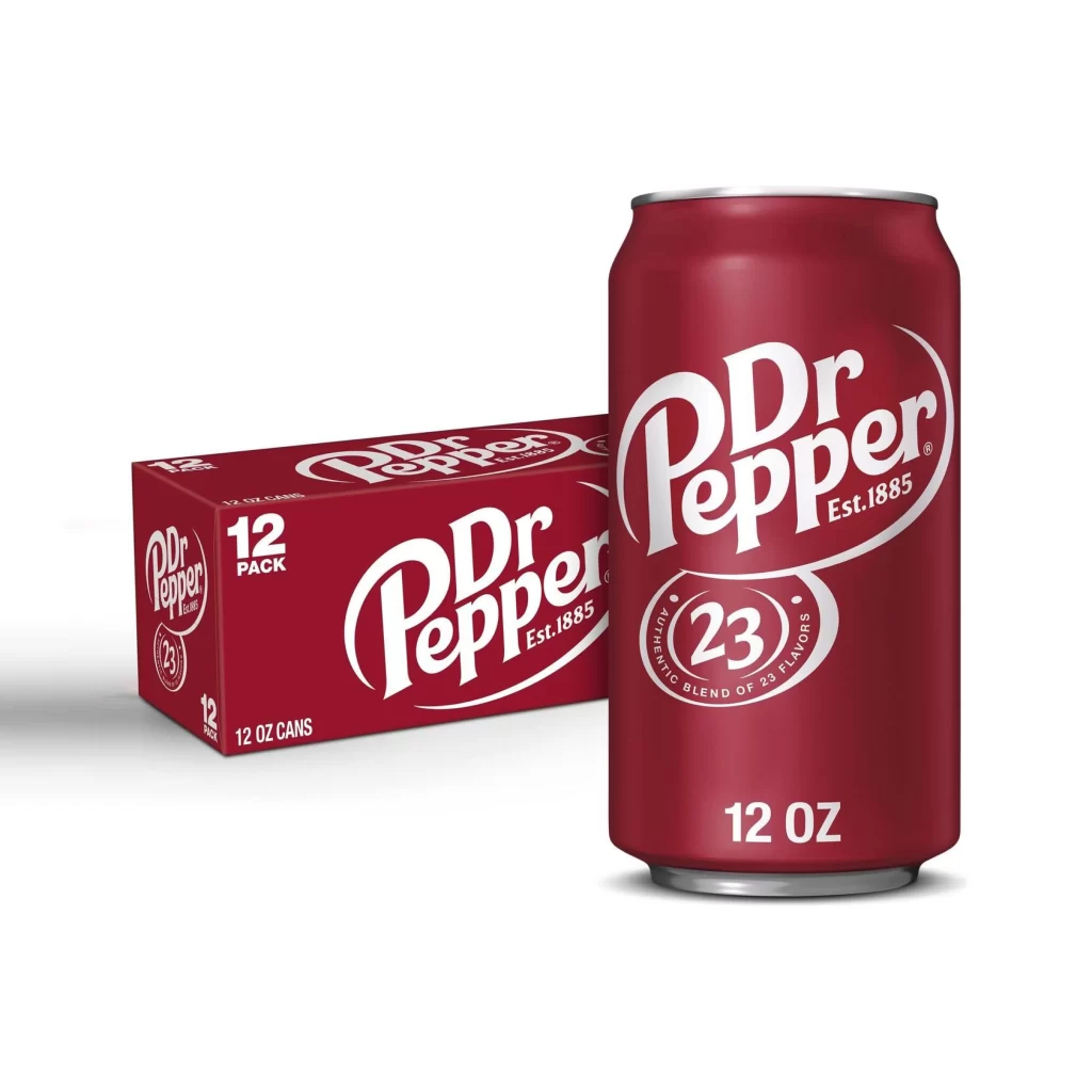
Dr Pepper Blackberry Packaging
DownloadTopics
Details
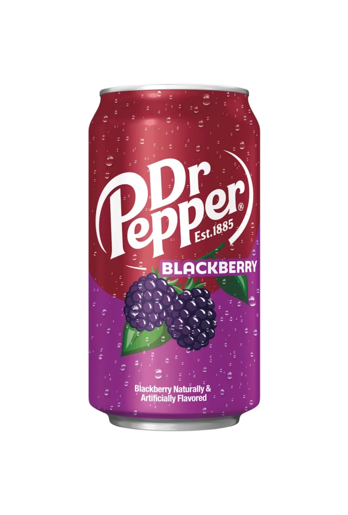
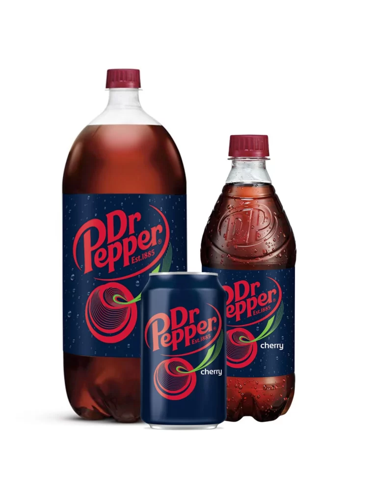
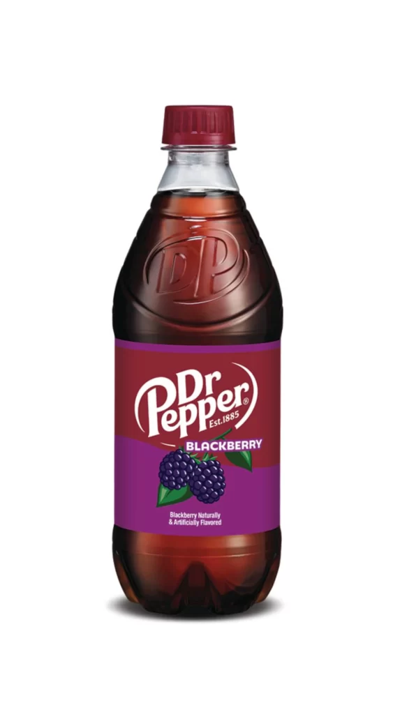
A contoured plastic bottle filled with dark amber liquid stands as the central focus, crowned by a deep burgundy screw cap that matches the upper portion of its label. The iconic Dr Pepper wordmark appears in white script against a rich maroon field, while the lower label section transitions into a vibrant purple band featuring realistic blackberry illustrations with green leaves. Subtle studio lighting creates soft highlights along the bottle's curved shoulder and reveals the embossed DP logo molded into the plastic above the label, all set against a clean, uncluttered backdrop that keeps attention fixed on the packaging details.
What distinguishes this particular variant is the bold color-blocked label design that departs from the brand's traditional single-tone aesthetic, using the purple gradient to immediately signal the fruit flavor profile. The photorealistic berry cluster adds a tactile, appetizing quality that contrasts sharply with the typographic elements above, creating visual hierarchy through both hue and imagery. Designers studying beverage branding will appreciate how the limited edition flavor maintains brand recognition while introducing fresh visual territory through its distinctive chromatic choices.
Product photographers and packaging students can analyze the lighting setup and composition techniques used to showcase the liquid's transparency and the label's surface textures without distracting glare. Marketing teams evaluating seasonal flavor launches might examine how the purple accent color performs against competitors' berry-themed offerings in terms of shelf visibility and appetite appeal. Anyone needing to study the specific typography or illustration style can access the full-resolution file at no cost directly from this page for detailed close-up inspection.