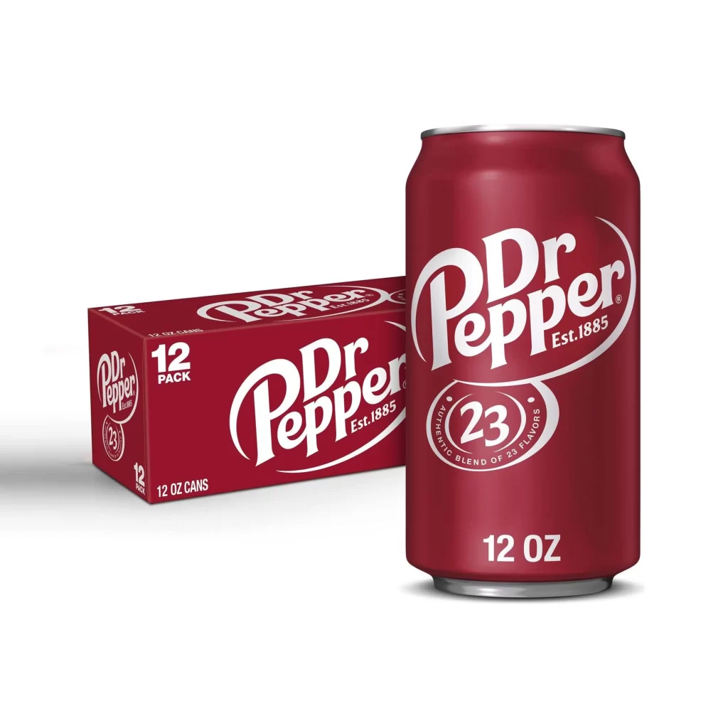
Dr Pepper Can Pack
DownloadTopics
Details
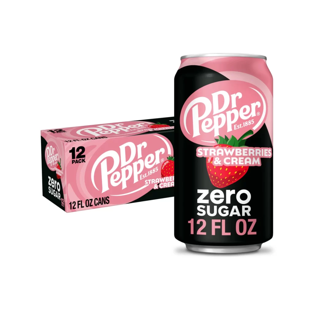
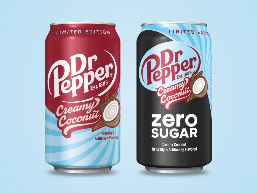
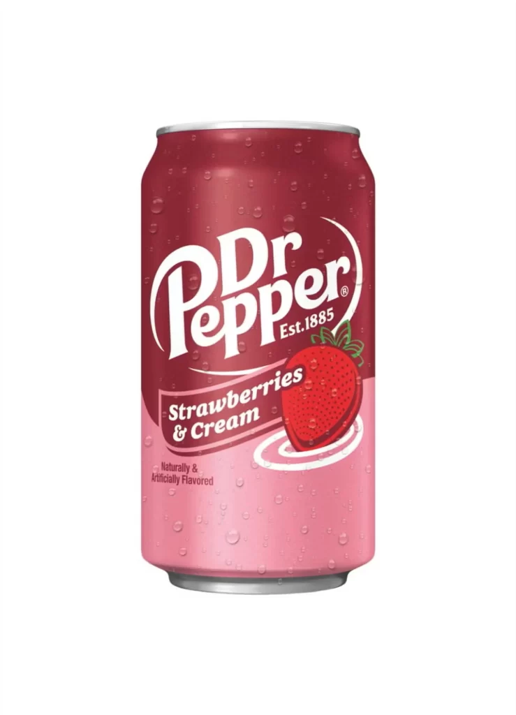
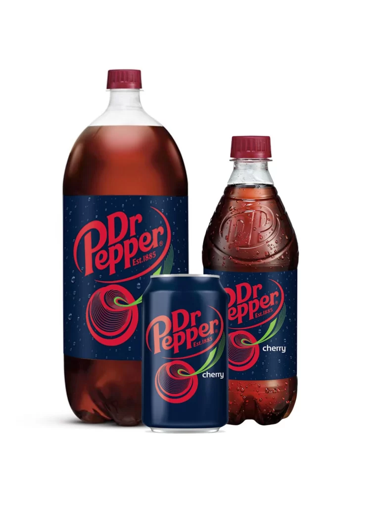
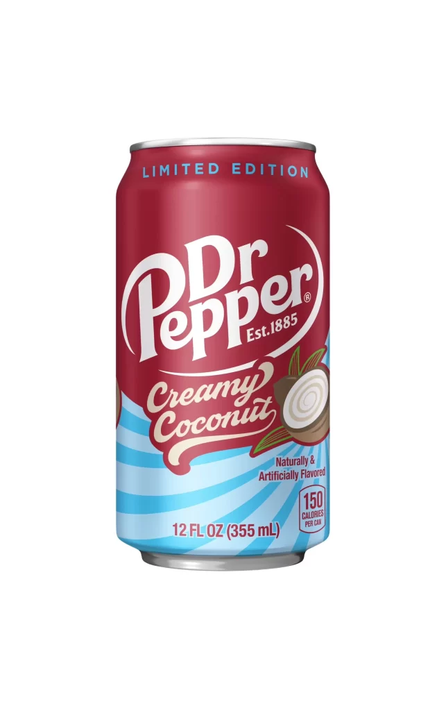
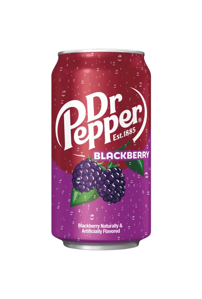
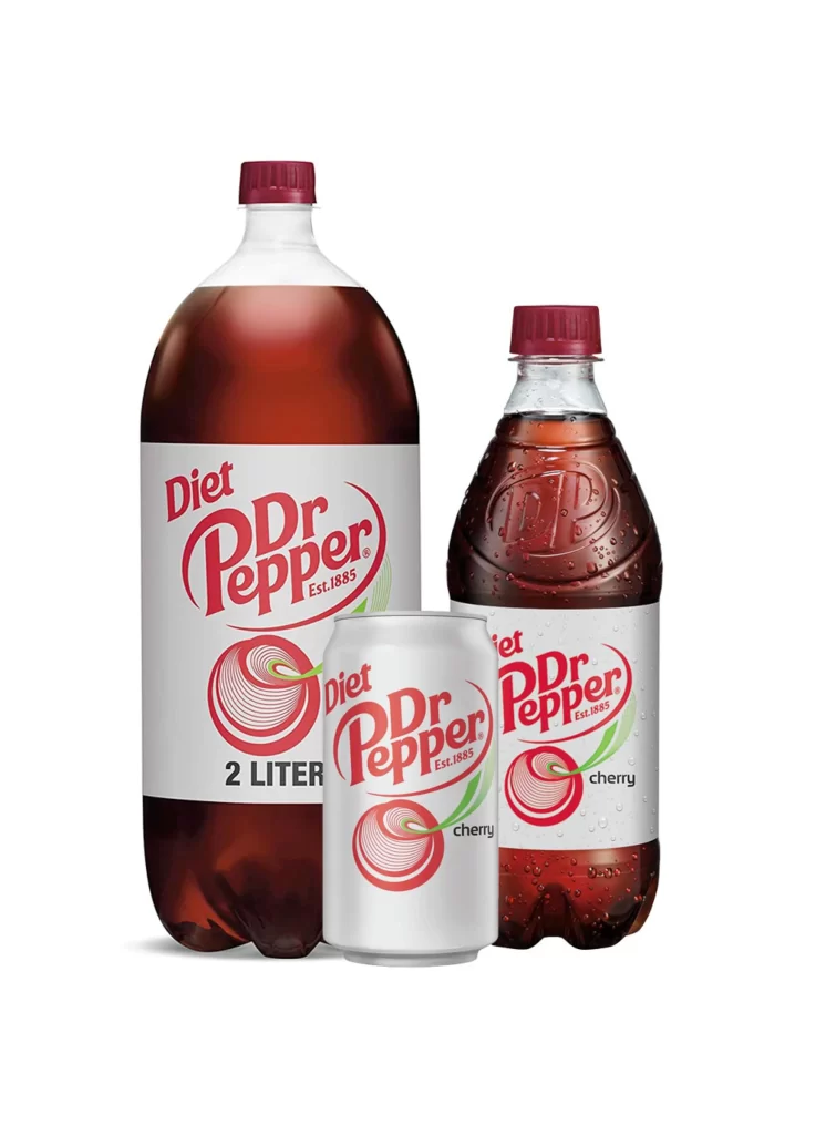
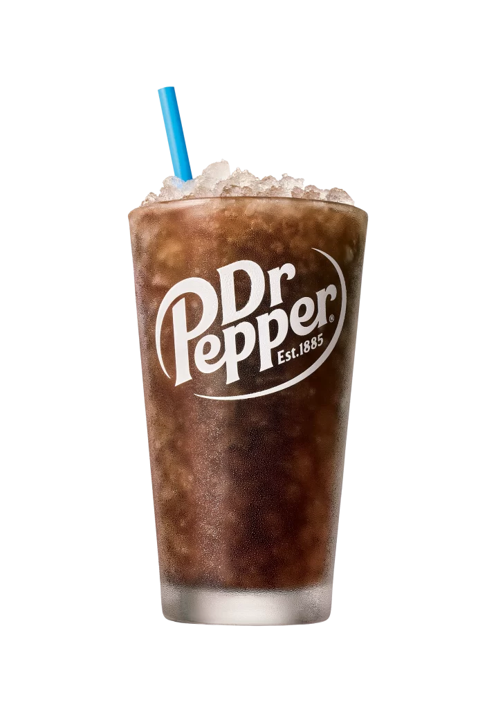
Deep crimson aluminum forms the cylindrical silhouette of a twelve-ounce beverage can, standing prominently beside its matching rectangular cardboard carrier. White typography arcs across both surfaces, displaying the iconic 'Dr Pepper' script alongside 'Est. 1885' and the circular '23' emblem denoting an authentic blend of flavors. Soft studio lighting casts gentle shadows beneath the objects, while the packaging clearly indicates this is a twelve-pack of standard-sized cans.
The visual identity relies on that signature burgundy hue contrasted against crisp white lettering, creating immediate brand recognition even from a distance. Curved text elements and the distinctive oval badge give the surface a dynamic quality that breaks up the solid color field. Designers studying commercial packaging will appreciate how the logo scales consistently between the flat box and the curved can surface, and you can grab the full-resolution file at no cost to examine those details closely.
Product photographers often seek out clean shots like this one to understand proper lighting angles for reflective metallic surfaces. 3D artists building virtual grocery scenes might use these proportions to model accurate soda containers for their environments. Marketing teams reviewing brand consistency across different form factors would also find value in comparing how the graphics adapt to varying geometries.