Monster Energy Drink Zero Sugar Blue Hawaiian
DownloadTopics
Details
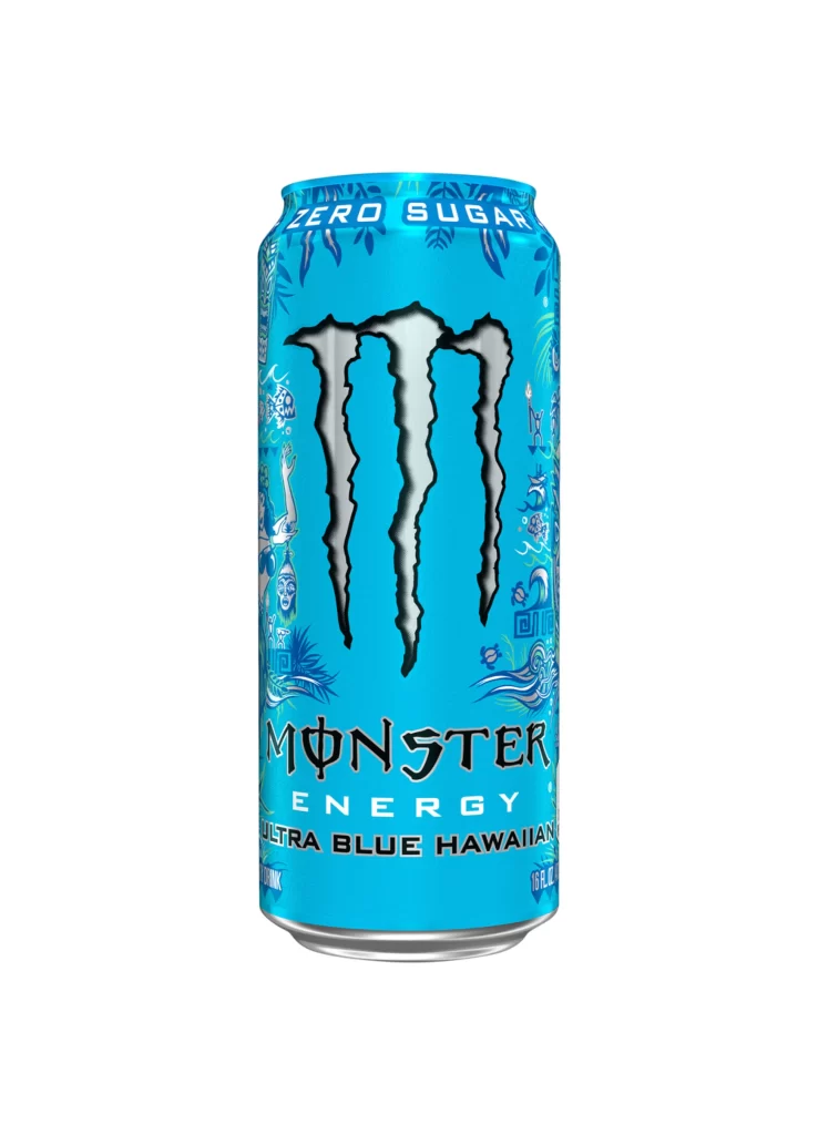
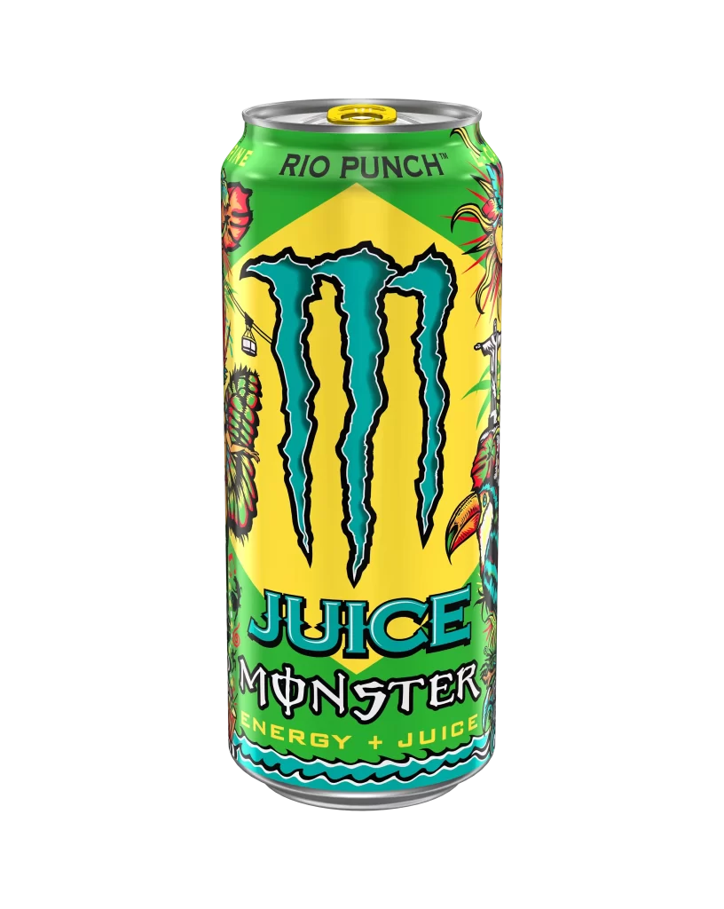
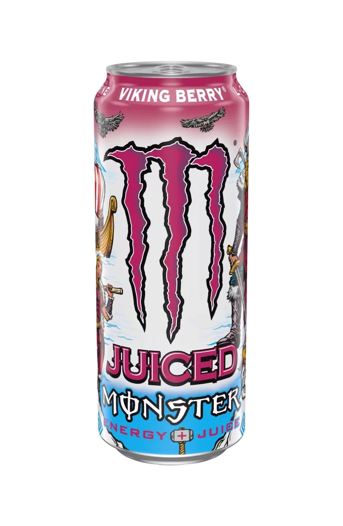
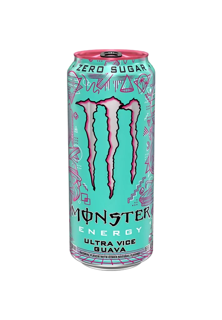
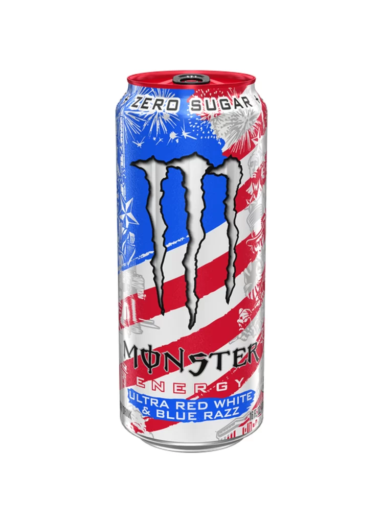
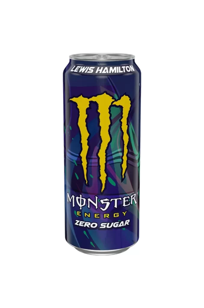
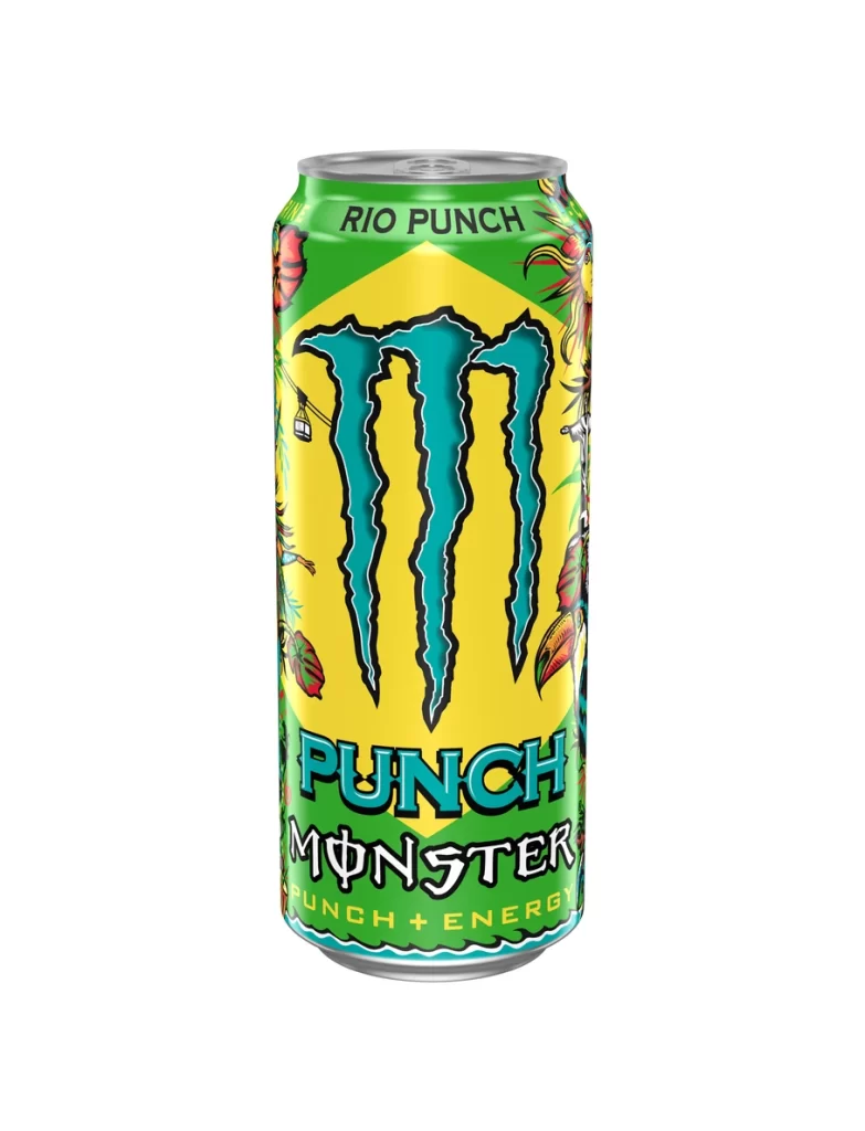
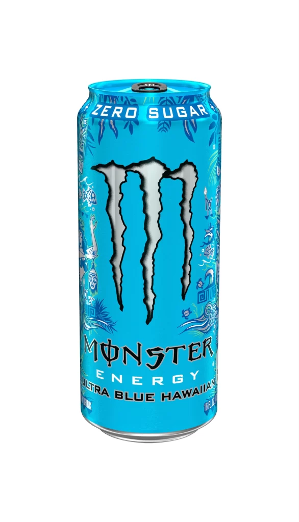
A cylindrical aluminum can dominates the frame, coated in a vibrant cyan-blue finish that immediately catches the eye. The iconic three-clawed Monster logo sits prominently in the center, rendered in silver with thick black outlines that create a bold, aggressive silhouette against the bright background. White text reading 'ZERO SUGAR' arches across the top rim, while the brand name 'MONSTER ENERGY' and flavor designation 'ULTRA BLUE HAWAIIAN' appear in stylized typography below the central graphic. Intricate white line art depicting tropical imagery and Polynesian-inspired motifs decorates the left and right edges of the can, adding texture to the otherwise smooth metallic surface.
What sets this particular variant apart is its striking monochromatic blue palette, which deviates from the brand's typical black-and-green color scheme to evoke a refreshing, tropical aesthetic. The detailed illustrative elements framing the central logo introduce a layer of cultural storytelling that transforms a standard energy drink container into a piece of thematic packaging design. Anyone studying beverage branding or tropical color theory will appreciate how the cool tones contrast with the sharp, dark linework. You can grab the full-resolution file for free if you need to examine those fine graphic details up close.
Product photographers might reference this shot to understand how studio lighting interacts with curved metallic surfaces and reflective coatings. Packaging designers could analyze the hierarchy between the massive central mark and the smaller decorative flourishes to inform their own label layouts. 3D artists building digital assets for advertising campaigns would find the specific proportions and text placement invaluable for creating accurate mockups. Even color theorists could use this as a case study in how saturated hues influence consumer perception of flavor profiles.