Red Bull Iced Vanilla Berry Energy Drink
DownloadTopics
Details
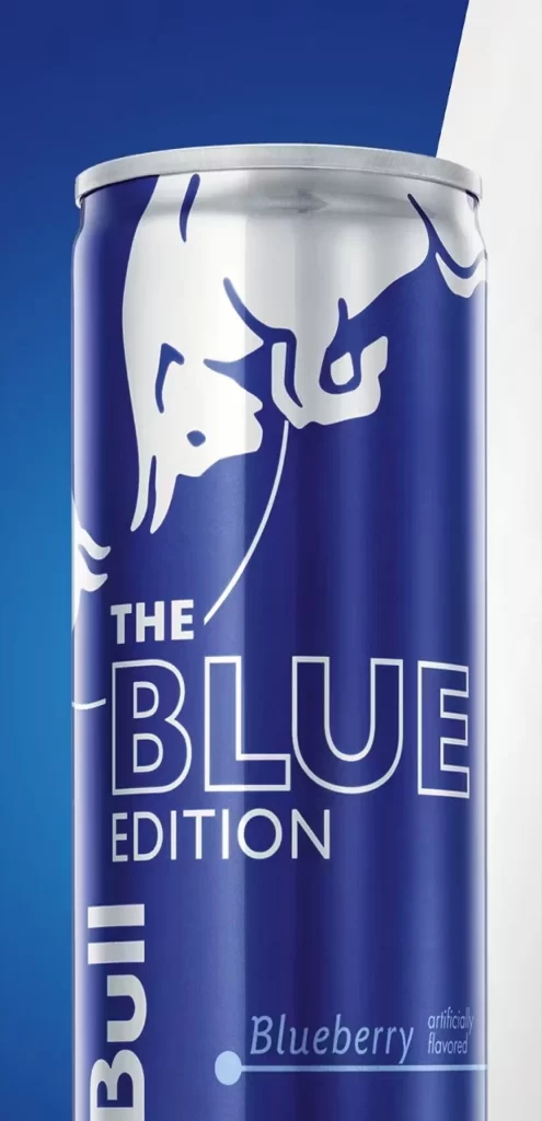
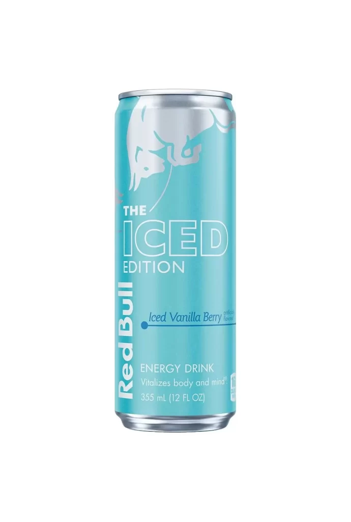
A cylindrical aluminum beverage can stands upright, displaying a matte light cyan finish that covers most of its surface. The silver metallic rim catches light at the top, while the body features white typography reading 'THE ICED EDITION' in bold sans-serif capitals above 'Iced Vanilla Berry' in a smaller script. A stylized white bull silhouette leaps downward from the upper portion, and vertical text spelling 'Red Bull' runs along the left edge in white block letters against the blue field.
Cool tones dominate this particular variant, setting it apart from the brand's signature red-and-silver palette through an almost aquatic aesthetic. The frosted appearance of the can surface reinforces the iced theme visually, while the minimalist bull graphic maintains brand recognition without cluttering the clean layout. Designers studying beverage packaging will appreciate how the limited color scheme creates immediate flavor association. Anyone needing crisp product visuals can access the full-resolution file at no cost directly from the site.
Product photographers might study the even lighting distribution across curved metal surfaces to replicate similar studio setups for client work. Packaging students could analyze the hierarchy between the edition name, flavor description, and brand identifier to understand visual weight allocation in commercial design. Marketing teams evaluating seasonal or limited-edition branding strategies would find concrete examples of how color shifts communicate product variations while preserving core identity elements.