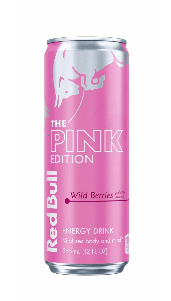
Pink Edition Energy Drink Wild Berries
DownloadTopics
Details
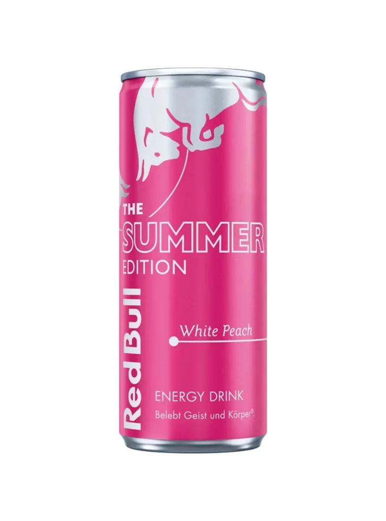
A cylindrical aluminum can dominates the frame, its surface coated in a vibrant bubblegum pink that extends from the base to the silver rim. The iconic charging bull logo appears in a pale, almost white silhouette near the top, while bold sans-serif typography spells out 'THE PINK EDITION' across the center. Below this, the Red Bull brand name runs vertically along the left edge, and smaller text identifies the flavor as Wild Berries with artificial flavors, noting the 355 mL volume and the tagline about vitalizing body and mind.
Departing from the brand's traditional silver and blue palette, this variant embraces a monochromatic pink scheme that creates immediate visual distinction on retail shelves. The strategic use of white and darker pink tones for text ensures legibility while maintaining the cohesive color story, making it a compelling case study in flavor-specific product differentiation. Designers examining packaging trends will find the full-resolution asset useful for analyzing how established brands experiment with color psychology to signal new taste profiles.
Product photographers might study the even lighting and minimal shadow work to replicate similar studio setups for beverage catalogs. Marketing teams could leverage this visual when developing campaigns targeting demographic segments that respond to bold, unconventional color choices in energy drink categories. Packaging engineers may also reference the typographic hierarchy and logo placement decisions when drafting specifications for limited-edition runs.