Blue Edition Energy Drink Can
DownloadTopics
Details
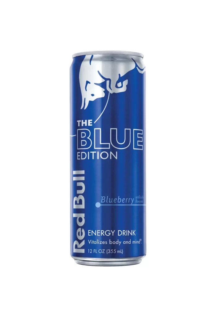
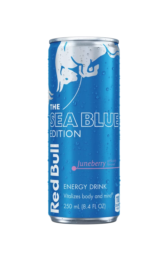
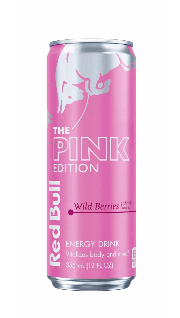
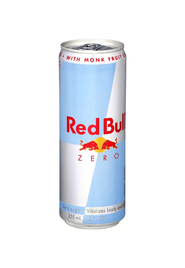
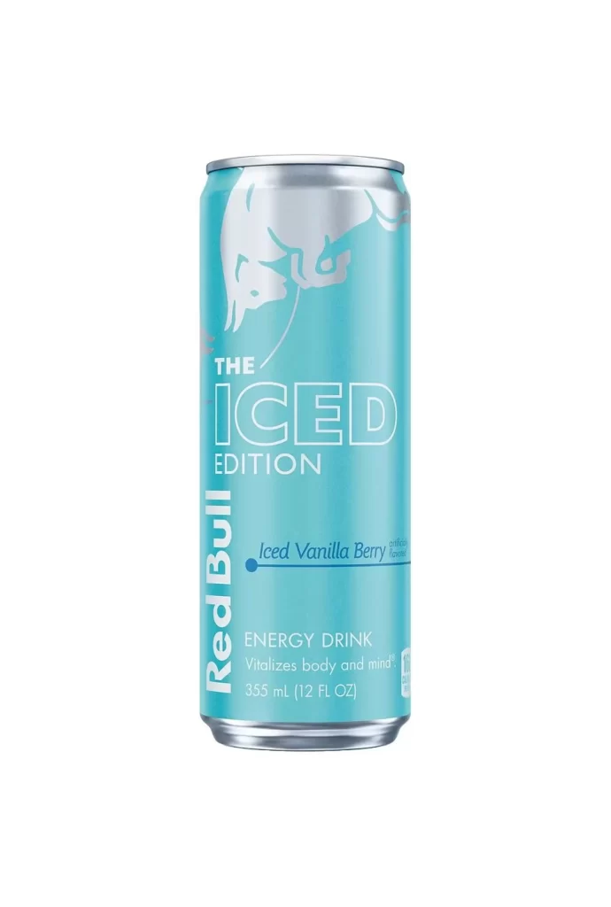
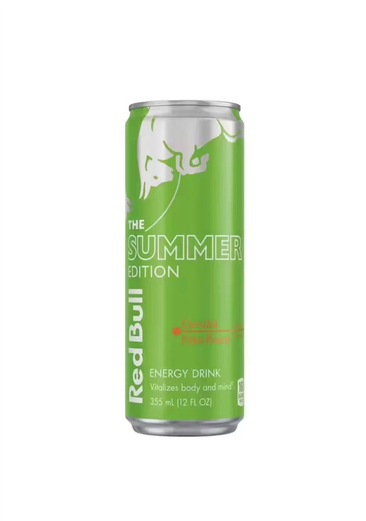
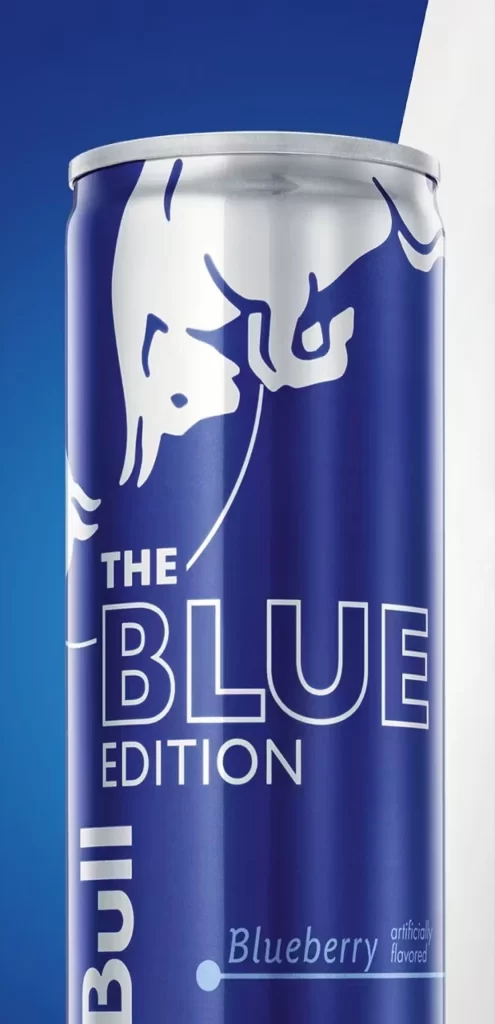
A cylindrical aluminum can with a silver rim dominates the frame, wrapped in a deep navy blue surface that reflects soft highlights along its curved body. The iconic white charging bull logo occupies the upper portion, positioned above bold sans-serif text reading 'THE BLUE EDITION' and a vertical 'Bull' inscription running down the left edge. Near the base, smaller typography identifies the flavor as 'Blueberry' alongside 'artificially flavored,' all set against a split background of solid blue and bright white that meets diagonally behind the container.
This particular variant stands out through its monochromatic blue-and-white color scheme, which departs from the brand's traditional red-and-silver palette to signal a distinct fruit flavor profile. The typographic hierarchy creates clear visual separation between the edition name and the flavor designation, while the matte finish of the printed surface contrasts subtly with the metallic sheen of the unprinted top rim. Designers studying beverage packaging will appreciate how the limited color palette maintains brand recognition while establishing product differentiation on store shelves.
Product photographers and 3D texture artists often seek out such clean, well-lit commercial shots to study specular highlights on curved metallic surfaces and label application techniques. Marketing teams developing seasonal or limited-edition packaging might analyze this composition to understand how background geometry influences the perception of the primary subject. Anyone needing detailed visual documentation of this specific Blue Edition variant can access the full-resolution file at no cost directly from the resource library.