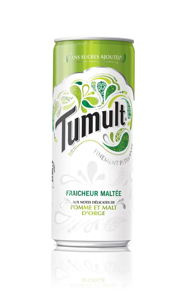
Tumult Can Beverage Design
DownloadTopics
Details
A cylindrical aluminum beverage can stands upright, featuring a two-tone color scheme of lime green on the upper portion and white across the main body. The brand name 'Tumult' appears in bold black serif lettering at the center, surrounded by organic green and teal swirl patterns with dotted textures. French text reading 'SANS SUCRES AJOUTÉES' sits near the top rim, while 'FRAÎCHEUR MALTEE' and flavor notes about apple and barley malt occupy the lower section. Soft studio lighting creates a subtle reflection beneath the can against a clean, light backdrop.
The packaging distinguishes itself through its hand-drawn decorative elements that evoke liquid movement and natural freshness without relying on photographic imagery. Typographic hierarchy effectively separates the product name from descriptive copy, while the limited palette of greens reinforces the malted apple flavor profile. Designers studying beverage branding will appreciate how the ornamental graphics balance whitespace to maintain visual breathing room. A full-resolution version of this file can be accessed at no cost for closer inspection of the print details.
Packaging engineers and label designers might reference this example when developing sugar-free or malt beverage lines targeting health-conscious consumers. Marketing teams could analyze the color psychology and French-language positioning for European market entries. Students of industrial design benefit from examining how metallic substrates interact with matte and gloss ink finishes in commercial production.