Sanitea Packaging Pear Flavored Tea
DownloadTopics
Details
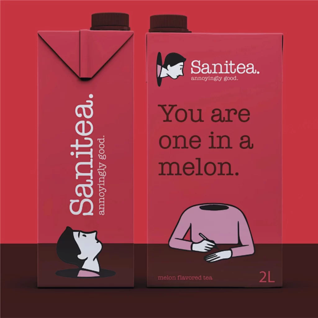
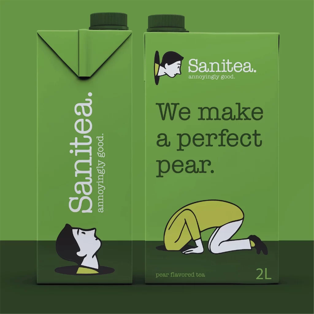
Two matte green cartons with screw caps stand side by side, their surfaces covered in white and dark green typography alongside minimalist line illustrations. The left carton displays the brand name Sanitea. vertically with the tagline annoyingly good., while the right features a profile portrait, the phrase We make a perfect pear., and a figure in child's pose wearing yellow. A solid green backdrop fills the frame behind the 2L containers, which are photographed from a straight-on perspective under even lighting that eliminates harsh shadows.
Visual wit drives this packaging concept through literal wordplay between the fruit flavor and the yoga posture illustration. The restricted palette of sage green, cream, black, and mustard yellow creates a cohesive system that feels both clinical and playful, while the recurring character motif establishes immediate brand recognition across different viewing angles. Designers studying this composition can access the full-resolution asset at no cost to examine the typographic hierarchy and spatial relationships in greater detail.
Brand strategists developing beverage identities for wellness or functional drink markets would find this mockup useful for presenting flavor-specific campaigns to clients. Art directors working on packaging systems could reference the layout structure when balancing vertical logo lockups with horizontal copy blocks on rectangular containers. Illustrators specializing in corporate mascot design might study how the simplified human forms integrate with product photography without overwhelming the essential nutritional information.